1. What is a flow?
The "Flow" section in the Eurus theme is a visually engaging component designed to showcase a sequence of elements, often used to introduce collections or product lists. It accommodates up to six content blocks across three types, promoting organized and visually appealing content presentation. Users can seamlessly explore various collections or products, enhancing their interactive experience on the website.

2. How to showcase different products or collections as each step in the flow?
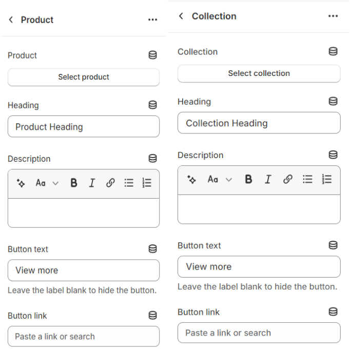
To showcase different products or collections as each step in the flow: Choose either the "Products" or "Collections" block.
- Products Block: Automatically displays images of products, allowing customization of text, headings, and other details.
- Collections Block: Similar to the Products block, but showcases collections’ information instead.
Add custom text and headings to provide context or highlight key features of the products or collections being showcased.
Use the "Default Content Height" setting to control how much content is shown before the "Read more" button is clicked. You can select from 4 options: Show full content, Small, Medium, or Large, based on your preference for how much content is visible initially.
Select the heading tag for this section to enhance the SEO of the page.
Optionally, add links to specific products or collections using buttons or custom links. This allows users to easily navigate to the desired product or collection for further exploration or purchase.

⚠️ Note: Leave the Button link field blank to directly navigate to the product or collection.
3. How to show custom images or videos at each step?
Add a media block and choose between uploading an image or video by follow these simple steps:
- You can upload images directly or select a video uploaded to Shopify. Alternatively, if no Shopify-hosted video is chosen, you can provide a URL from YouTube or Vimeo.
- Customize the heading and description by adding text content to provide context or information related to the image or video.
-
Choose your preferred Button style: Primary, Secondary, or Text link.

4. How to change the layout of the section?
To change the layout of the section, use the settings within the section itself.
- Adjust the desktop layout and choose the image position.
- Expand the section to fill the entire width of the screen and add left and right padding when it's full-width.
- Optionally display a divider above the section and adjust the height of the section for desktop devices.
- Add padding at the top and bottom of the section.
- Similar settings are available for mobile devices as well.
These settings allow for comprehensive layout customization directly within the section editor.

5. How to add a small image next to the heading?
You can add a small image next to the heading to enhance the clarity of product steps or categories, making navigation more intuitive for users.

Step 1: Navigate to the Flow section in the theme editor.
Step 2: Select the content block where you want to add the image next to the heading.
Step 3: Click on a block under the Flow section to open its setting, locate the Image option and click Select to upload an image or choose from free images.
Step 4: Adjust the Image Style by selecting either Square or Rounded.
Step 5: Set the Image Ratio to your preference (e.g., Landscape 4:3 for a wider look).
⚠️ Note:If your Image Ratio is 1:1 and you Image style is Rounded ⇒ The image will be shown in circle shape.
Step 6: Click Save.
6. How to enable auto-play for the Flow section?
Step 1: Navigate to the Flow section in the theme editor.
Step 2: Locate the Enable auto-play toggle andturn it on to activate automatic transitions.
⚠️ Note:With this setting enabled, the Flow section will begin playing from step one, regardless of whether you've disabled the 'Open first tab by default' option.
Step 3: Adjust the Change steps every setting to define the duration (in seconds) for each step before it transitions.
Step 4: (Optional) Enable Pause on hover to stop auto-play when a visitor hovers over the section.
Step 5: Click Save.
Once enabled, the Flow section will automatically cycle through content blocks, creating a dynamic and engaging browsing experience.
