The Eurus theme is designed to have responsive image functionality, allowing the use of various image sizes across all sections. It means the theme itself can adjust images to look great on devices of any size, regardless of the original image size admin uploads.
Recommended Sizes: For optimum quality, you can reference the image sizes used on our demo stores. Some examples include:
| Desktop (px) | Mobile (px) | |
| Menu - Promotion image | 750 x 500 | - |
| Menu - Banner menu | 1500 x 2250 | - |
| Slideshow |
Slide: 1920x860 Media with Text: 1048x860 Three-fold: 960x860 |
Slide: 900x1290 Media with Text: 900x1290 Three-fold: 444x1290 |
| Promotion banner | 1 images: 1920 x 860 2-3 images: 950x860 |
900 x 1290 |
| Media with text | 1400x900 | - |
| Text columns with image | 750x750 | - |
| Collection list banner/Image comparison | 1920 x 860 | 900 x 1290 |
| Flashsale | 1920x? (dynamic height based on content) | 900x? (dynamic height based on content) |
| Collection list carousel | 1350 x 1900 | - |
| Map | 1920 x 860 | - |
| Collection banner | 1920 x 860 | - |
| Video - Cover image | 1920 x 860 | - |
| Popup | 900 x 600 | - |
| Age verification popup | 1920 x 860 | - |
| FAQ/Contact form | 1400 x 900 | - |
| Email signup | 1920 x 860 | 900 x 1290 |
| Collection list/Collection page - Promotion block | 900 x 1150 (standard 4-column layout) | - |
| Tabs - Media with text | 1400 x 900 | 900 x 1290 |
| Event calendar | 1400 x 900 | - |
| Shop the look |
Layered: 1920 x 860 Non-layered: 700 x 920 |
- |
| Featured collections - Title card | 1200 x 1800 (standard 4-column layout) | - |
| Flow - Media block | 1400 x 900 | - |
| Media gallery/Promotion grid |
Layout 1: Default
Image 1: 2048x1365 (3:2 ratio) Image 2 & 3: 896x600 (3:2 ratio) |
- |
|
Layout 2: 2 columns, 2 rows
|
- | |
|
Layout 3: 3 columns, 2 rows
Image 1,2:
Image 3,4:
|
- | |
|
Layout 4: 3 columns, 2 rows
|
- | |
|
Layout 5: 4 columns, 2 rows
Image 1 & 6: 2048x1024 (2:1 ratio) Image 2, 3, 4, 5: 2048x2253 (5:5.5 ratio)
|
- |
|
| Collage |
Layout 1: 4 columns, 2 rows
Media: 2048x2048 (1:1 ratio) |
- |
|
Layout 2: 6 columns, 2 rows
Media:
|
- |


If you want to check image sizes on our Demo Store, please follow these steps:
- Visit the demo store: https://themes.shopify.com/themes/eurus/styles/breeze/preview
- Right-click on the image, choose "Inspect."
- Hover over the <img> tag, find "Intrinsic size" for reference: h

Note:
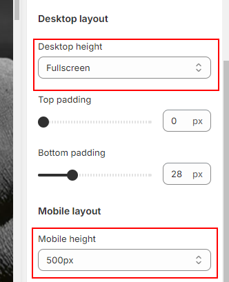
- Some sections offer options to adjust the height/width of added images (e.g., slideshow, promotion banner Image). Certain configurations may lead to distortion or enlargement, especially in fullscreen or "Adapt to first image" settings. Feel free to experiment with these settings to avoid display issues.
- For larger sections (like slideshows, promotion banners, grids, and collection banners), consider adding separate images for mobile viewing. This ensures your visuals remain effective and engaging on smaller screens, providing the best display possible across all devices.
Explore these recommendations, and customize your images based on your preferences and specific section requirements. If you have any further questions, feel free to reach out!

