To create collapsible tabs for additional content in the description section, follow these simple steps:
- Add the block “Collapsible tab”
- From here, you can customize
- Open this tab by default: tick the box to make the tab expand automatically when the page loads.
- Set up the icon: 4 options
-
- Choose your favorite Icon from the drop-down list. Choose "None" if you don't want any icons.
- Find your preferred one in the Icon list, copy and paste its exact name to the “Use another icon” field. (Note: Make sure to choose Icon > "Use another icon" to activate this function.)
- Upload a Custom icon image.
- Add a Custom icon (SVG code). (For assistance with custom SVG code, please contact our support.)
Use secondary background: Tick the box to show the background for the content inside the collapsible tab.
Heading: enter the title of the collapsible tab to describe the content it will contain.
Tab content: Add the content you want to display when the tab is expanded.
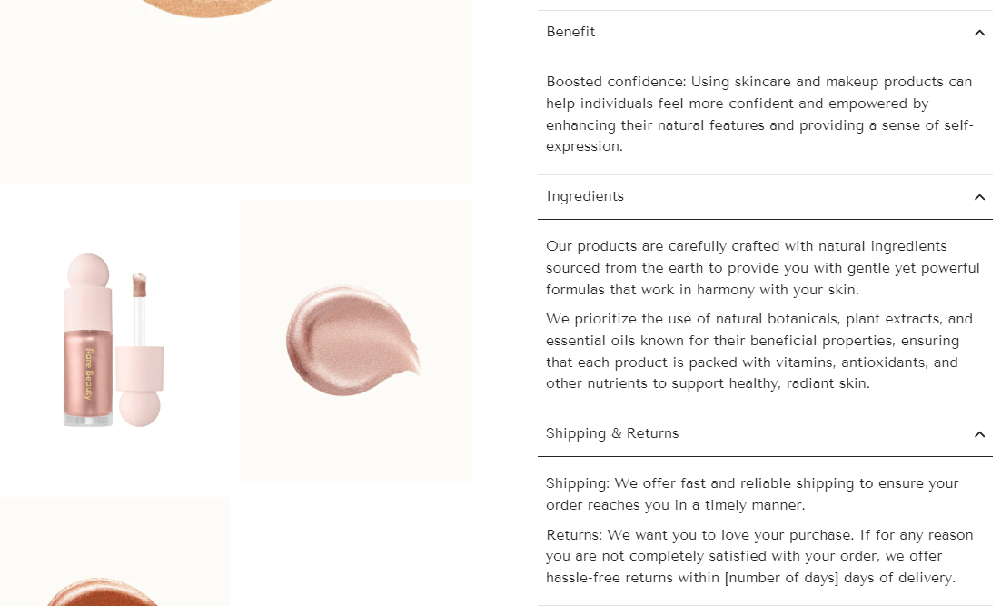
Result:

Tips: You can also utilize metafields to dynamically populate content based on the product, providing more personalized information.

