1. What is the contact form?
A contact form is a section that allows visitors to send messages or inquiries directly to the site owner or support team. It typically includes fields for the visitor's name, email address, and message. By using a contact form instead of an email link, businesses can reduce spam messages and provide a convenient way for customers to reach out with questions, feedback, or support requests.

2. How to set up the contact form?
a) How to set up the form name and description?
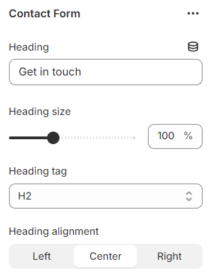
To configure the contact form's name and description, follow these steps:
- Enter the heading of the contact form section.
- Adjust the size of the heading (range from 50-200%).
- Select the heading tag for this section to enhance the SEO of the page.
- Enter the text to display under the heading or leave it blank.
- Choose the background color in light or dark mode.
- Enter the label for the Submit button. The default text is “Send”.
b) Adding Custom Fields to the Form
By default, the contact form includes the following fields: Name, Email, Phone Number, and Message.
- You can customize the label for each field.
- The Email field is always required as per Shopify regulations, even if the Email block is hidden or removed.
- You can optionally mark other fields as required for form submission.

To add custom fields to the contact form, you can use the Form Item block. The theme supports various form types. Here’s how to set them up:
- Enter the label for the field.
- Enable “Mark as Required” to make this field required for form submission.
- Choose the input type for this field (Text, Dropdown, Radio Button, Checkbox).
- Enter the input values for dropdowns, radio buttons, and checkboxes. Options are separated by a semicolon.
Note: This setting only works if you choose the input type as Dropdown, Radio Button, or Checkbox.
Example: Dropdown type

Example: Radio button

After the customer submits the form on the frontend, an email will be sent to the store administrator through the Store Sender Email configured in the settings. You can find this setting by navigating to: Shopify admin => Settings => Notification

This email address is where the admin will receive notification emails when a customer contacts them.
Result in store sender email:

c) How to show Date/Time input field to the contact form?
STEP 1: In the Theme Editor, add Contact form section.
STEP 2: Under Contact form section, add Form item block.
STEP 3: Enter the Label for the field.
STEP 4: Enable “Mark as Required” toggle to make this field required for form submission.
STEP 5: Choose Date or Time options in Form input type setting.
|
⚠️ Note: One Form item block can only be used for either a Date input field or a Time input field. If you want both, add 2 separate Form item blocks. |
STEP 6: Save changes.
3. How to show an image next to the form?
If store owners want to make the section more engaging by showing a map, directions, or a store photo, they can add an image for illustration.
- Go to the section settings and in the option “Show additional content”, select Image.
- Click to upload images from your library or select from free image resources.
- Adjust the height of the image on desktop or mobile devices.

4. How to show the store contact information?
If you want to display store information to make it easier for customers to contact you, you can add the store information to the section.
Go to the section settings and in the option “Show additional content”, select Contact information. Then configure it: Enter the store address, store's phone number, email address and the operating hours of the store.

If you want to display both an image and contact information alongside the form, in “Show additional content”, select the option Both.
This will allow you to configure and display both an image and the store contact information in the section.
5. How to create and show a contact page?
Creating a contact page allows customers to easily reach out to your store with questions or concerns. Here’s a step-by-step guide to set it up:
A contact page typically includes a contact form, store contact information, and possibly a map or an image to make it more dynamic.
Step 1: Create a New Template:
Follow this guide to create a new template:
- From your Shopify admin, go to Online Store > Themes.
- Find the theme you want to edit, and then click Customize.
- Use the Template drop-down menu to select a template. Click + Create template.
- Give your template a unique name.
- Select which existing template you want to base your new template on from the Template drop-down menu.
- Click Create template.
- In the new template, drag the Contact Form section into place.
For more details, Please follow the instructions of Shopify documentation.
Step 2: Create a Page and Assign the Template:
Apply the new template to a page by following this guide:
- From your Shopify admin, go to Online Store > Pages.
- Click the title of the store page you want to edit or create a new page.
- In the Online store section, use the drop-down menu to select the new theme template you created.
- Click Save.

For a quicker setup, you can use the ready-to-use templates available in the Eurus theme. These templates are designed to be easily customizable and provide a professional look for your contact page, ensuring a smooth and quick setup.
By following these steps, you can create a functional and attractive contact page that makes it easy for customers to reach out to your store.
6. How to customize the success and error message of the form?
You can customize the success message in the section settings of the contact form. This message will be displayed to users after they successfully submit the form.
- Navigate to the contact form section settings.
- Look for the Success message field.
- Enter the message you want to display after a user submits the form.

Error messages are handled by the browser and cannot be customized through the theme. These messages ensure users provide the necessary information in the correct format before the form can be submitted.

By customizing the success message, you can provide a clear and personalized response to users, enhancing their experience when contacting your store.

