Sections & Blocks
Sections & Blocks

Sections & Blocks
1. What is the product comparison table? A product comparison table is a structured layout presenting a side-by-side comparison of multiple products. It typically includes various features, specifications, and attributes relevant to the products being compared, allowing customers to easily evaluate and make informed decisions based on their preferences and requirements. This table format provides a clear and concise overview of each product's strengths, weaknesses, and key characteristics, aiding customers in comparing different options and selecting the most suitable one for their needs. 2. How to set up the product comparison table? a) General settings: To set up the product comparison table, follow these steps: Text: Specify the heading for the table. Adjust the size and alignment of the heading. Customize the "View more" button label and link if needed. Table: Select up to five products to compare. Define the text to display for empty fields. Choose the product image ratio (e.g., square). Colors & Layout: Customize the background, criteria, heading, text, and line/border colors for both light and dark themes. Configure the desktop and mobile layout settings, including full width, section divider visibility, and top/bottom padding. b) Compare related products (on product page only) To improve the shopping experience on product pages, admin can add a feature that automatically fills the comparison table with similar products based on similar category or purchase history. This uses Shopify's recommendation rule, which looks at customer behavior and product details to suggest relevant items. This feature doesn't just make comparison easier, it also encourages customers to explore related products. This could lead to more cross-selling and overall customer satisfaction. This is the main product, and the automatically generated product comparison table corresponds to it. By configuring these settings, you can create a comprehensive and visually appealing product comparison table, allowing users to easily compare multiple products and make informed purchasing decisions. Adjust the content, colors, and layout to align with your brand's identity and design preferences. 3. How to add criteria to compare? To add criteria to compare, add the needed blocks: a) Use default product information to compare Use the blocks available within the section. There's no limit to the number of blocks you can add: Include various blocks and showcase default product information for comparison. Customize settings within each block as needed. Add Product Summary block to show product image, name, price, and other relevant details. Use blocks Variant option to display variant options such as material, size, or color. Please make sure to enter the exact name of the product option. Enable color swatches if needed. Add Description/Buttons/Rating/Vendor name blocks to provide additional information or actions related to the product. Note that there are no customizable settings available for these blocks. b) Use product metafields Add a "Product metafield" block and enter the metafield key to access and display custom product information. Please refer to the documentation of Shopify here to create metafields. Detailed guide to set up: Step 1: Create metafields: In the Shopify admin, navigate to Settings => Metafields and metaobjects => Metafield Definitions => Products, and add a definition. Provide a name, Namespace, and key (optionally enter Description). Select a suitable type, such as text or number. Be noted to Choose "One value", and then save. Step 2: Set up the metafields for each product Go to Admin => Products. For individual products, select the product, find the metafields section, and enter the values. Save the configuration. For bulk editing, select all products you want to set up. Add a column if not already present and choose the metafield created in the previous step. Step 3: Add block Product Metafield Open the Theme editor, locate the Product comparison table section, and add a Product metafield block. Enter the metafield key to access and display custom product information within the comparison table. If you need any support, feel free to contact us. Click on this link to create a support ticket. Our team will be happy to help you.

Sections & Blocks
1. What is image comparison? Image comparison is a section that allows users to compare two different images side by side, highlighting their distinct characteristics or differences. It's commonly used to showcase before and after images, product comparisons, or visual transformations, enabling users to easily discern changes or variations between the two images. This feature enhances user experience by providing a clear and visual representation of differences, aiding in decision-making or understanding of the content being presented. 2. How to set up image comparison? To set up image comparison, follow these key configurations: Section Heading: Specify the heading for the section & Adjust heading size and tag. Before and After Images: Upload images for before and after comparisons. Specify heading inside the image, its size, and position (start, middle, end). Desktop and Mobile Layout: Choose to show images in horizontal or vertical layout. Customize desktop and mobile image heights. Set corner radius for images. Adjust the Image labels edges to change the Before/ After background shape (Square, Rounded corners). The default option is Square. Choose whether you want the image aligned to the left or the right (Left/Right) Decide the order in which the images will appear (first or second) in mobile view. Choose the alignment for the text within the Image Comparison section (Left/Center/Right) Configure section width and padding. Show or hide section dividers. Adjust top and bottom padding. Styles: Customize heading and background colors for light and dark themes. 3. How to add heading and additional text to the section? To add a heading and additional text to the section, follow these steps: a) Heading Block: Add a "Heading" block to the section. Customize the following settings: Optionally, provide a subheading for additional context. Enter the main heading text & Adjust the size of the heading. Choose the HTML tag for the heading (e.g., H1, H2, etc.). Add any additional text content. Choose the color for the heading text. b) Button Block: Add a "Button" block to the section. Configure the button settings: Enter the text for the button & Paste the URL link for the button. Optionally, check this box “Show as primary button” to highlight the button as the main call-to-action. Set up the color for the button to match your branding or design scheme. By adding these blocks and configuring the settings accordingly, you can easily include a heading and additional text, as well as a button, within your section. When these blocks are added, the text block will appear beside the image. Adjust the content and styling to align with your brand's identity and messaging.

Sections & Blocks
1. What is a flow? The "Flow" section in the Eurus theme is a visually engaging component designed to showcase a sequence of elements, often used to introduce collections or product lists. It accommodates up to six content blocks across three types, promoting organized and visually appealing content presentation. Users can seamlessly explore various collections or products, enhancing their interactive experience on the website. 2. How to showcase different products or collections as each step in the flow? To showcase different products or collections as each step in the flow: Choose either the "Products" or "Collections" block. Products Block: Automatically displays images of products, allowing customization of text, headings, and other details. Collections Block: Similar to the Products block, but showcases collections’ information instead. Add custom text and headings to provide context or highlight key features of the products or collections being showcased. Use the "Default Content Height" setting to control how much content is shown before the "Read more" button is clicked. You can select from 4 options: Show full content, Small, Medium, or Large, based on your preference for how much content is visible initially. Select the heading tag for this section to enhance the SEO of the page. Optionally, add links to specific products or collections using buttons or custom links. This allows users to easily navigate to the desired product or collection for further exploration or purchase. ⚠️ Note: Leave the Button link field blank to directly navigate to the product or collection. 3. How to show custom images or videos at each step? Add a media block and choose between uploading an image or video by follow these simple steps: You can upload images directly or select a video uploaded to Shopify. Alternatively, if no Shopify-hosted video is chosen, you can provide a URL from YouTube or Vimeo. Customize the heading and description by adding text content to provide context or information related to the image or video. Choose your preferred Button style: Primary, Secondary, or Text link. 4. How to change the layout of the section? To change the layout of the section, use the settings within the section itself. Adjust the desktop layout and choose the image position. Expand the section to fill the entire width of the screen and add left and right padding when it's full-width. Optionally display a divider above the section and adjust the height of the section for desktop devices. Add padding at the top and bottom of the section. Similar settings are available for mobile devices as well. These settings allow for comprehensive layout customization directly within the section editor. 5. How to add a small image next to the heading? You can add a small image next to the heading to enhance the clarity of product steps or categories, making navigation more intuitive for users. Step 1: Navigate to the Flow section in the theme editor. Step 2: Select the content block where you want to add the image next to the heading. Step 3: Click on a block under the Flow section to open its setting, locate the Image option and click Select to upload an image or choose from free images. Step 4: Adjust the Image Style by selecting either Square or Rounded. Step 5: Set the Image Ratio to your preference (e.g., Landscape 4:3 for a wider look). ⚠️ Note:If your Image Ratio is 1:1 and you Image style is Rounded ⇒ The image will be shown in circle shape. Step 6: Click Save. 6. How to enable auto-play for the Flow section? Step 1: Navigate to the Flow section in the theme editor. Step 2: Locate the Enable auto-play toggle andturn it on to activate automatic transitions. ⚠️ Note:With this setting enabled, the Flow section will begin playing from step one, regardless of whether you've disabled the 'Open first tab by default' option. Step 3: Adjust the Change steps every setting to define the duration (in seconds) for each step before it transitions. Step 4: (Optional) Enable Pause on hover to stop auto-play when a visitor hovers over the section. Step 5: Click Save. Once enabled, the Flow section will automatically cycle through content blocks, creating a dynamic and engaging browsing experience.

Sections & Blocks
1. What is Collection list banner? Typically displayed prominently on the homepage or a dedicated landing page, the Collection list banner provides an organized and visually appealing way for users to browse through different product categories or collections. This section serves as a navigational aid, helping users quickly find and access the products they are interested in. It also helps to highlight featured or seasonal collections, promote new arrivals, or showcase best-selling categories. 2. Section Components Section Collection list banner Showcase a list of collections together with its featured image. Available block Collection banner Used to add a separate collection, with its own text & banner (e.g. Deep cleanser). 3. Location & Setup To add and set up the Collection list banner section: Open the Shopify Theme Editor (Online store > Themes > Customize) Decide where you want to place the new section. Click "Add section". Select "Collection list banner". 4. Highlight Features Multiple collections showcase: Display up to 6 collections with individual banners, each with its own title and featured media. Carousel support: Enable auto-play and choose transition styles for smoother, dynamic interactions. Appealing layout: Supports rich media to present your collections like images, videos, and is freely customizable. 5. Common Use Cases 🤔 How to set up the Collection list banner section? If you want to set up the section but don't know how to start, follow this: STEP 1: Add the section Add the Collection list banner section. STEP 2: Add and set up Collection banner blocks Under the Collection list banner section, add Collection banner blocks (up to 6). Once added, click on the block to open its settings panel: Choose the collection to feature in the banner. Enter a Custom title for the banner. If there's no custom title provided, it will use the selected collection's name. At Image, you can upload or explore free images for the banner, including separate options for mobile devices at Mobile image. You can also feature a video by choosing a video hosted on Shopify or embedding one from a URL (supports YouTube and Vimeo). If you upload both an image and a video, the video is displayed, and the image is disabled. Repeat STEP 2 to add more collections to this section. STEP 3: Customize the section's look Click on the Collection list banner section to open its settings panel, then: Choose the Layout for the section: Carousel layout Flex layout Under Collection titles setting group, choose Position to make it appears on Top, at center, or at the bottom of the banner image and adjust the font Size. Customize section width, padding, or media height for Desktop 🖥️ and Mobile 📱 layout. STEP 4: Click "Save" to apply changes. 🤔 How to show the number of products of each Collection on the banner? To display the number of products on each collection like this, follow these steps: STEP 1: Click on Collection list banner to open its settings banner. STEP 2: Scroll down to Collection titles setting group, then: Enable "Show item count". STEP 3: Click "Save" to apply changes. 🤔 How to enable carousel for Collection list banner section? To enable carousel effect for the section, follow this: STEP 1: Click on the Collection list banner to open its settings banner. STEP 2: Scroll down to the Carousel setting group, then: Toggle "Enable auto-play" Choose Transition style among blocks: Slide or Fade. STEP 3: Click "Save" to apply changes. 6. Support Information Need help? Contact support@omnithemes.com or visit omnithemes.com.
Sections & Blocks
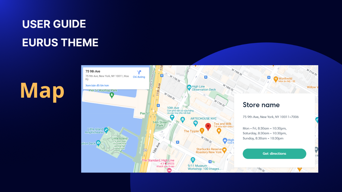
1. What is the map? Map section is where you can display the map that shows the store location, allowing customers to easily locate nearby stores or pickup points. By integrating an interactive map, customers can view store addresses, contact information, and operating hours, enhancing their shopping experience. This feature is particularly beneficial for omnichannel retailers who offer both online and offline shopping options, as it helps bridge the gap between digital and physical storefronts. 2. How to add a valid address? To add a valid address, please follow these simple steps: Type the accurate address (including the zip code, if available) into the address field. The address provided must exist and be recognized on Google Maps. Google Maps will automatically locate and display the map corresponding to the entered address. If Google Maps fails to find or inaccurately locate the address, you can use a custom image instead. 3. How to show a custom image instead of the map? Simply add an image to the section. The section will prioritize displaying the image over the map. 4. How to customize the text and layout of the section? Adjust section settings such as desktop and mobile height, content position, alignment, and layout preferences. Customize each block within the section: For the "Store name" block, set the heading text, size, and HTML tag. Select the heading tag for this section to enhance the SEO of the page. For the "Address and hour" block, set the text and its size. For the “Button” block, specify the button label. In such cases, the button within the section will automatically link to the google map of the correct address entered, requiring no additional setup.

Sections & Blocks
1. What is the product attribute table? A product attribute table is a structured presentation of key attributes or features of multiple products. It serves as a comparison tool, allowing users to easily evaluate and contrast different products based on one specific criteria. The primary benefit for a product attribute table is to provide a side-by-side comparison of various products, highlighting their distinguishing values or characteristics in a particular criteria. This enables customers to make informed decisions by quickly assessing the differences and similarities between products. On Home page (or other page template) > Template section group > Add section > Click on the Product attribute table to customize this section of Eurus theme. 2. How to show the option values (columns values)? The "Criteria option" configuration allows you to specify the attribute options or values that you want to display as columns in the attribute table. Here's how you can set it up: Enter the exact name of the option used in your store, separated by commas. This should match the name of the product option you've set up in the backend. Provide variations of the option name if it's spelled differently in different languages or formats (e.g., Color, Colour, Couleur). In the admin settings: In the theme settings: If you want to use metafields for the criteria options, follow these steps: Create a metaobject with the key "product_specs_list" and add a field named "specs" (Single line text/One value). ⚠️Note: The metaobject name & key must be exactly "product_specs_list" for this feature to work. Populate the metaobject with entries representing different attribute values (e.g., "Dry Skin", "UV Protection"). Create a product metafield with the key "product_specs" (Metaobject/List of values) and link it to the previously created metaobject. Assign specific attribute values to each product via the product metafield on the admin product detail page. Fill in the key "product_specs" of the respective metafield in the "Criteria option" field. It's important to note that this setup method may not be optimal for the general public, so our team at Eurus is planning a release in the near future. For more detailed assistance or support, feel free to reach out to us. 3. How to select products in the table? In this section, click “Add product” For each block, choose the products you want to compare from your product catalog. You can add up to 5 products for comparison and a custom image for each block added. Additionally, you can customize the comparison section by adding a heading, text, or other content to provide context or instructions for users. Select the heading tag for this section to enhance the SEO of the page. Video guide of configuration can be found here. By following these steps, you can easily select and display the products you wish to compare on your website. 4. How to add a conclusion to the table? You can add a conclusion below the product attribute table to sum up key insights for customers. To do that: Click on the Product attribute table section Find the Conclusion field in the section settings &enter your text. Click “Save” when done. 5. How to style the product attribute table? In Theme Editor, go to the Product Attribute Table section, and you can styling your product attribute table within these settings group: Colors: Customize the color of the background, text, highlight, line and border, buttons and so on for both light and dark theme modes. Desktop/ Mobile layout: Configure the desktop and mobile layout settings, including table layout (Horizontal, Vertical), full width, section divider visibility, and top/bottom padding.

Sections & Blocks
1. What is Promotion Banner? The Promotion Banner section creates eye-catching visual elements to highlight special offers, promotions, or events with attention-grabbing graphics, text, and interactive elements. It serves as a powerful tool for brand reinforcement and user engagement, directing visitors to specific actions or pages through clickable elements. 2. Section Components Section Promotion Banner Displays promotional content with multiple images, text, and interactive elements. Available Blocks Text Used to show headings, subheadings, and promotional descriptions. Buttons Used to create up to two call-to-action buttons with custom styling. Banner Menu Used to show featured collections and navigation options. Countdown Timer Used to show urgency with standard or evergreen countdown timers. 3. Location & Setup To add & set up the Promotion Banner section: Open the Shopify Theme Editor (Online store > Themes > Customize) Decide where you want to place the new section. Click "Add Section" Select "Promotion Banner" 4. Highlight Features Multi-Image Support: Up to 3 desktop images and 1 mobile image Hero Section Mode: Optimized loading as the main page introduction Advanced Timers: Standard and evergreen countdown options Smart Linking: Banner-wide and individual element linking Responsive Design: Separate configurations for desktop and mobile Visual Customization: Overlay opacity, positioning, and alignment controls Navigation Integration: Menu display for custom links on the banner 5. Common Use Cases 🤔 How to create a basic promotion banner quickly? STEP 1: Add Promotion Banner section to your desired position STEP 2: In the Promotional banner setting panel, upload 1-3 desktop images and 1 mobile image. Set the Banner link for overall image clickability. STEP 3: Under the section, add a Text block and enter the content into Heading, Subheading, and Text (for description). Some customization options for your Text block: Put some words of the Heading into the square brackets [ ] for text highlight effect. Add a color for the Content box (light/dark) and change its type to be Round or Square in the Content box type. Turn on Add frame to show a border around the box. STEP 4: Under the section, add a Buttons block. You can set up to 2 buttons by entering the label and link. STEP 5: In the Promotional banner setting panel, adjust the Image overlay opacity to make your content easy to read. STEP 6: Click “Save” and preview. 🤔 How to create a flash sale banner with a countdown timer? STEP 1: Set up the basics of the banner, following the steps in the use case "How to create a basic promotion banner quickly?" above. STEP 2: Under the Promotion Banner section, add a Countdown Timer block. STEP 3: There are 2 kinds of countdown timers for you to choose from: Option 1: Countdown type = “Standard timer” 🔍 Note: The standard timer counts down to one fixed date, with no restarting! To set it up: Choose the right Time zone. Set the exact End date when the countdown should finish. Option 2: Countdown type = “Evergreen timer” 🔍 Note: The evergreen timer automatically restarts when the time is up! To set it up: Set the Duration (per loop) and Unit (for example: 3 days - so after 3 days, the countdown will restart). Choose the right Time zone. Set the exact Start date when the countdown should start. STEP 4: Click “Save” when done. 🤔 How to customize the layout of the countdown timer? The countdown timer block might be a little tricky to style. So here is a cheatsheet explaining how it works for you: In the Countdown timer block setting panel, find the Timer style setting group, and you can see the options below: Timer style: ⚠️ Note: This setting only works when you’ve already set a Background color for the timer. Square Round Line and border: ⚠️ Note: You can only see the line and border if you do not set the Background color. None Border Vertical line Overlay opacity & Colors: ⚠️ Note: The Overlay opacity works with the Background color setting inside the Colors group. Overlay opacity = 0% Overlay opacity = 100% 🤔 How to show custom links on the promotion banner? You can display links to other important pages on the announcement bar just by doing these steps: STEP 1: Set up the basics of the banner, following the steps in the use case “How to create a basic promotion banner quickly?” above. STEP 2: Preparing a menu in the Shopify admin In the Shopify admin, click on the Content tab > Menu > “Create menu”. Give the menu a Name, and click “Add menu items” to assign menu labels and links > click “Save”. Note: Only the first level of your menu will be shown on the promotional banner. STEP 3: Add the Banner menu block under the Promotional banner section. STEP 4: In the Menu setting, click “Select” and choose the menu you created in step 2. STEP 5: Adjust the Menu text size, reorder the block position, and turn on Display on mobile if needed. STEP 6: Click “Save” when done. 6. Support Information Need help? Contact our support team at Omni Themes Support.

Sections & Blocks
1. What is Slideshow? A slideshow dynamically displays multiple images or content in sequence, commonly used to grab attention, highlight promotions, or tell a visual story. 2. Section Components Section Slideshow Display multiple images, videos, or content in sequence. Available blocks Slide Used to add a single image/video slide with optional text and button. Three-fold Slide Used to add a slide displaying the main content in the center with two supporting images on each side. Media with text Used to add a slide displaying an image and text side by side for a clean presentation. 3. Location & Setup To add and set up the Slideshow section: Open the Shopify Theme Editor (Online store > Themes > Customize). Decide where you want to place the new section. Click "Add section". Select "Slideshow". 4. Highlight features Flexible layouts: Choose between standard Slide, Three-fold Slide, or Media with Text to fit various storytelling needs. Product highlights: Showcase up to two products per slide with titles, ratings, and purchase links. Optimized for mobile: Upload a separate video for the slide on mobile. 5. Common Use Cases 🤔 How to create a Hero Slideshow? A hero slideshow occupies the top section of your webpage, showcasing key messages or visuals to capture attention. Here's how to set up: STEP 1: Add the section Add the Slideshow section. STEP 2: Enable Hero mode Click on the Slideshow section to open its settings panel, then enable the Use as Hero setting. STEP 3: Add Slide blocks and set up Under Slideshow section, add Slide block, then open its settings panel: Upload a high-quality Image optimized for desktop and mobile. Add Headings, Subheadings, and optional descriptive text under the Content setting group. In the Desktop/Mobile video settings group, upload separate videos for desktop and mobile displays within the slide. Add a link to the Image link field, so when users click on the banner, it will navigate to that link. Add up to two CTA buttons per slide, customizing labels, links, and styles. STEP 4: Click "Save" to apply changes. 💡 Note: Hero images are not lazy-loaded, meaning they load immediately. This prioritizes performance. To avoid potential slowdowns, limit your site to one hero slideshow per page. 🤔 How to create a Media with Text slide layout? Use this layout to highlight a product or story with text displayed separately from the image for a clean and modern look. STEP 1: Add the block Add a new Media with Text block to the Slideshow section. Then click on the block to open its settings panel. STEP 2: Upload an image to the slide Upload the main Image for the slide. (Add a link to the Image link field, so when users click on the banner, it will navigate to that link.) STEP 3: Customize the content Add a Subheading, Heading, and optional text. Add up to two buttons with labels, links, and styles (Primary, Secondary, or Text link). STEP 4: Set up the layout Choose the look for your Media with text slideshow on both Desktop and Mobile under the Layout settings group. STEP 5: Click "Save" to apply changes. 🤔 How to create a Three-fold Slide layout? The Three-Fold Slide layout adds two images flanking the central content, perfect for a detailed story or showcasing multiple products. STEP 1: Add the block Add a new Three-fold Slide block to the Slideshow section. Then click on the block to open its settings panel. STEP 2: Upload images to the slide Upload two images for left (First image) and right side (Second image). (Add a link to the Image link field, so when users click on the banner, it will navigate to that link.) STEP 3: Customize the content Add a Subheading, Heading, and optional text. Add up to two buttons with labels, links, and styles (Primary, Secondary, or Text link). STEP 4: Click "Save" to apply changes. 🤔 How to add animation and pagination to your Slideshow? Animations and pagination enhance the slideshow's user experience, making it more interactive and visually appealing. Here's how to set up: STEP 1: Open the settings Click on the Slideshow section to open its settings panel. STEP 2: Adjust the settings, depending on your needs Setting name Purpose Enable auto-play Turn on to set a slide transition time (5–10 seconds is recommended). Change slides every Adjust the duration between each slide change (from 3-10s). Pause on hover Turn on to stop autoplay when users hover over the slideshow. Next/Previous Arrows Enable to add left and right arrows to the slideshow. Pagination Choose your desired pagination style from the list: None: No pagination indicators. Dots: Simple dot indicators for slide navigation. Bars: Bars showing slide progress. Image Pagination: Displays a preview of the next slide's image (desktop only). Transition style Choose a Transition Style (Slide or Fade). STEP 3: Click "Save" to apply changes. 🤔 How to add products to the slideshow? You can highlight specific products directly within the slideshow to promote best-sellers, new arrivals, or featured items. You can add up to 2 products in this slideshow. STEP 1: Open the settings Click on the block (Slide/Media with text/Three-fold Slide block) that you want to add products to. Then locate the Product settings section. STEP 2: Add products to the section At Product, click Select to choose a product from your catalog. You can choose up to 2 products to display on the slide. STEP 3: Optional settings Update the Text field to introduce the product (e.g., "Check out our best-seller!"). Enable the Show Rating option to display the product's star rating. STEP 4: Click "Save" to apply changes. 🤔 How to show Slideshow content below the image on Mobile? Use the Show content below image setting to control how text appears on mobile: 🧩 How it works: Enabled: On mobile, the image will appear first, and the text (headings, subheadings, buttons) will display below the image. ⚠️ Note: When enabled, the Mobile height setting will no longer apply. Disabled: Text content will overlay directly on top of the image, following the usual slideshow display style. STEP 1: Open the settings In the Theme Editor, click on the Slideshow section > Mobile layout settings group. STEP 2: Enable the setting Toggle "Show content below image" on or off depending on your preference. STEP 3: Click "Save" to apply changes. 🤔 How to add depth with a Parallax effect? The Parallax effect creates a layered visual experience by moving the slideshow background slower than the foreground content. To enable the effect: STEP 1: Open the settings Navigate to Theme Settings > Design > Animations settings group. STEP 2: Configure the settings In the Animations settings group, uncheck the Disable Parallax Effect option. STEP 3: Click "Save" to apply changes. STEP 4: Return to the slideshow and preview the parallax effect. 6. Support Information Need help? Contact our support team at Omni Themes Support.

Sections & Blocks
1. What is media with text? The "Media with text" layout typically consists of one or more media elements, such as images or videos, alongside text content. The media elements serve to capture attention, evoke emotions, or showcase products, while the text content provides explanations, descriptions, or calls to action. 2. How to set up the media with text? In the Theme editor, select your desired page, and under the "Template" section group, add the Media with text section to your preferred location. Then follow these simple steps: Used as Hero: Enable to assign the section as an effective hero that supports immediately-loading images. Note that using only one hero section per page will help to optimize page load speed and user experience (UX). Choose image/video: Choose one or two images or a video to feature in the section. Locate the “Show sound control” checkbox. Check the box to enable the sound control feature. By default, this checkbox is set to false. Once enabled, an icon will appear on the storefront, allowing customers to toggle sound on or off as needed. Use text blocks to add content such as subheadings, headings, and descriptions to the section. Select the heading tag for this section to enhance the SEO of the page. Use the "Default Content Height" setting to control how much content is shown before the "Read more" button is clicked. You can select from 4 options: Show full content, Small, Medium, or Large, based on your preference for how much content is visible initially. Customize the color of the heading and text, choosing between light or dark options. Configure buttons with labels and links to facilitate user interaction and engagement by using button blocks. Then, set up layout & padding: Adjust the height and width of the images separately for desktop and mobile devices to ensure optimal display. Customize the layout and corner radius of the images to suit your design. Align the images as desired and configure the content layout and text position for optimal presentation. Enable the "Add spacing between images" option. When selected, a small fixed spacing will be added between two images. This spacing only applies when there are exactly two images. Choose whether the section should span the full width of the device or adhere to a predefined width. Select the background color for the section, opting for either a light or dark theme. Set padding for the top and bottom of the section to control spacing. 3. How to set up Text columns with icons inside the Media with text section? ✍️ How to add Text columns with icons? Step 1: Under Template, tap on the Media with text section Step 2: Click “Add block” or “+”, and select the Text columns with icons block. Step 3: Press “Save”. Repeat the steps to add more Text columns with icons as you need. After adding blocks, you can set up the icon and the content for each. ✍️ How to arrange the layout of all Text columns with icon blocks? To do it, you need to set up the numbers of columns appearing on a row both inside the Media with text section and Text columns with icons block. 🖥️ For desktop: Media with text section Text columns with icons block Step 1: Click on the Media with text section. Step 2: Scroll down to find the Number of columns on desktop setting. Step 3: Adjust the number of columns you want to display on desktop (from 1 to 4) Step 1: Click on the Text columns with icons block. Step 2: Scroll down to find the Number of columns wide setting under Desktop layout section. Step 3: Adjust the number of columns wide. This will determine the width of each block inside the Media with text section. 📱 For mobile: Media with text section Text columns with icons block Step 1: Click on the Media with text section. Step 2: Scroll down to find the Number of columns on mobile setting. Step 3: Choose the number of columns you want to display on mobile. (1 or 2) Step 1: Click on the Text columns with icons block. Step 2: Scroll down to find the Number of columns wide setting under Mobile layout section. Step 3: Adjust the number of columns wide. This will determine the width of each block inside the Media with text section.

Sections & Blocks
1. What is Scrolling Promotion? The Scrolling Promotion section creates a dynamic, eye-catching banner that moves across your store to showcase promotions, announcements, and calls-to-action. This animated display ensures your most important messages don't get lost in the shuffle, whether you're announcing a flash sale, launching a new product, or highlighting a special event. 💡 Note: You can add this section inside the Header group to display promotions at the top of your store, making them visible on every page your customers visit. 2. Section Components Section Scrolling Promotion Creates a moving banner that displays various promotional elements with customizable styling and animation effects. Available blocks Headline Used to show formatted text with highlighting options for key messages Text Used to show simple text content with adjustable sizing Icon Used to add visual icons from built-in library or custom SVG Image Used to show images with custom dimensions and styling Button Used to create clickable buttons with different styling options 3. Location & Setup To add & set up the Scrolling promotion section: Open the Shopify Theme Editor (Online store > Themes > Customize) Decide where you want to place the new section. (or add it to the Header group for site-wide visibility) Click “Add Section”. Select “Scrolling promotion”. 4. Highlight Features Smooth Animation: Adjustable scrolling speed and direction control Rich Content Blocks: Mix headlines, text, icons, buttons, and images Text Highlighting: Use brackets [ ] to highlight specific words in headlines Rotating Effect: Optional tilt animation when scrolling up/down Hover Controls: Pause animation when users hover over the banner Dual Mode Styling: Separate colors for light and dark themes 5. Common Use Cases 🤔 How to set up the scrolling promotion? If you don't know where to start to set up this section, just follow this: STEP 1: Add the Scrolling promotion section to your theme. STEP 2: Add/delete, rearrange the blocks inside the section. By default, you will have the Text, Icon, Text, Button, and Icon blocks. Add more, delete the unused, or reorder to make the section fully yours. STEP 3: Change the content of each block: Click on the block to open its settings panel. Depending on the block you use, the setting might be slightly different. STEP 4: Adjust the scrolling effect: Click on the Scrolling promotion section, then find the Scrolling setting group. You can change the Time per scroll, Direction, Pause on hover, and more. STEP 5 Click "Save" and preview. 🤔 How to add the rotating tilt effect to the scrolling promotion? 🔎 A scrolling promotion with a rotating effect is a great way to make your site more catchy and appealing. With this effect, the scrolling banner will tilt to the right or left when scrolling up or down. To enable this effect: STEP 1: In Theme Editor, add a Scrolling promotion section. STEP 2: In the section setting panel, find the Scrolling setting group. STEP 3: Toggle “Enable rotating effect” ON to activate the tilt animation. STEP 4: Click "Save" and preview. 🤔 How to use a background image instead of a plain color? Rather than a simple color, you can use an image to make it the background for your scrolling promotion, like this: STEP 1: In the Scrolling promotion settin panel, find the Scrolling setting group. STEP 2: In the "Background image" setting, click "Select image" and choose from your library or free resources STEP 3: Adjust Overlay opacity (10-100%) to control background visibility STEP 4: Scroll down to Desktop/ Mobile layout setting group, and set the appropriate Desktop/Mobile height for the background image. STEP 5: Click "Save" and test readability of your text over the background image 💡 Tip: Use 30-60% overlay opacity to ensure your text remains readable over background images. 6. Support Information Need help? Contact our support team at Omni Themes Support.

Sections & Blocks
1. What is a promotion grid? A promotion grid is a section that displays promotions using images or videos along with short descriptions and optional labels. Unlike product grids, promotion grids don't directly show products; instead, they provide links to specific products or collections. They're useful for highlighting special offers and drawing attention to specific promotions or products. 2. How to set up the media? To set up the media with the given settings: Click on the "Add promotion" button to add a new promotion block. a) Image: Click the "Select image" button to choose an image from your library or free image resources. After selecting the image, you can click "Change" to replace it with another image. Set the overlay opacity by adjusting the slider. A higher value will make the image darker. Enter the URL where users will be redirected when they click the image. b) Video: If you choose to add a video, click the "Select video" button to choose a video from your store's data. Enter the URL of the video in the "Embed Video From URL" field. Only YouTube and Vimeo videos are supported. Tick the checkbox next to "Enable video autoplay" if you want the video to play automatically. Locate the “Show sound control” checkbox. Check the box to enable the sound control feature. By default, this checkbox is set to false. Once enabled, an icon will appear on the storefront, allowing customers to toggle sound on or off as needed. Enter alt text for the video in the "Video alt text" field. Once you've configured all the settings according to your preferences, you can save the changes and the media block will be set up accordingly. 3. How to modify the height and width of each media block? a) Section settings: Adjust the number of columns displayed on desktop devices. Set the spacing between blocks within the section. Define the height of each row of media within the section. (Optional) Enable "Keep block ratio on different screen width" to maintain the block's aspect ratio across screen sizes, but disables the Row height setting. For mobile layout, the settings are similar to desktop layout, but the number of columns is limited to 1-2 columns. b) Promotion block Adjust the number of columns wide by selecting a value between 1 and 6. This determines the width of the media block. Please note that: The number of columns here cannot exceed the number of columns configured in the section settings above. Adjust the number of rows tall by selecting a value between 1 and 6. This determines the height of the media block. Enter the title of the media block in the provided field. Adjust the size of the title by selecting a percentage value between 50% and 200%. Enter the content of the media block in the provided text field. Choose the alignment of the content (Left, Center, Right) using the provided options. If you want to include a button on the media block, enter the label of the button in the "Button label" field. Enter the link where users will be redirected if they click on the button in the "Button link" field. 4. How to show content outside of the media? To display content outside of the media, you can use the Overlay feature in the media block settings. If you want the content to appear in the image, enable the content overlay option and adjust the overlay opacity (ranging from 0% to 100% - the higher the value, the darker the image is) and overlay content position settings accordingly. If you prefer the content to be outside the image, simply disable the “Enable the content overlay” settings. 5. How to add a sale label to the promotions? Sales labels can be added to promotions to highlight campaigns.To execute this function, navigate to the Sale label settings group within each individual promotion. Here, users can input up to three lines of text and apply various styling configurations: Enter the content for each line of the sale label in the respective fields (Line 1, Line 2, Line 3). This could include promotional messages like "SALE", "50% OFF", or any other relevant information. Adjbetween 50% and 200% in the corresponding "Line X font size" fields. ust the font size for each line of the sale label by selecting a percentage value Choose the position of the sale label from the available options: Top left, Top right, Bottom left, Bottom right. Choose the style of the sale label from the available options: Square, Circle, Flag, Angle. Select the background color of the sale label by choosing a color from the available options. Choose the text color of the sale label by selecting a color from the available options. Example: Circle Example: Flag 6. How to create a Swipeable promotion grid on mobile? If you have more than three images in your promotion grid section, a swipeable carousel can be a better way for customers to view them on mobile devices. To enable this feature: In Theme Editor, click on the Promotion grid section. Scroll down to the Mobile layout setting. Check the box that says Enable swipe on mobile. (Optional) Turn on "Enable next/previous arrow on mobile" to show the arrows so customers can click to see the next blocks instead of scrolling through them on mobile. Click "Save". 7. How to add and display products on the section? STEP 1: Add the Product block Under Promotion grid section, add the Product block. STEP 2: Set up the block Click on the block to open its settings panel: Choose a Product to display on the section. (Optional) Show vendor, product rating,.. Choose the layout of the block. STEP 3: (Optional) Show customized product image with metafield ✍️ Why would you need to use metafield for product images? You want to show a designed image for the product on the section, without changing the featured images of that product. You want to show higher-resolution images. Then follow this: 3.1: Create a product metafield: In Shopify admin, go to Settings> Metafields and metaobjects > Products > Add definition. Give your metafield a Name. Choose type as Image (File). Click Save. 3.2: Assign a value for the product metafield: Go back to Shopify admin, click on the Products, and then find the product (that is chosen in STEP 2) to assign the metafield value. Scroll down to Product metafields. Upload an image in the newly created product metafield. Click Save. 👉 Refer to this guidance about “How to create Product metafields” for a detailed explanation. 3.3: Set up in Theme editor: Back to Promotion grid section > Product block. Copy the text after “custom.” of the metafield’s Namespace and key. → Paste to this “Auto-fill product images with metafield” field. Click Save. STEP 4: Save your changes 8. How to add and display collections on the section? STEP 1: Add the Collection block Under Promotion grid section, add the Collection block. STEP 2: Set up the block Click on the block to open its settings panel: Choose a Collection to display on the section. Adjust text size, title size or choose custom image. Choose the layout of the block. STEP 3: (Optional) Show customized collection image with metafield ✍️ Why would you need to use metafield for collection images? You want to show a designed image for the collection on the section, without changing the featured images of that collection. You want to show higher-resolution images. Then follow this: 3.1: Create a collection metafield: In Shopify admin, go to Settings> Metafields and metaobjects > Collections > Add definition. Give your metafield a Name. Choose type as Image (File). Click Save. 3.2: Assign a value for the collectionmetafield: Go back to Shopify admin, click on the Products > Collection tab. Find the collection (that is chosen in STEP 2) to assign the metafield value. Scroll down to Collection metafields. Upload an image in the newly created collection metafield. Click Save. 👉 Refer to this guidance about “How to create Product metafields” for a detailed explanation. 3.3: Set up in Theme editor: Back to Promotion grid section > Collection block. Copy the text after “custom.” of the metafield’s Namespace and key. → Paste to this “Auto-fill collection images with metafield” field. Click Save. STEP 4: Save your changes
Sections & Blocks
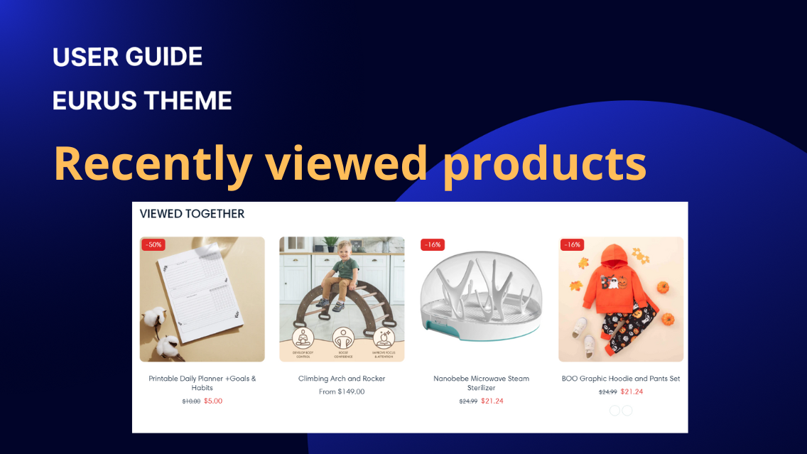
1. What are recently viewed products? Recently viewed products are a feature that display items that a user has previously looked at during their browsing session. This section benefits your store by enhancing user experience, increasing engagement, and maximizing sales opportunities through personalized recommendations and convenient access to previously viewed items. 2. How to set up recently viewed products? Enter the title for the section, default is "Recently viewed products". Adjust its size. Select the heading tag for this section to enhance the SEO of the page. Tick the checkbox “Enable Clear History” to allow users to clear their viewing history manually. Tick the checkbox “Show Section Divider” to display a divider above this section. Set the maximum number of products to display in the section (2 to 10). Use the setting “Number of Columns on Desktop” to adjust columns displayed (1 to 5) and enable carousel. Select to display vendor name and product rating. In the “Mobile Layout” setting group, you can adjust number of mobile columns (1 or 2) and enable swipe functionality. Adjust top and bottom padding (0 to 100px) at the setting of section padding. 3. Why are there no products shown after I dragged and dropped the section in the page template? It's likely that there are no products shown in the section because you haven't viewed any products yet. To resolve this, try the following steps: Click on a different product to view it. Return to the section “Recently viewed products” on the previous page The products you just viewed should now appear in the section. This process ensures that the section displays products based on your browsing history, showing recently viewed items for your convenience.

Sections & Blocks
1. What is a logo list? The Logo List section allows you to display a series of logos in a visually appealing way. This is typically used to showcase brand partnerships, client logos, or any affiliations your store might have. This section is perfect for building credibility and trust with your customers by highlighting your associations with well-known brands or clients. You can add multiple logos and configure their appearance to align with your store's design. 2. How to add logos to the section? Step 1: Adding a Logo Block Click the "Select image" button to choose an image for the logo from your library. Enter the URL that users will be redirected to when they click the logo. Step 2: Configuring Style and Layout Adjust the range slider (0 to 100px) to set the corner radius of all logo images, giving them rounded edges if desired. Adjust the number of columns to be displayed on desktop devices to control how many logos appear in a single row. Choose the background color for the logo list section in either light or dark mode to match your store's theme. Tick the checkbox "Enable Carousel on Desktop" to display logos in a sliding carousel format on desktop devices. Turn on "Enable next/previous arrow on mobile" to show the arrows so customers can click to see the next blocks instead of scrolling through them on mobile. Tick the checkbox "Auto-switch Logo" to enable the automatic switching of logos. Adjust the range slider (3 to 9 seconds) to set the interval for auto-switching logos. Note: This setting only works if the "Auto-switch Logo" option is enabled. Tick the checkbox "Show Navigation" to display navigation arrows, allowing users to manually slide through the logos. Choose the layout for mobile devices, either Carousel or Stacked. This setup will ensure your logo list is both functional and visually appealing, enhancing the professional look of your store. 3. How to set up the section layout? To configure the section layout effectively, follow these settings to customize the heading, width, dividers, mobile layout, and padding: Enter the heading of the section to provide a title or context. Enter subheading and text for further content. Adjust the size of the heading (range from 50-200%) to make it prominent. Select the heading tag for this section to enhance the SEO of the page. Adjust the padding at the bottom/top of the section (range from 0 to 100 px) to create space above the content. These settings will help you tailor the section layout to your design preferences and ensure it looks great on both desktop and mobile devices.

Sections & Blocks
1. What is collage? A collage is a collection of images, text, or other visual elements arranged in a creative and visually appealing layout. This section in our theme supports this type of display, allowing you to add various types of content blocks and arrange them in a flexible layout. With a collage section, you can showcase multiple elements in an artistic and engaging way, capturing the attention of your audience and conveying information effectively through visual storytelling. 2. How to set up the collage section? To set up the collage section, please follow these simple steps: a) General settings: Enter the title of the collage section. Adjust the size & choose the HTML tag for the heading. Set the alignment of the heading (Left/Center/Right). Add additional text below the main heading. Enter any supplementary information or description. Choose the background color for light or dark mode. Adjust the color for background, heading, and text. b) Block settings: Admin can add blocks to incorporate various types of content. The Eurus theme supports four types of blocks: Image block: Select an image from your library or free resources. Enter the URL for the image link. Maintain the original aspect ratio of the image. Video block: Choose a video from your store’s data. Paste the URL of a YouTube or Vimeo video. Locate the “Show sound control” checkbox. Check the box to enable the sound control feature. By default, this checkbox is set to false. Once enabled, an icon will appear on the storefront, allowing customers to toggle sound on or off as needed. Provide alternative text for the video. Product block: Select a product from your store to display in the section. Set up Product Cards in the section setting: Set up to display the product vendor information & optionally include product ratings in the display. Change the size of the product cards by choosing Small, Medium, or Large inside "Desktop size". Collection block: Choose a collection from your store to feature in the section. 3. How to modify the height and width of the section and each media block? a) Section setting Adjust the number of columns displayed on desktop devices. Set the spacing between blocks within the section. Define the height of each row of media within the section. For mobile layout, the settings are similar to desktop layout, but the number of columns is limited to 1-2 columns. b) Block setting Configure the layout settings for each individual block within the section. Set the number of columns wide for the block. Specify the number of rows tall for the block.

Sections & Blocks
1. What is Shop the look? Shop the look is an interactive feature commonly used on the homepage to enhance the shopping experience. It allows customers to view and purchase an entire outfit or collection of related items that are styled together. This feature is designed to support and guide upsell strategies by recommending products that complement each other. 2. Section Components Section Shop the look Display an entire outfit or collection of related items that are styled together for customers to view and purchase. Available blocks Product with text Attach an image hotspot showing products with descriptive text. Collection with text Attach an image hotspot showing a collection with descriptive text. Media with text Attach an image hotspot showing media with descriptive text. 3. Location & Setup To add & set up the Shop the look section: Open the Shopify Theme Editor (Online store > Themes > Customize) Decide where you want to place the new section. Click “Add Section”. Select “Shop the look”. 4. Highlight Features Shoppable image hotspots: Turn any image into an interactive shopping experience. Add product, collection, or media hotspots to showcase items directly on lifestyle photos. Multi-type hotspot blocks: Choose from three hotspot types—Product with text, Collection with text, and Media with text—to highlight different kinds of content and boost discovery. Precise hotspot positioning: Individually adjust hotspot vertical/horizontal placement for desktop and mobile to ensure perfect alignment across devices. 5. Common Use Cases 🤔 How to set up Shop the look section? If you want to set up the Shop the look section but don’t know how to start. Here’s quick steps to begin: STEP 1: Add the section Add Shop the look section. STEP 2: Add a shoppable image to the section Click on the section to open its settings panel. Choose the Image you want to display on desktop/mobile devices. STEP 3: Add image hotspots to the section Under Shop the look section, you can add up to 5 blocks to set up those as image hotspots: To add products to show as image hotspots 👉 Add & set up Product with text block. To add a collection to show as image hotspots 👉 Add & set up Collection with text block. To add media to show as image hotspots 👉 Add & set up Media with text block. For further guidance on setting up these blocks, please refer to the following use cases. STEP 4: Section general settings Back to Shop the look section: Add Heading, Subheading for the section. Customize Desktop layout/Mobile layout: Choose the shoppable image size and content size for desktop devices. Choose section width, height, padding. Enable the section divider if you want. STEP 5: Click “Save” when done. 🤔 How to add products to show as image hotspots? STEP 1: Add the block Udnder Shop the look section, add Product with text block. Click on it to open the settings panel.STEP 2: Add products to display Select the Product you want to associate with the hotspot. If you want to display multiple products in 1 image hotspot, choose products (up to 4) in the Product list. Note: The products chosen in Product list will override the single Product. STEP 3: Add text content Add more descriptive content to display at Heading and Text. Choose Content alignment. STEP 4: Customize the hotspot’s look and position Choose Hotspot color. Adjust its position for desktop and mobile devices. STEP 5: Customize the display of product cards Back to Shop the look settings panel, scroll down to Product settings group: Choose Image ratio and adjust Content alignment. Choose elements to show such as Quick view button, vendor, product rating… STEP 6: Click "Save" to apply changes. 🤔 How to add a collection to show as image hotspots? STEP 1: Add the block Under Shop the look section, add Collection with text block. Click on it to open the settings panel.STEP 2: Add & customize the collection to display Select the Collection you want to associate with the hotspot. Choose a Custom image to feature the collection if you don’t want to use the default image. Adjust Image style. To show the number of collection’s products, toggle Show item count ON. Adjust Collection title size and Collection text size. STEP 3: Add text content Add more descriptive content to display at Heading and Text. Choose Content alignment. STEP 4: Customize the hotspot’s look and position Choose Hotspot color. Adjust its position for desktop and mobile devices. STEP 5: Click "Save" to apply changes. 🤔 How to add media to show as image hotspots? STEP 1: Add the block Under Shop the look section, add Media with text block. Click on it to open the settings panel.STEP 2: Add & customize the media to display Add an Icon/Custom icon image to display. Add Image or embed Video to display. Adjust Media ratio and Media position. Note: If you add an image, the icon will automatically hide. If you add both an image and a video, the image will be used as the video thumbnail. STEP 3: Add text content Add more descriptive content to display at Heading and Text. Choose Content alignment. STEP 4: Customize the hotspot’s look and position Choose Hotspot color. Adjust its position for desktop and mobile devices. STEP 5: Click "Save" to apply changes. 6. Support Information Need help? Contact our support team at Omni Themes Support.

Sections & Blocks
1. What is Video? The Video section is a part designed to embed and display a video. It is used when the goal is to have visitors concentrate on the video content without the additional elements that might be present in a video hero section. This section is ideal for detailed product demonstrations, in-depth tutorials, or any content that requires the viewer's full attention. 2. Section Components Section Video Insert and display a video with text & button above 3. Location & Setup To add & set up the Video section: Open the Shopify Theme Editor (Online store > Themes > Customize) Decide where you want to place the new section. Click "Add section". Select "Video". 4. Highlight Features Separate desktop and mobile videos: Upload different videos for each device to ensure optimal performance. Customizable cover image: Add a thumbnail or banner to grab attention before playback. Flexible layouts: Adjust full width, video height, and padding for desktop and mobile. 5. Common Use Cases 🤔 How to set up the Video section? STEP 1: Add the section Add the Video section and click on it to open the settings panel. STEP 2: Choose the video to show At Desktop video settings group: Upload a Video to display or embed a URL that supports YouTube and Vimeo videos. (Optional) Enter descriptive text for accessibility and SEO at Video alt text. ⚠️ Note: If you have a separate video optimized for mobile, upload it in the Mobile video settings group. If no mobile video is uploaded, the theme will automatically adapt the desktop video for smaller screens. STEP 3: Add cover image Choose an image from your library to set as the cover of the video. This cover image will appear before the customer clicks to play, making it an excellent opportunity to showcase promotions or capture attention. If no cover image is added, the video's first frame will automatically be used as the thumbnail. STEP 4: Enter text content Enter a Heading for the section. Wrap the heading text in [] to highlight it. Choose the highlight style at Marker. Adjust the size and tag of the heading. Enter Text for further description. STEP 5: Adjust Desktop layout/Mobile layout Scroll down to Desktop layout/Mobile layout settings group: Tick the checkbox "Make section full width" to make the video's width span the full width of the user's device. Choose Video height and padding. STEP 6: Click "Save" to apply changes. 6. Support Information Need help? Contact support@omnithemes.com or visit omnithemes.com.

Sections & Blocks
1. What is Video hero? The Video hero section is a prominent, visually impactful part of a website that features a video as the background or central element, often with overlay text and call-to-action buttons. This section is designed to grab visitors' attention immediately upon landing on the page and to create a strong, memorable first impression. 2. Section Components Section Video hero Upload or embed a video at a central position on the site. Available block Product Used to show a featured product under the video (⚠️Note: You can showcase up to 20 featured products). 3. Location & Setup To add & set up the Video hero section: Open the Shopify Theme Editor (Online store > Themes > Customize) Decide where you want to place the new section. Click "Add section". Select "Video hero". 4. Highlight Features Flexible video options: Upload Shopify-hosted videos or embed from YouTube/Vimeo. CTA button: Direct visitors with customizable button text, style, and link. Product showcase: Display up to 20 products with ratings, quick view, and "Add all to cart" option. 5. Common Use Cases 🤔 How to set up Video hero section? STEP 1: Add the section Add the Video hero section and click on it to open the settings panel. STEP 2: Add video At Desktop video/Mobile video settings group: Upload a Video to display or embed a URL that supports YouTube and Vimeo videos. (Optional) Enter descriptive text for accessibility and SEO at Video alt text. ⚠️ Note: If you have a separate video optimized for mobile, upload it in the Mobile video settings group. If no mobile video is uploaded, the theme will automatically adapt the desktop video for smaller screens. STEP 3: Enter text content Enter a Heading for the section. Wrap the heading text in [] to highlight it. Choose the highlight style at Marker. Adjust the size and tag of the heading. Enter Text for further description. STEP 4: Add a CTA button Enter the Button label and paste a Button link to redirect customers. STEP 5: Adjust section layout and appearance Choose the position for text content & button at Desktop position or customize it yourself. Choose content alignment. At Colors settings group, choose color for button and text elements. Scroll down to Desktop layout/Mobile layout settings group: Tick the checkbox "Make section full width" to make the video's width span the full width of the user's device. Choose Video height, padding, and video corners. STEP 6: Click "Save" to apply changes. 🤔 How to add Products to the Video hero section? You can now showcase up to 20 products directly under the Video hero - perfect for highlighting featured items right on your homepage. Plus, there's an "Add all to cart" button to let customers instantly add all featured products to their cart. ✍️ How to set it up: STEP 1: Add the Product block Under the Video hero section in the theme editor, add the Product block STEP 2: Choose products Once added, you will see the Product block's setting panel, click Select on the Product setting, and choose up to 20 products from the list. STEP 3: Customize the look Show rating: Toggle on to display star ratings. Show Quick view button: Show a 🔍 button which allows customers to click & preview product details in a popup. Show add all to cart: Adds an "Add all to cart" button under the product list. Styling options: Customize your product list colors in both light and dark modes. STEP 4: Click "Save" to apply changes. 6. Support Information Need help? Contact support@omnithemes.com or visit omnithemes.com.

Sections & Blocks
1. What are testimonials? Testimonials are sections that contain statements or endorsements given by customers, clients, or users of a product or service, expressing their satisfaction and positive experiences. They serve as social proof, highlighting the value and benefits of what you offer, and can be presented in various formats, including written text, image and star ratings. 2. How to set up the testimonials? To set up the testimonials section on your website, follow these steps to add and configure blocks, customize layout and display settings, and manage individual testimonial reviews. Section setting: Enter the heading for the testimonials section in the Heading field (e.g., "What Our Customers Say"). Add a subheading for the section. Choose the alignment for the heading (Left/Center/Right). Adjust the size of the heading using the Heading size slider (range from 50-200%). Select the heading tag for this section to enhance the SEO of the page. Choose the text alignment (Left, Center, Right) for the heading and testimonials using the “Text alignment” option. Select Multiple to show 3 items at a time on the screen or Single to show only one item at a time. You can tick “Enable auto-play” to automatically transition between testimonial. Specify the duration in seconds between each testimonial transition by using config “Change slides every”. For example, setting this to 5 seconds will change slides every 5 seconds. Choose the background color for the section and background color for individual testimonial blocks in light and dark modes. Set the color for the heading, title and text color for testimonials. Adjust the padding at the top and bottom of the section(range from 0 to 100 px), and optionally show a section divider on top of the section. Adding and Configuring Testimonial Blocks Click on Add Testimonial to add a new testimonial block. Choose an icon for the review, either a Quote or 1-2-3-4-5 stars. Enter a title for the review in the Title field (e.g., "Excellent Service"). Enter the review text. Click the Select image button to upload or choose an image for the author from your library or free image resources. Enter the author's name. Add additional information about the author in the “Author's note” field, such as their address, associated product, or specific characteristics. Notes Ensure the testimonials are visually appealing and easy to read. Adjust the text alignment, padding, and colors to fit your website’s overall design. Regularly update the testimonials section with new reviews to keep the content fresh and relevant. >>> Create a faster photo and video review system for your Shopify store by importing and requesting reviews from anywhere. Try for free here! 3. How to add a product to the testimonial? ✍️ Why Add a Product to a Testimonial? Linking a product in the testimonial section builds trust and drives sales. When customers read positive reviews, they can easily navigate to the featured product, improving their shopping experience and boosting conversions. ✍️ Steps to Add a Product to a Testimonial: Step 1: In the Theme Editor, add the Testimonials section. Step 2: Under that section, add a Testimonials block. Step 3: Scroll down to the Product section. Step 4: Click the "Select product" button and choose the product you want to feature. Step 5: Click Save when done.

Sections & Blocks
1. What is email signup? The Email signup section is a component designed to capture email subscriptions from visitors. It typically includes a newsletter form where users can enter their email addresses to subscribe to updates or promotions. Additionally, this section may feature added text to provide context or incentive for users to sign up. 2. How to set up the section? To set up the Email signup section, please follow these steps: STEP 1: Add a new Email Signup section to your desired position. STEP 2: You can add up to 4 blocks. There are four types of blocks: Heading block The block is used to add heading text for the section. Enter the heading for the email signup section and adjust the heading size. Select the heading tag to enhance the page's SEO. Add additional text and adjust text size if needed. Text block The block is used to add a description or plain text. Email form block Add this block to allow customers to fill their email in. Customize the text for the subscribe button. The default is "Subscribe". Name input form block Add this block to collect customer names. STEP 3: (Optional) Add an image as the background for the Email Signup section. Click on the Email Signup section to open its settings panel: Optionally upload images for desktop and mobile views. Adjust the Image height for the Desktop/Mobile layout. STEP 4: Customize the overall look. Adjust the opacity of any overlay on the background image. Choose between Small or Large for the width of the email form. Choose the Content layout between 2 options: Vertical: Horizontal: Customize colors for the background, heading, text, heading highlight, buttons, and so on. For the Desktop/Mobile layout, customize top/bottom padding or enable show section divider toggle. STEP 5: Click “Save”.
Sections & Blocks
Overview The Custom Liquid section allows you to add custom Liquid code directly into your theme. This powerful feature lets you create highly customized content and functionality on your Shopify store. Use the Custom Liquid section when you need to: Add custom text, products, collection templates, images, or other custom elements that are not available through the standard Shopify settings. Implement advanced customizations that require specific Liquid code. Create dynamic content that changes based on specific conditions or inputs. To add the Section, please follow these simple steps: In your Shopify admin, go to the theme editor. Click on the “Add section” button in the left-hand navigation bar and search for Custom Liquid. Once you add the Custom Liquid section, a textbox will appear on the right-hand side where you can enter your Liquid code. This code can include a wide range of elements, from simple text to complex dynamic content. With Liquid, you can: Display text or HTML content; Embed products, collections, and other store data dynamically… Support and Tips: Technical Support: If you need assistance with technical issues or customizations, contact Eurus theme support. Tips: One of the significant benefits of using the Custom Liquid section is that your customizations will not be lost when the theme is updated. This ensures that your store maintains its unique customizations without the risk of losing them during updates.
