Theme settings
Theme settings

Theme settings
1. What is Color schemes? Color schemes is a feature in the Eurus theme that lets you set up ready-made color sets for elements within your store, such as background, heading and title, buttons, etc. Instead of changing colors one by one, you can choose a color scheme and apply it to sections throughout your online store. This helps your store look consistent and saves time when editing. Note: Color schemes is an on-demand feature for Eurus users. Please reach out to our support team to enable it for your store. 2. How to set up Color schemes? STEP 1: Enable Color schemes in Theme settings Go to Theme editor > Theme settings > Schemes > Enable Use color scheme. STEP 2: Set up color schemes Still at Schemes, you can add a new scheme and adjust the colors for background, heading and title, text, buttons, and so on. STEP 3: Choose the color scheme to apply At Colors and Colors (Dark theme), you can choose a color scheme (set up in STEP 2) to apply for each theme mode separately. STEP 4: Click "Save" to apply changes. 3. Important notes If you update the theme and find issues when switching to use color scheme like this: Then follow this guide: Here is the code to embed into Theme editor: "color_schemes": { "scheme-1": { "settings": { "background_scheme": "#FFFFFF", "colors_heading_scheme": "#000000", "colors_heading_highlight_scheme": "#000000", "colors_text_scheme": "#525151", "colors_text_link_scheme": "#FB8500", "colors_line_and_borders_scheme": "#F2F2F2", "secondary_background_scheme": "#F6F6F6" } } }, When you enable color schemes, Secondary colors and Buttons settings groups in Colors & Colors (Dark theme) will follow the selected scheme’s main color. You can create multiple color schemes and apply each one to different sections as needed. 4. Support Information Need help? Contact our support team at Omni Themes Support.

Theme settings
1. What is Cut-off time? Cut-off time determines the latest time an order must be placed to be processed on the same working day. Orders placed after the cut-off time will be processed on the next eligible working day. This guide explains how to configure cut-off time correctly, including weekend and holiday exclusions, to avoid misleading delivery information. 2. How to set up Cut-off time? STEP 1: Open the settings Go to Theme editor > Theme settings > Cut-off time settings group STEP 2: Set the cut-off time At Hour and Minute, select the cut-off time for order processing. Example: 12:00 PM = cut-off time at exactly noon. STEP 3: Configure weekend delivery exclusions Use Weekend delivery exclusions to prevent cut-off time from applying on non-working days. Choose among these options: None: Cut-off time applies every day, including weekends. Saturday: Exclude Saturdays. Sunday: Exclude Sundays. Both weekends: Exclude both Saturday and Sunday. STEP 4: Set holiday delivery exclusions In the Holidays delivery exclusions field: Enter holidays in the format: Month Day Example: March 13 ⚠️ Note: Enter one date per line. List holidays in chronological order. Do not include holidays that fall on weekends, as they are already excluded by the Weekend delivery exclusions setting. STEP 5: Choose the cut-off time calculation mode Select how the countdown and delivery logic should be calculated: Everyday: Counts time continuously across all days, including weekends and holidays. Countdown is always within 24 hours. ❌ May cause misleading delivery information if your store does not operate on weekends. Working days only (Recommended) Excludes weekends and holidays from the calculation. Countdown may extend beyond 24 hours (e.g. during weekends). ✅ Ensures accurate delivery expectations and avoids customer complaints. STEP 6: Click "Save" when done 3. Support Information Need help? Contact our support team at Omni Themes Support.

Theme settings
Custom text on product cards (Highlighted features)
1. What is Custom text on Product Cards? This feature is also called "Highlighted Features on Product Cards", which helps you to add extra context or selling points directly on your product cards - like “New Arrival”, “Ethically Made”, or “Ships in 24h”. 2. Where does it show? You can display highlighted text in any sections that have product cards, including: Product recommendations Recently viewed products Header > Product menu Media gallery > Product Collage Overlay > Product highlight Template > Product highlight Shop the look Featured collections > Collection Promotion grid > Product Collection page > Product grid Search page > Search results Product information > Frequently bought together Product bundle Cart page > Cart upsell 3. How to set up the Highlighted Features on Product Cards? 🤔 Option 1: Apply the Same Text for All Products If you want to show a static text for all products, just type in a fixed content to the field, step-by-step: STEP 1: In your Theme Editor, go to:Theme settings > Products > Highlighted featuresSTEP 2: Enter your desired text in the Content fields.STEP 3: Choose where the text should appear using the Position setting: Above product image Below product title Below product price STEP 4: Go to the settings panel of the specific section you want to show the text, and turn on the “Show highlighted features” toggle.STEP 5: Click “Save” when done. 🤔 Option 2: Show Different Text per Product If you just want to show the text for some products, or want to have different text tailored to each products, you need the help of metafields: STEP 1: In your Shopify Admin, go to:Settings > Metafields and metaobjects > Products, click “Add definition” to add a new metafield, make sure to choose the type as “Multi-line text”. 👉 Refer to this guidance about “How to create Product metafields” for a detailed explanation. STEP 2: Back to the Shopify admin, click on Products > choose a certain product, then fill in the highlighted text into your created metafield. STEP 3: In the Theme Editor, go to: Theme settings > Products > Highlighted features. STEP 4: In each Content field, enter your metafield key (e.g., custom.highlighted_text) STEP 5: Choose the Position where it should appear. STEP 6: Go to the settings panel of the specific section you want to show the text, and turn on the “Show highlighted features” toggle. STEP 7: Click “Save” when done. 4. Support Information Need help? Contact our support team at Omni Themes Support.

Theme settings
The Search & Navigation settings in the Eurus theme allow you to customize search behavior, enhance navigation, and improve user experience. Below are the available settings and how to configure them. 1. Search (General Settings) ✍️ How to Set Up: In Theme Editor > Go to Theme Settings > Search and Navigation > Search. Adjust settings based on store needs. (as listed below) ✍️ Available Options: 1. Enable search – Turns on the search function. 2. Position on mobile - Choose the search bar position on mobile devices. 3. Enable refined search box – Adds a secondary search box for advanced filtering. 4. Search results scope – Choose between 5 options: All Content (default) Products only Products and collection Products, page and article Products and page 5. Enable product suggestions – Provides live search suggestions. (Not available in all languages.) 6. Show vendor & price – Displays product vendor and pricing in product search results. 7. Set result limits – Adjust the maximum number of search results shown for desktop and mobile. 8. Show 'View More' button – Allows customers to go directly to the search results page. 9. Popular products search – Select specific collection to highlight in search. 10. Search recommendation – Choose recommended search terms or categories for users. 11. Search box layout – Select between different search box styles (e.g., Collage, 2 columns). 2. How to set up Search Prompts? ✍️ Purpose: The Search Prompts feature automatically fills the search bar with suggested placeholder text, helping guide customers toward relevant searches. ✍️ How to Set Up: Step 1: Go to Theme Editor > Theme Settings > Search & Navigation > Search Prompts. Step 2: Enter up to 3 prompt texts into the Prompt text 1, 2, 3 fields (e.g., "Search for products", "Search for articles"). Step 3: Select the font style for the prompts. Step 4: (Optional) Enable search prompts for mobile if the text is short enough. Step 5: Click “Save”. 3. How to Exclude Collections from Search? ✍️ Purpose: This feature lets you exclude specific collections (such as collections made for product siblings, dummy collections, etc.) from in-store search results and automatic recommendations. ✍️ How to Set Up: Step 1: Go to Theme Editor > Theme Settings > Search and Navigation > Search Exclusion. Step 2: Click Select under "Exclude collections". Step 3: Choose the collections you want to exclude. Step 4: If you don’t want products from the excluded collection(s) to appear in search either, toggle “Also hide products in collection(s)”. Note: Shopify now supports the Unlisted product status, which can hide products from customer discovery while keeping them available for purchase. These products are only accessible via direct link. To set up Unlisted product status, go to Shopify admin > Products > Choose the Product > Change Status to Unlisted. Step 5: Click “Save”. 4. How to enable speech search? ✍️ Purpose: Enables voice search functionality for customers using Google Chrome (desktop) or Android devices. ✍️ How to Set Up: Step 1: Go to Theme Editor > Theme Settings > Search and Navigation > Speech Search. Step 2: Toggle Enable Speech Search ON. Step 3: Customize the speech pulse color for light and dark themes. Step 4: Click “Save”. ⚠️ Note: Speech search is not available on iPhones. 5. How to enable breadcrumbs for navigation? ✍️ Purpose: Breadcrumbs improve navigation by showing the path users took to reach a page. ✍️ How to Set Up: Step 1: Go to Theme Editor > Theme Settings > Search and Navigation >Breadcrumbs. Step 2: Toggle Show Breadcrumbs ON. Step 3: Select a breadcrumb separator (e.g., dash, slash, or arrow). Step 4: Click “Save”.

Theme settings
Product labels & badges - Metafields
1. Why use Metafields for Product Labels? If you need to display a product-based or variant-based label on many products, metafields help you bypass Shopify’s 50-product limit for manually applied labels. For example, a store selling false eyelashes might want to show the lash length (e.g., "11mm" or "15mm") directly on the product image. While you can manually assign a text label to products, it maxes out at 50 products. Using metafields allows unlimited products to display the same label dynamically, making it a more scalable solution. (Image from real Eurus customer: https://www.minkmuse.co.uk/) 2. How to set up labels & badges using metafield? Step 1: Create a Product Metafield Go to Shopify Admin > Settings > Metafields and metaobjects > Products. Click Add definition and create a new metafield. Set the metafield Type to: Single line text - One value (Each product/variant holds a single label value). Single line text - List (Each product/variant can hold multiple label values, all displayed as separate labels). Save the metafield. If you need more detailed guidance, check this out 👉 How to create Product metafields. ⚠️ Note: If you want your labels & badges to change dynamically for each product variant, just create a Variant metafield in this step. And other steps remain the same. Step 2: Input Metafield Values Go to Shopify Admin > Products. Click on a product you want to add a label for. Scroll to the Metafields section and enter the label text for the created metafield. Save the product. Step 3: Enter the Metafields key in Theme Settings Open the Theme Editor. Go to Theme Settings > Product Labels and Badges. In the Metafields used in labels field, enter the namespace and key of the created metafield. To add multiple custom labels, enter each metafield key on a new row. Click Save. Step 4: Add a block under the Product Labels and Badges section In the Theme Editor, go back to the Sections tab. Under the Overlay group, click on Product Labels and Badges. Click Add Block and choose one of the following: Text Label Sale Label Sold Out Label Click on the newly added block to edit it. Step 5: Set Up the Label Content In the Content field of the label block, fill in the metafield key you entered into Theme Settings in Step 3 above, using the format: {metafield_key} Example: {custom.label} ⚠️ Note: The metafield key is a variant, you can add other variants into the Content field, as specified in this guide. Click Save. Your product labels will now dynamically display based on the metafield values you entered.

Theme settings
1. What is Theme Mode? Theme Mode lets you customize your store’s appearance by switching between light and dark modes. This enhances user experience by adapting to different lighting conditions and personal preferences. 2. How to Set Up Theme Mode? Step 1: Enable Theme mode Go to Theme Settings > Theme Mode > Toggle on Enable theme mode to activate light and dark modes. ⚠️Note: If disabled, the theme will always stay in Light Mode. Step 2: Choose a Mode Use Device Settings – Automatically matches the user’s device preference. Allow Manual Switch – Adds a toggle in the header for users to switch modes. Step 3: Set a Default Mode (Only available if “Enable theme mode” and "Allow Manual Switch" are enabled) Choose Light or Dark as the default mode when users first visit. Step 4: Click “Save” when done.

Theme settings
Highlighted icons on product cards
This feature allows you to display up to 4 icons beneath each product card, making product highlights easy to spot. 1. How to show icons at the bottom of product cards: a) Method 1: Using icons from Eurus' icon library To use the icon from Eurus list, follow these steps: Step 1: Create a product metafield: Go to Settings > Metafields and metaobjects > Products > Add definition. Name the metafield (e.g., "icon from list"). (❗ Important) Set the Type as Single line text - One value. 👉 Refer to this guidance about “How to create Product metafields” for a detailed explanation. Step 2: In Shopify admin, Go to Products > Select a product > Scroll to Product Metafields > Click the metafield you just created (e.g., “icon in list”). Step 3: Choose an icon from Eurus' icon library, copy its name, and paste it as the value for the metafield. Step 4: Go to Online Store > Themes > Click Customize. Step 5: In Theme Settings > Product, scroll to Highlighted Icons. There are 4 sections for 4 icons. Fill in the Icon metafield by pasting the metafield’s Namespace and Key. Note: If you enter the same Namespace and Key in multiple Icon metafield fields, the icon will only appear once. In Step 3, if you type a name that is not already listed in the Theme icon list, that name will be displayed as plain text. Step 6: Click Save. b) Method 2: Uploading custom icons To use your own images as icons, follow these steps: Step 1: Create a new product metafield. Go to Settings > Metafields and metaobjects > Products > Add definition. Name the metafield (e.g., "custom icon"). Set the Type as File. Save the metafield. 👉 Refer to this guidance about “How to create Product metafields” for a detailed explanation. Step 2: Go to Products > Choose a product > Scroll to Product Metafields. Click the metafield you just created (e.g., "custom icon"). Upload your custom image file. Step 3: Go to Online Store > Themes > Click Customize. Step 4: In Theme Settings > Product, scroll to Highlighted attributes. In each of the 4 icon sections, enter the Namespace and Key of the metafield you created into the Icon metafield. Now your custom image will display as an icon under the product card. Note: If you enter the same Namespace and Key in multiple Icon metafield fields, the icon will only appear once Step 5: Click Save. 2. Choosing Which Sections to Show Highlighted Icons By default, highlighted icons appear on all product cards in the following sections: Recommendation Product Featured Collections Cart Upsell Collection Page Search Page Recently Viewed Collage Shop the Look ✍️ If you want to hide the icons in specific sections, then: Navigate to the Theme Editor Go to the section where you want to disable them (only the sections listed above). Turn off the "Show highlighted attributes" setting. 3. How to add tooltips for icons on Product Cards 💡 Tooltips are small text boxes that appear when customers hover over the icons at the bottom of the product card. Before setting up tooltips, make sure you've already added icons following the steps in Part 1: How to show icons on product cards. Step 1: Create a new product metafield. Go to Settings > Metafields and metaobjects > Products > Add definition. Name this metafield (e.g., "icon label"). Set the Type as Single line text. Save the metafield. 👉 Refer to this guidance about “How to create Product metafields” for a detailed explanation. Step 2: Go to Products > Choose a product > Scroll to Product Metafields. Click the metafield you just created (e.g., "icon label”). Enter the tooltip text you want to display (this is what customers will see when they hover over the icon). Step 3: Go to Online Store > Themes > Click Customize. Step 4: In Theme Settings > Product, scroll to Highlighted attributes. Step 5: Paste the Namespace and Key of the metafield you just created into the Label Metafield field. Note: You can use one label metafield for multiple icons by pasting the same Namespace and key in different Label metafield boxes. Step 6: Click Save.
Theme settings
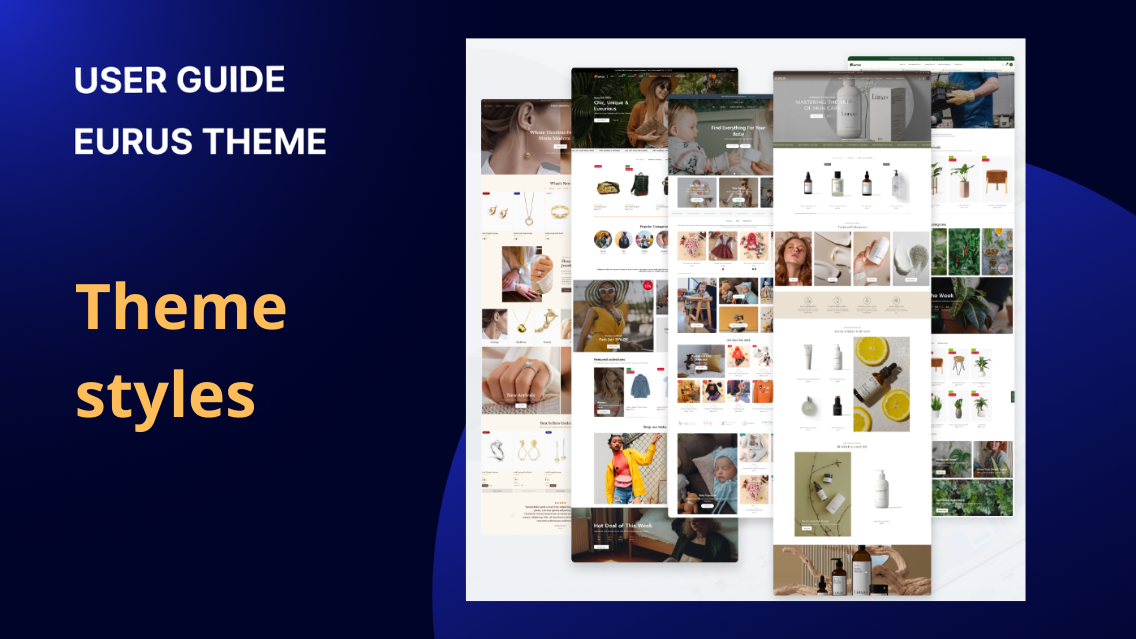
1. What are theme styles? Theme styles refer to the predefined design elements and visual settings that are included with a theme. These styles typically encompass various aspects of the website's appearance, such as typography, color schemes, button styles, layout options, and more. Note: Theme styles only differ in their default combinations, resulting in different layouts, but fundamentally, they use the same set of configurations. Therefore, store owners can freely select any of the five presets without concern that choosing one will restrict their ability to set up another. Theme styles provide store owners with a convenient way to customize the look and feel of their website without the need for extensive coding or design expertise. They allow for consistency across different pages and elements of the website, ensuring a cohesive and professional appearance. 2. How to switch theme styles? To switch theme styles, follow these steps: Go to Online Store > Themes in your Shopify admin. Click Customize next to the theme you want to edit. Navigate to Theme settings > Styles. Choose your desired theme style options from the drop-down menus. Click Save to apply the changes. For more detailed instructions and information, you can refer to the Shopify help guide. To ensure you don't lose any setup data for your header and footer, refer to the guide located in Theme settings > Advanced of Eurus theme. 3. Eurus theme styles Here are the five style presets offered by the Eurus theme along with a brief overview of what each is best suited for: Breeze: This style preset is ideal for clothing stores. With its clean and modern design, it highlights apparel products effectively, allowing customers to focus on the clothing options available. Breath: Designed for outdoor and garden-related stores, Breath brings a fresh and natural aesthetic to your website. It's perfect for showcasing outdoor furniture, gardening tools, plants, and other related products. Swirl: Swirl is tailored for baby and kids' stores. Its playful and vibrant design appeals to parents looking for cute and charming products for their little ones, making it a great choice for showcasing children's clothing, toys, and accessories. Whiff: This style preset is specifically crafted for jewelry and accessories stores. With its elegant and sophisticated design, Whiff accentuates the beauty of jewelry pieces, helping to create a luxurious and enticing shopping experience. Puff: Puff is best suited for health and beauty stores. Its clean and minimalist layout puts the focus on skincare, makeup, and wellness products, allowing customers to browse and shop for their favorite beauty essentials effortlessly.

Theme settings
This feature allows you to input custom CSS for all pages except the checkout page. For detailed instructions and examples, you can refer to the Shopify documentation on adding CSS.
Theme settings
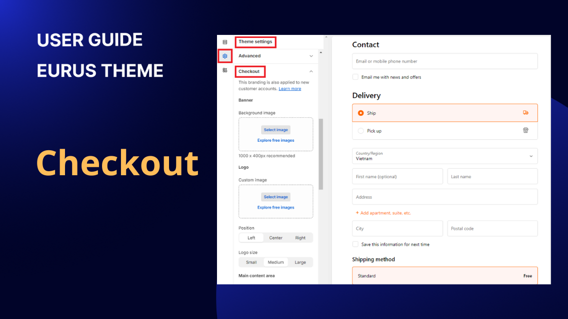
Eurus Theme provides extensive customization options for styling the checkout page, allowing you to create a seamless and branded shopping experience. Here's a brief overview of the major sections you can style: Banner and Logo: Customize the banner and logo displayed on the checkout page. Ensure your brand identity is consistent throughout the entire shopping process. Background Color and Typography: Adjust the background color to complement your brand palette. Fine-tune the typography settings to enhance the readability and visual appeal of text elements on the checkout page.

Theme settings
1. How to Show Product Reviews on Your Store A Product Reviews App allows customers to leave feedback and ratings on products they have purchased. These reviews are displayed on the product pages or shown as ratings on the product card, helping potential buyers make informed decisions by providing insights into the quality and overall satisfaction of the product from previous customers. To integrate a product reviews app with your theme's native product rating system, follow these steps: Go to Theme Settings > Advanced section > Product Reviews App settings. Select one of the supported apps from the list: Judge.me Loox Okendo Stamped.io Yotpo Trustoo.io ReviewXpo If you want to use a different app, select the Product Reviews App option. Please note that some apps under this option may not be fully compatible with the theme. If you encounter any issues, please contact support for help. 2. How to Add Custom Code to the <head> Tag Adding custom code to the <head> tag is a feature that allows admin to incorporate additional tracking codes or custom scripts that apply to the entire site. Here's how you can use this feature: How to Add Custom Code: Navigate to your theme settings. Look for the section “Custom CSS” in the “Advanced” section group. Insert your custom code in the provided space. Placement: The custom code added here will be inserted at the end of the <head> tag in the HTML of your website. Note: If you are not familiar with technical aspects or coding, and you need assistance with adding custom code, feel free to contact us. Click on this link to create a support ticket. Our team will be happy to help you. 3. How to Change Theme Styles Without Losing Data Changing the preset in Theme Settings => Theme Styles will change the default configs in Theme Settings, potentially losing data that was set up before the switch. To retain data in the Header and Footer, follow this logic: After changing the theme style, go back to the Theme Settings => Advanced => System => Selected Preset config to revert to the initial preset and preserve the originally configured data. Example: Steps to change the theme style without losing data configured in the Header and Footer: Change the theme style from Breeze to Breath. In the selected preset config, choose the Breeze. This ensures that the settings in the Header and Footer are retained from the initial setup in Breeze. 4. How to Grab Customer Attention with Tab Messages The Tab Attention feature helps bring customers back to your store when they switch to another browser tab. It changes the tab title with custom messages to catch their eye and encourage them to return. How to Enable Tab Attention In Shopify Admin, go to Online Store > Themes > Customize. Open the Theme Settings and find Tab Attention. Turn on Enable Tab Attention. Enter two custom messages. These will alternate in the browser tab when customers leave your store’s tab. Set the Message Delay (how often the messages switch). Click Save to activate the feature. This feature is a great way to re-engage visitors and boost conversions.
Theme settings
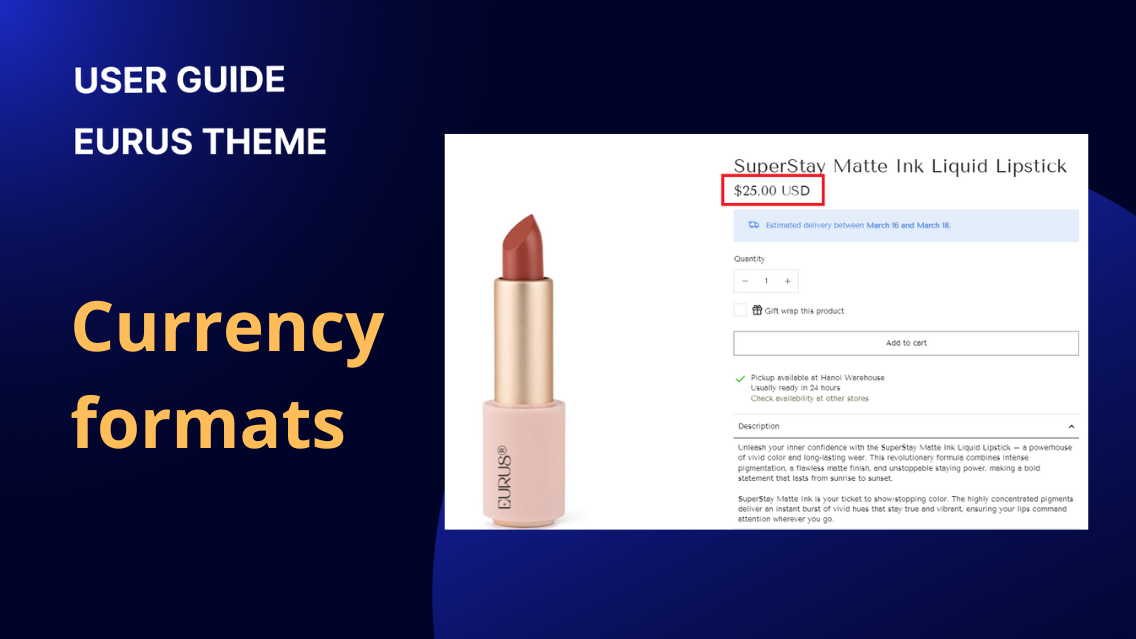
In order to enhance clarity, admins can choose to either display or hide the currency code next to the product price. This is particularly useful in scenarios where multiple markets share the same currency symbol or to avoid confusion. Adding the currency code provides a clear distinction. Disable “Show currency codes” Enable “Show currency codes”
Theme settings
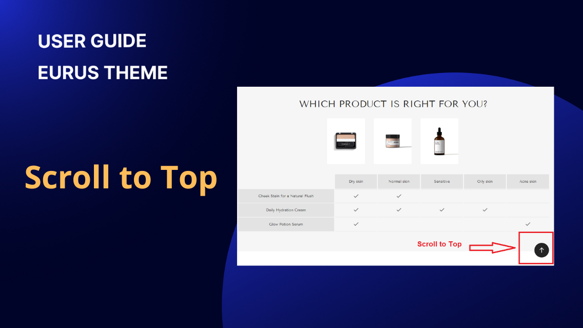
The Scroll to Top button is a handy feature in the Eurus theme that provides users with a smooth and quick way to return to the top of a webpage. This enhances the overall user experience by eliminating the need for manual scrolling. The Scroll to Top button can be easily enabled for both desktop and mobile devices. Admins have the flexibility to tailor the user experience based on the platform. By default, the Scroll to Top button icon is an arrow. However, admins can personalize this icon to better align with their brand or design preferences. This customization is achieved through the use of the Custom SVG config. For assistance with custom SVG code or fixing issues that arise from custom SVG code, please contact our support. To customize the Scroll to Top button’s position, set the horizontal alignment to Left, Center, or Right based on your preference. Adjust the vertical position by specifying a percentage value for both desktop and mobile devices to determine how far from the bottom of the screen the button will appear. Tips: When setting up the Scroll to Top button, it's essential to be mindful of other elements present on the webpage, such as chat widgets or popups. Ensuring these elements do not obstruct the button enhances visibility and functionality.

Theme settings
1. Overview Estimated Delivery Time (EDT) is a feature designed to enhance the shopping experience by providing customers with an estimated timeframe for order delivery. With this feature, admins can establish delivery time parameters for all orders and all products. The feature also considers cut-off times for daily shipping operations, ensuring real-time updates based on the current time. Note that when the product is sold out, the EDT will be automatically hidden. 2. How to set up the minimum and maximum days for delivery? To set up the minimum and maximum days for delivery for all orders and products, follow these steps: Step 1: Open Theme Settings and expand the “Shipping and delivery” config group.Step 2: Enter the minimum and maximum number of days required to ship all orders and products universally. Example: If the standard shipping time is 3 to 5 days, enter "3" as the minimum and "5" as the maximum. If a customer places an order on March 7, the Estimated Delivery Time would be displayed as "Between March 10 and March 12." This indicates that, based on the configured shipping parameters, the customer can expect their order to be delivered within that specified timeframe. Result: Note: If your store caters to multiple markets with distinct shipping times, use semicolons to differentiate the shipping days for each market. Example: Suppose it takes 6 days to ship orders to the US and 3 days to the UK, enter "US:6;GB:3". By applying these steps, you can establish specific shipping timeframes for all orders and products while accommodating variations for different markets through the use of semicolons. 3. Set up specific delivery times for individual products: If you want to tailor the delivery time or messages for individual items, providing more specific information to customers during the shopping experience, follow these steps: In the Shopify admin, go to Settings => Metafields and metaobjects => Metafield Definitions => Products, add a definition. Create two metafields which have Namespace and key 'custom.delivery_date_min' and 'custom.delivery_date_max' with the type 'Text' if you want to set up specific delivery times. Or: Create a metafield with the namespace and key 'custom.delivery_date_message' to customize the delivery message for the product . For each product that requires a specific metafield, go to its admin settings. Enter the desired minimum and maximum delivery days or delivery messages in the created metafields. If a product doesn't have values for these metafields, it will follow the general configuration set in the theme settings. 4. How to display the Estimated Delivery Time (EDT) on different pages? a) Show EDT on Product Page: Navigate to the product page where you want to show the Estimated Delivery Date. Add the block named "Estimated Delivery Date” in the Product Information Section. To customize the message for each product in this block, you can create a metafield with the key 'custom.delivery_date_message' and type 'Rich text'. Moreover, the admin can customize the message and tooltip to provide additional information, also style the message according to your preferences using the styles section, where you can choose colors for the background, text of the content box, and colors for the tooltip. b) Show EDT on Cart Page/Minicart: Open your Theme Settings and expand the “Shipping and delivery” config group. Find the config labeled "Show in Cart." Enable this option to display the estimated delivery time for the entire cart. Configure "Show in Cart Items": None: No estimated delivery time will be displayed for items in the cart. Show Cart EDT: Displays the same message for each item in the cart, considering the delivery times of all products. Show Item EDT: Displays the estimated delivery time for each individual item in the cart, checkout page, and order details. This option is applicable if a metafield is set up to specify custom delivery dates for products. Customize the message and tooltip to provide additional information about the delivery date. You can further style the message according to your preferences using the Styles section. These steps allow you to effectively communicate the estimated delivery time to customers at different stages of their shopping journey. 5. How to show the estimated delivery date for each product’s variant? One product can have several variants, follow these steps to show a different estimated shipping date for each one: Step 1: Create two variant metafields: In Shopify admin, click on Settings on the bottom left. Click on Metafields and metaobjects, under Metafield definition, click on Variants. Choose Add definition to create a new variant definition. Step 2: Setting up the two variant metafields: 1. Delivery date min: (🛑 Important) Enter the “delivery date min” as the name of the metafield Select type as Single line text Under the Validations section, click on the Regular expression field. From here, you will see a drop-down list, click on the Numeric characters. (This makes your metafield only accept numbers) Click Save. 2. Delivery date max: (🛑 Important) Enter the “delivery date max” as the name of the metafield Repeat the same steps above. Step 3: Assign a value for your metafield Back to Shopify admin, click on the Products tab. Click to open the product with variants that you want to assign a specific estimated delivery time. Scroll down to the Variant section, click on the specific variant you want to assign value for: You will be navigated to a new page, scroll all the way down to Metafields section, enter a number value for each: 💡 Which number should I enter in the metafields? To determine on the number, you must understand the concept. It is pretty simple: The message shows up as “Estimated delivery between earliest_delivery_date and latest_delivery_date.” delivery date min: X delivery date max: Y Then: earliest_delivery_date = today + X days latest_delivery_date = today + Y days Still unsure? Let us explain by an example: today is 26 September delivery date min: 3 delivery date max: 5 ⇒ earliest_delivery_date = 26 Sep + 3 days = 29 Sep ⇒ latest_delivery_date = 26 Sep + 5 days = 01 Oct Then the message will be shown as: Don’t forget to click Save. 6. Show the estimated delivery date for each product’s variant in the cart. By following the instructions in part 5. How to show the estimated delivery date for each product’s variant?, you now enable the estimated delivery date for each variant on the product page and quick view. To make it appear on the cart (mini cart & cart page), you need some more actions. First, let's take a look at how it will display on site: In minicart: In cart page: To set it up, you must: Step 1: Make sure you finish the setup at 5. How to show the estimated delivery date for each product’s variant? above. Step 2: Visit the Theme Editor by clicking on Online Store > Themes > Customize, and click on the ⚙️ gear icon to go to Theme Settings. Step 3: Find and tap on Shipping and delivery to expand the tab. Then, scroll down to the Estimated delivery time in cart section. Step 4: Continue scroll down to find the setting called Show in cart items, there are 3 options for you to choose: Option name Function Image “None” Hides the delivery date message. “Show cart EDT” Shows one delivery estimate for all items in the cart, based on the latest possible date across all products. “Show item EDT” Show a different delivery estimate for each product in your cart, based on its specific information. Step 5: Click Save to finish. 7. How to set up a cut-off time for delivery? Cut-off time refers to the specific point within a day when a business or shipping service stops accepting orders or processing shipments. It serves as a deadline for customers to place orders if they want their items to be shipped on the same day. Cut-off times are crucial for logistical planning and ensuring timely deliveries. For example, if a customer places an order after the cut-off time, the shipment will be processed on the next business day. Implementing a cut-off time helps businesses manage their workflow, maintain shipping schedules, and provide accurate Estimated Delivery Times to customers. Please follow these steps to set up: Open Theme Settings and expand the “Shipping and delivery” config group. Locate the option for "Cut-off Time" Choose the time within the day (Hour & Minute) when shipping activities stop. Example Scenario: If the current time is before the cut-off, the EDT displayed will be Min days_Max days. If the current time is equal to or after the cut-off, the EDT displayed will be Min days+1_Max days+1. This configuration helps manage customer expectations based on the time of day, providing accurate and reliable estimated delivery information. 8. How to Display a Countdown for Cut-off Time? To show a countdown message for the time left until the cut-off time on the cart page, mini-cart, or product page, follow these steps: Step 1: Go to Theme Settings > Shipping and delivery > and find the Estimated delivery time in cart. Step 2: In the message field, enter your wanted message, and make sure to use the “time_to_cut_off” text to show the remaining time before the order cut-off. For example: “Order within time_to_cut_off”. Step 3: Click Save when done. 9. How to Hide the Estimated Delivery Time for Pre-Order Products? If you don’t want to show the Estimated Delivery Time (EDT) for pre-order products, just follow these steps: Step 1: Go to Shopify Admin > Online Store > Customize > Theme Settings. Step 2: Find Shipping and Delivery > Turn "Hide when Pre-order is enabled" to ON. Step 3: Click Save, then check your cart—EDT for pre-order products should be hidden! For Quick View and Featured Product sections, go to their section settings and turn on this option there to hide EDT in those areas too. ⚠️ Note: 1. The Estimated Delivery Date (EDT) will not be displayed for: Gift cards Digital products 2. If both the Min and Max fields are left blank and the product’s metafield is empty, the EDT will be hidden on the product page, cart item, and whole cart. 10. How to Exclude Weekends and Holidays from Estimated Delivery Time? If your store only delivers on working days, you can exclude weekends and holidays from the estimated delivery calculation. a) Exclude Weekend Deliveries 📅 Go to Theme Settings > Cut-off time Under Weekend delivery exclusions, choose: None – If your store delivers even on weekends. Saturdays – If you deliver on Sundays but not Saturdays. Sunday – If you deliver on Saturdays but not Sundays. Both weekends – If no deliveries are made on Saturdays and Sundays. b) Exclude Holidays ⛱️ In Holidays delivery exclusions, enter non-working days in the format "Month Day" (e.g., January 1). Add one holiday per line, in chronological order, for accurate results. Holidays that fall on a weekend don't need to be added. 11. Add value for after-sale with Parcel Panel App If you want to reduces your after-sales costs while keeping your customers satisfied and driving revenue conversion, Parcel Panel is your choice. Parcel Panel is the #1 tracking app: auto sync, tracking & update, branded tracking page, shipping notifications, upsell, 24/7 live chat support. Especially, it's completely compatible with Eurus Theme and can work right out of the box. >>> Try the app for free
Theme settings
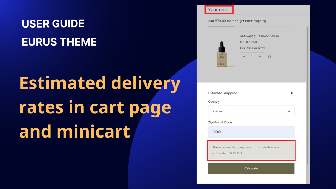
Estimated delivery rates in cart page/minicart
1. How to enable estimate shipping rates? The normal delivery rates usually appear on the checkout page only. With Eurus theme, for customer convenience, admins can choose to display these rates directly on the cart page. To set it up: Admin Configuration: You can open Theme settings > Shipping and delivery > Estimated shipping rates and toggle on "Enable" to display estimated delivery rates. Storefront Display: Customers can input their address in either the mini cart or cart page. Then, they can view instantly applicable delivery rates based on the entered address. In case customers do not log in, or they do not have a default address, the country/city of the store address configured in the admin will be shown. By following these steps, you provide customers with quick access to estimated delivery rates, improving their shopping experience. 2. How to set up the automatic shipping rate calculation? The Eurus theme offers an "Auto Calculate Shipping Rates" feature to help your customers see accurate shipping costs based on their address and market. To understand how Shopify calculates shipping rates, visit this Shopify documentation. The Eurus theme's feature functions as a tool to display these rates to customers. Follow these steps to enable it: Step 1: Navigate to your theme settings Step 2: Find the Shipping and delivery section and click to expand it. Step 3: Under the Estimated shipping rates group, turn on the toggle that says "Enable auto-calculation" option to enable it. ✍️ How It Works For logged-in customers: If they have a default address: Rates display based on their default shipping address If they have multiple addresses: Rates show for their primary address If no default address is set: Rates display for their first listed address For guests (non-logged-in customers): Shipping rates will show based on general settings, with certain markets requiring a zip code to display accurate rates. If the zip code is not required (e.g., Vietnam), rates will appear automatically; otherwise, customers will be prompted to use "Estimate Shipping" for more details. Note: If shipping calculations aren't available for a specific location, customers will see a message to use the Estimate Shipping calculator for more details.

Theme settings
1. What is Free shipping bar? The Free shipping bar in Eurus theme helps communicate to customers how close they are to qualifying for free shipping, encouraging them to add more items to their cart. By keeping customers informed about the benefits of reaching the free shipping threshold, the Free shipping bar contributes to increased order values and customer satisfaction. 2. Common Use Cases 2.1 How to show a Free shipping bar on the cart? Prerequisite: Before using the Free shipping bar, it is important to set up a free shipping rule in your Shopify admin. Refer to the Shopify documentation for detailed instructions on creating free shipping rules. STEP 1: Enable Free shipping bar To enable Free shipping bar, go to Theme settings > Shipping and delivery > Scroll down to Free shipping section > toggle Enable cart progress bar. STEP 2: (Optional) Apply free shipping bar to virtual products To count both physical and virtual products (for example: gift vouchers) toward the free shipping threshold, toggle Also apply to virtual products ON. STEP 3: Set Free shipping thresholds Free shipping thresholds is the minimum order amount customers need to reach to qualify for free shipping. To set up: Under Free shipping section > Order amount for freeshipping, enter the amount to qualify for free shipping. Amount entry formats include: Format Example Free shipping application Amount 100 Applies to all countries/currencies. Currency code:Amount USD:100 Applies to any country using USD. Country code:Currency code: Amount US:USD:100 Applies only to the United States with USD currency. Note: Add one rule per line only. STEP 4: Click “Save” when done. STEP 5: Check the Storefront Display in Minicart, Cart page and Check out page Case 1: When the cart doesn't meet the free shipping threshold, the bar prompts customers to add more items. Case 2: When the cart qualifies for free shipping, showcase how the bar communicates the achievement. 2.2. How to set up Other offer (like Free gift) on the freeshipping bar? If you want to offer something besides free shipping (like free gift) on the bar in cart, follow this: STEP 1: In Theme Settings > Shipping and delivery > under the Free shipping section > Toggle Enable cart progress bar ON > Other offer, enter the offer name (e.g. free cosmetic samples). STEP 2: Enter the required amount of order value for the customer to achieve the benefit in Order amount for other offer, using the same format rules in use case above: Format Example Free shipping application Amount 100 Applies to all countries/currencies. Currency code:Amount USD:100 Applies to any country using USD. Country code:Currency code: Amount US:USD:100 Applies only to the United States with USD currency. STEP 3: Choose Icon to display on the cart progress bar. STEP 4: Click “Save” when done. 2.3. How to guide customers to apply Free shipping code at the Checkout page? 👉 Why need to guide customers to use Free shipping code at the checkout page? If you have set up a free shipping code in the Shopify admin before, it can be applied directly on the checkout page. However, it can’t be applied to the cart page because of Shopify’s limitation on theme availability. When your customer types the available free shipping code on the cart page, it will display “Discount invalid”, which may cause customer confusion. 👉 To avoid customer confusion and guide them to use Free shipping code at the checkout page: STEP 1: In Theme Settings > Shipping and delivery > Under Free shipping section > Free shipping code, enter the exact free shipping code created in Shopify admin. STEP 2: Click “Save” when done. After finishing, at the cart page, when the customer types the free shipping code, it will suggest: “Free shipping code should be applied later on Checkout page.” When applying free shipping code at the checkout page:

Theme settings
This guide will walk you through various functions and configs available within the Cart section (Minicart & cart page), which allows you to show discount breakdown (list of all discount codes applied), grand total, and more. Open the Theme Editor and navigate to the Theme Settings. Then, select the Cart section. 1. How to show a mini cart as a popup? Eurus theme provides two options for presenting the minicart: drawer and popup, with the default setting being the drawer style. Popup type: Drawer type: Additionally, if you wish to hide the "View Cart" button, simply tick the "Hide 'View Cart' button" option within the config settings. This prevents customers from accessing the cart page. For mobile, you can adjust the Cart drawer size on mobile with three options: Fullscreen, Medium, and Small. Tips: If the tracking data shows that many users go directly from the minicart to the checkout page, using this feature can eliminate one step, making the checkout process smoother and reducing cart abandonment rates. 2. How to open the cart page when clicking on the cart icon? Normally, when clicking on the cart icon, the minicart will show up. If you want to open the cart page instead of a minicart, do this: In the Theme settings > Cart > Cart type In the Cart type config, choose Page Click “Save” when done. 3. How to change the cart icon? To change the cart icon display: In the Theme settings > Cart > Cart icon Choose the cart icon you prefer. Click “Save” when done. 4. How to show/hide product option in mini cart and cart page? The Show product option config controls whether variant information (e.g., Color: Gold, Size: M) is displayed on product cards in both the minicart and the cart page. To do this Go to Theme Settings > Cart. Toggle Show product option ON to enable the config. 5. How to show cart note/cart instructions in mini cart and cart page? Cart note is a feature designed to allow customers to input additional notes during the ordering process. These notes are then stored within the order information in the backend, enabling the admin to review and act accordingly. To activate this feature, simply tick the "Enable cart note" config. In the backend: 6. How to show terms and condition checkbox in minicart/cart page? "Terms and Conditions Checkbox" serves the same purpose as in any other online platform. It is used during the checkout process to ensure that customers actively acknowledge and agree to the terms and conditions, privacy policy, or any other legal agreements before they can proceed with a purchase. To enable it in the Eurus theme, you just need to tick the "Enable terms and conditions checkbox" config. Additionally, you should add a page for the terms and conditions. Click the "Select page" button to choose the link that leads to your terms and conditions page. Note: Due to Shopify's restrictions, customers won't be required to tick this checkbox when checking out with a dynamic payment button. 7. How to modify the "Continue shopping" link when the cart is empty? Locate the "Continue shopping" option. You can select a link that directs users to products, collections, or any preferred page. Conclusion: By customizing minicart styles, enabling features like cart notes, and configuring the "Continue Shopping" link, you can tailor the cart and minicart section to match your brand and improve user convenience. These features not only help create an attractive cart interface but also streamline functionality to meet the specific needs of your e-commerce platform. 8. How to show the Payment method on Minicart & Cart page? In Theme Editor, click on Theme Settings (the Gear icon ⚙️ on the 2nd position on the left sidebar). Tick on the Enable payment icon box. The default payment icons from Shopify will be displayed. (Optional) You can customize your preferred payment icons by adding or replacing them with SVG code. Click Save when done. 9. How to show the saving amounts for the order on cart? Showing savings on your cart page and mini cart can motivate customers to buy more by letting them know how much money they save. Here’s how: In Theme Editor, go to Theme Settings (or the Gear icon) > Tap on Cart > Tick the box that says Show savings amount > Click Save. 10. How to hide the minicart/cart page? Why You Might Want to Hide the Cart: For businesses selling wholesale or to other businesses, it may be preferable to have customers contact sales representatives directly rather than using an online cart. Some stores may want to display their products purely for informational purposes without allowing purchases directly through the site. When a store is preparing for a launch or running a preview, the cart can be hidden to build anticipation while displaying the product catalog. In Theme settings => Cart => Catalog mode, tick this checkbox to hide the cart: When Hide Cart is enabled: Mini cart icons will not be displayed on both desktop and mobile. Quick add options will be hidden. Add-to-cart button will not be shown on product pages, featured products, or quick view. 11. How to Enable Save & Share Cart? The "Save & Share Cart" feature allows your customers to save their cart items and generate a unique link. By enabling this feature, you can enhance the shopping experience for your customers, making it easier for them to share their carts with friends and family. ✍️ To enable this feature: Step 1: Navigate to your Shopify admin and open the Theme Editor. Step 2: Click on "Theme Settings", or the gear icon on the left sidebar. Step 3: Scroll down to the "Cart" section. Step 4: Find and tick the checkbox labeled "Enable Save & Share Cart". ✍️ Once enabled: Customers can save & share their cart by clicking the “Share cart” text link. A unique link will be generated, which can be copied and shared. When someone accesses the link, they will see the saved cart items, ready to checkout. 12. How to Show the Countdown Timer on the Cart? Add a cart countdown timer to create urgency and encourage faster purchases. This shows shoppers how long items’ information like quantity, and prices are reserved. Step 1: Enable the Cart Timer Go to Theme Settings > Cart > Find the Countdown timer section > Toggle Enable cart timer to activate the countdown. Step 2: Customize the Countdown Message Default message: 🔥 Items in your cart are reserved for {timer}. Change the content inside the Message field for a custom message. Add {timer} to dynamically show the countdown. Step 3: Set the duration Adjust the Timer (minutes) setting to choose how long items stay reserved. Step 4: Choose what happens when time expires Select an action under Action after time expired: Repeat the countdown – The timer restarts automatically. Hide the message – The countdown disappears when time runs out & restarts when customers edit their cart (add/remove items) Clear the cart – Items are removed from the cart once the timer expires. Step 5: Click “Save” when done. 13. How to disable the minicart display after adding to cart? The "Show cart drawer/popup after adding product to cart" feature automatically displays the minicart (covering half the screen) when customers add an item to their cart. By default, this feature is on. However, you can disable it to show a simple pop-up cart notification instead. When enabled (Default) When disabled ✍️ To disable this feature: Step 1: In the Theme Editor, go to Theme Settings (gear icon ⚙️) > Cart. Step 2: Disable "Show cart drawer/popup after adding product to cart". Step 3: Click "Save." 14. How to show Shipping insurance option in the cart? The Shipping Insurance is an add-on option that allows customers to protect their order during shipping by paying an additional fee. It typically covers situations like: Lost packages Damaged items during transit Stolen deliveries If you want to show Shipping insurance (extra fee included) as a choice in the cart, here’s how: STEP 1: Go to Theme settings > Cart > Scroll down to Shipping insurance (Extra fee) section. STEP 2: Create a product as the Shipping insurance product. In Shopify admin, create a simple product (no variants) to act as the shipping insurance fee. This item will be added to the cart as protection against damage, loss, or theft. For more information about how to create a product in Shopify, read this guide. STEP 3: Toggle on Enable Shipping insurance (Extra fee) to activate the feature. (Optional) Toggle Shipping insurance added by default to make the shipping insurance option automatically chosen. STEP 4: Once the Shipping insurance product is created, select it in the Product setting to show it in the cart. Note: If you want to hide the Shipping insurance product from customer discovery while keeping it available for purchase, Shopify now supports the Unlisted product status. To set up Unlisted product status, go to Shopify admin > Products > Choose the Shipping insurance product (created in STEP 2) > Change Status to Unlisted. STEP 5: Customize Shipping insurance content Go back to Theme Settings > Cart > Shipping insurance (Extra fee) section, and you can: Enter the Title and Description to explain the value of the insurance (for example: Protect your orders from damage, loss, or theft). (Optional) Toggle Show image and upload a Custom image to highlight the shipping insurance product visually. STEP 5:Click “Save” when done. 15. How to show recommended collections in the empty cart? When no products are added to the cart, you can suggest to customers some collections to encourage product exploration and boost sales, like this: Here’s how to set up: STEP 1: Go to Theme settings > Cart > Scroll down to Empty cart recommendations section. STEP 2: Choose collections to suggest Under Collection list, select some collections you want to feature. Note: You can select up to 50 collections, but we recommend limiting it to 3–4 to avoid overwhelming customers. STEP 3: Add text content Write an engaging Text to encourage customers to explore collections. STEP 4: (Optional) Choose button style Choose the collection Button style among Text link, Primary, Secondary. STEP 5:Click “Save” when done. 16. How to let customers choose their own delivery date? Eurus theme supports Delivery date picker feature, allowing customers to self-pick a delivery date for the products. To enable the feature: STEP 1: Open the settings Navigate to Theme settings > Cart STEP 2: Set up the feature Toggle Enable delivery date picker to ON. To set how many delivery days are shown in the calendar for all products, enter a number in Slot visibility (e.g., 10). To set delivery days for each product, create a metafield with: Key 'custom.slot_visibility' Type 'Text'. 👉 Learn more about creating metafields. Then assign the Slot visibility value for each product in Shopify admin: Note: If the cart contains products with different Slot visibility values (from Theme settings and custom metafields), the larger value will be applied. STEP 3: (Optional) Mark delivery date as required Enable Make delivery date required if you want the date picker to be mandatory before checkout. STEP 4: Click “Save” when done. 17. How to show products to cart upsell? With Cart upsell feature, you have the ability to promote additional products or special offers directly within the shopping cart. This provides a valuable opportunity to showcase complementary items or exclusive promotions to encourage customers to add more to their cart. Ways to show products to cart upsell: a) Default setting: By default, if no specific setup is configured by the admin, the theme will automatically showcase suggested products in the Cart Upsell section. This feature relies on Shopify's inherent "related products" rule, taking into account the customer's purchase history and product descriptions. Please check out the Shopify guide for more information: Show related products on product pages This seamless integration ensures that your Cart Upsell section presents products based on relevant data, enhancing the shopping experience for your customers. b) Static Product Selection: If you wish to emphasize particular products, such as bestsellers or featured items, you have the option to manually choose products within the theme settings. Follow these steps: Open the Theme settings then navigate to the Cart section. In the group config for Cart upsell, find the option to select products and choose the desired products. Products selected in this section will be set for all products in your cart. Please note that if you are utilizing a product metafield to add upsell products (as explained in the next section), you should leave this field blank. This customization lets you create a personalized list of products to display prominently in the Cart upsell section. c) Advanced Customization with Metafields: For more advanced customization, enabling you to tailor the Cart Upsell section for each product, you can utilize metafields. Follow the guide below to add metafields: Navigate to your store backend and go to Settings > Metafields and metaobjects > Metafields > Choose Products to create metafields for your products. Fill in the following information: - Name: Provide a name for the metafield. This name will be visible in the product detail page in the backend. We recommend using "Cart Upsell" as the name to avoid confusion.- Namespace and Key: These are identifiers for the metafield in the database and will be used to display upsell products in the frontend. The key must be "cart.upsell" for the metafield to work.- Description: This field is optional, and you can add text here to describe the purpose of the field.- Select Type: Choose "Product" and then select "List of Products" to add multiple upsell products. After setting up the metafield, go to each product page in the backend. Scroll down to the bottom of the page and click on Metafield > Cart Upsell. Here, you can select a list of products to be the upsell products. For instance, if you add products B, C, and D as upsell products for product A, whenever a customer adds product A to the cart, products B, C, and D will appear in the Cart Upsell section. Note: The three methods follow a priority order, with the third method having the highest priority. If all three are set up in a particular theme version/ product, the third method (metafields) will override the previous ones. This flexible approach empowers you to effortlessly manage and customize the Cart Upsell section based on your specific marketing and product promotion goals.

Theme settings
A favicon is a small icon, used to represent a website or bookmarked page in browsers' favorites lists, address bars, and search results. It enhances brand recognition and adds a professional touch to a website. For users, it facilitates easy identification and management of opened browser tabs. How to Upload a favicon? Open the Theme Editor and in the Theme Settings, select the Favicon section. Favicon images should be in PNG or ICO file format. The ideal size for a favicon is either 16×16 pixels or 32×32 pixels.

Theme settings
1. Social accounts Our theme provides a seamless way to integrate your social media presence across the entire platform. With the Social Media configuration options, you can display icons linked to your social accounts in various sections of your theme.Navigate to Theme Settings > Social Media to access the configuration panel.Fill in the corresponding social media links for each platform in the provided fields (Twitter, Facebook, Pinterest, Instagram, TikTok, Tumblr, Snapchat, YouTube, Vimeo, LinkedIn, LINE, Email address, Phone number) 2. Sharing options The Sharing Options feature enables customers to easily share product details across various platforms like Facebook, Twitter, Pinterest, WhatsApp, Telegram, LINE, Email, and SMS. Note: To display the sharing options on your product pages, you need to add the Social Sharing block in the Product Information section of your theme. In addition to product pages, social sharing options are also available in blog posts.You need to add a "Back to Blog" block and tick the "Show Social Share" option. Note that social sharing must be enabled in the theme settings first. For more details, please refer to the relevant guide on enabling social sharing options. This functionality helps boost product visibility and reach by allowing quick and effortless sharing directly from the product page. 3. Affected areas Once you've entered your social media links, the corresponding icons can be displayed in the following sections across your theme: Announcement bar Header Footer Social feeds Video shopping Video looping

Theme settings
1. How to customize the product cards' look? To optimize product cards' look in the Theme Editor, follow these steps: Navigate to Online Store > Themes > Customize in your Shopify Admin. Go to Theme settings > Product. Set the desired Title size and Price size (from 50-200%) Set the desired padding for desktop/mobile view. This sets the space between the text and the edges of the product card. Choose a background color for light/dark mode. 2. How to change product card image ratio? Open the Theme Editor and in the Theme Settings, select the Products section. For the option labeled “Products Image Ratio”, Product card image ratio can be adjusted from the available options, including Natural (original ratio), Square (1:1), Landscape (4:3), Portrait (2:3), and Wide (16:9), to customize the visual presentation of your product images. Natural (original ratio) Square (1:1) Landscape (4:3) Portrait (2:3) Wide (16:9) Standard (3:4) 3. How to reveal next product images on the product cards? This guide will help you configure your Shopify theme to reveal the next product images on product cards using various effects and customization options. In Theme Settings > Product > Product cards, find the Image effect, and there will be 3 options to choose: Option name How it works Example Image Carousel - Multiple images will be displayed in a carousel. (You can adjust how many images appear by changing the setting of Number of additional images) - Action to view: For desktop 🖥️: Appears on hover. For mobile 📱: Swipe inside the image. Reveal Second Image - Only the second product image will be displayed. - Action to view: For desktop 🖥️: Appears on hover. For mobile 📱: Swipe inside the image. None No additional images will be displayed on hover. You can also set up some effects and styles: 1️⃣ Product card image reveal effect: Choose the transition to reveal the next image in product cards, which is to be Fade or Slide. 2️⃣ Navigation (light/dark): Set the color for Navigation (transition arrows) when Image Carousel is enabled (for both light and dark backgrounds) 3️⃣ Next/Previous arrows”: Turn on/off to customize the appearance of the next and previous arrows: When ticked: The left and right arrows will appear above the product images when you hover over them. When unticked: The pagination will appear on top of the product images. 4️⃣ Change slides every: Set the duration for each slide in the carousel between 0 to 4 seconds to control how long each slide remains visible in the carousel. This works only when the "Next, previous arrows" setting is enabled. If you set "Change slides every" to 0, autoplay will be turned off. 4. How to alter the inventory stock status? ✍️ What is a low stock threshold? The low stock threshold serves as a predefined limit set by the retailer or admin to determine when a product's stock level is considered low. When the quantity of a particular product falls below the specified threshold, it shows a "Low stock" signal in Inventory status block on the product page. ✍️ How to set up the low stock threshold? In Theme Editor, go to Theme Settings, select Products, look for the Inventory status section, and find the config "Low Stock Threshold” Adjust the low stock threshold according to your preference. This threshold can typically be set within the range of 10 to 200 units. (Note: It must be a whole number). Result: Case Result When the number of products > or = Low stock threshold When the number of products < Low stock threshold ✍️ How to set up the “In stock message” and “Low stock message”? In Theme Editor, go to Theme Settings, select Products, scroll down to the Inventory status section, then fill in the personalized message you want in the right field: In stock message: Showing when the number of products > or = Low stock threshold value. Low stock message: Showing when the number of products < Low stock threshold value. ✍️ How to set up the “In stock message” and “Low stock message”? In Theme Editor, go to Theme Settings, select Products, and scroll down to the Inventory status section. You can also customize the color of the text message in both light and dark versions. 5. How to customize product variant picker? The Variant picker displays all available product variants for customers to choose from. Follow the steps below to customize it: STEP 1: Navigate to Theme settings > Product > Variant picker settings group. STEP 2: Adjust the variant picker options: Type: Choose how variants are shown: Dropdown or Button. For Button type, set the maximum number of variants displayed in Maximum variant number of button type. Toggle Select available variant as default to ON to automatically select in-stock variant as default. STEP 3: Click "Save" and preview. 6. How to show the price range on the product cards? To show the minimum and maximum price range of a product with multiple variants, follow these steps: Step 1: In Theme Settings > Product > Product price. Step 2: Toggle on the Enable price range setting. Step 3: Click “Save”. 7. How to link a Price Guide Popup next to the price range on the product cards? You can allow your shoppers to view additional price-related information using a popup link: Step 1: In Theme Settings > Product > Product price, toggle on the Enable price range setting. Step 2: Create a page in Online stores > Pages. Step 3: Enter the URL to that page in the Price guide popup page link field. Step 4: Click “Save”. Then, an "Info" icon (!) will appear on the product card. Clicking it opens the linked popup page. 8. How to customize the price format under each product card? Step 1: In Theme Settings > Product > Product price. Step 2: Entering into the Custom price format field using these placeholders: {price}: The product's current price. {max_price}: The highest price value. {middle_price}: The mid-range price value. {min_price}: The lowest price value. ⚠️ Note: You can hide the price on the product cards using this setting. For example, fill in: “Open to offer”. However, the actual price will still be visible on the product page. Step 3: Enable custom price format in Price Open the Price block of the product where you want to apply the custom format (under Quick view / Featured product / Product information sections). Enable Use custom price format in theme settings. Step 4: Click “Save”. Advanced settings: Customize the price format using metafield If you want to customize the price format for each product like this, follow the guide below: STEP 1: Create a product metafield Go to Shopify admin > Settings > Metafields and metaobjects > Products. Click Add definition and create a new metafield. Set the metafield Type to Single line text. Save the metafield. STEP 2: Input metafield value Go to Shopify admin > Products. Click on a product you want to add a custom price format for. Scroll to the Metafields section and enter the label text for the created metafield. For example: $300 / 3 bottles. Save the product. STEP 3: Enter the Metafield key in Theme settings Open the Theme editor. Go to Theme settings > Products > Product price format. In the Custom price format, enter the namespace and key of the created metafield. STEP 4: (Optional) Choose how to apply the custom product price There are two ways to apply this label: ✅ Apply storewide: Leave both Apply to products and Apply to collections blank ✅ Apply to specific products or collections: Use the Apply to products and/or Apply to collections fields to select specific items Note: The Apply to products setting takes priority over Apply to collections (if both are enabled). STEP 5: Enable custom price format in Price block Open the Price block of the product where you want to apply the custom format (under Quick view / Featured product / Product information sections). Enable Use custom price format in theme settings. STEP 6: Click “Save” when done.
