
User Guide - Header
User Guide - Header

User Guide - Header
Theme basics Feature Description Lightning fast pages Built with performance best practices and page pre-loading when hovering over any link. Search engine optimized All pages and content are built with SEO-optimized best practices. Keyboard accessible All features and functionality can be used with keyboard navigation. Screen reader support All content is accessible to screen readers for an inclusive browsing experience. Light/dark mode Toggle light or dark mode for customer reading. Dynamic content Use metafields and dynamic content inside sections and blocks. Global shopping Supports Shopify Markets so customers can browse in their local language and currency (30+ languages including EU, Asia, Arabia, etc.) RTL support Supports right-to-left layout for specific languages. Flexible price settings Enable product price range and customize price with available variables (min/middle/max price) or metafields. Device specific visibility Customize visibility on almost every section for mobile and desktop separately. Drag and drop sections Fully supports Shopify OS2.0 drag-and-drop sections. Navigation and header Feature Description Multi-announcement bar Feature multiple promotions using the simple announcement bar. Different header layouts Various layout to set up with header on both mobile and desktop devices. Sticky header A sticky header that can be opened anywhere on the page. Dynamic scroll header Set your header bar to be hidden while scrolling down and revealed when scrolling up. Transparent header Allow a see-through effect for the header. Mega-menu Extensive navigation including simple menu, tree menu, banner menu, product menu, blog menu, tabbed menu, contact menu, and more. Header sidebar A panel that slides out from the side of the header to showcase promotions, seasonal deals, or extra content. Drawer menu Multi-page drawer menu with optional content blocks to feature text, images or videos. Menu highlight effect Draw attention to any menu item using stylish effects like sparkles, circles, or underlines. Mobile dock A fixed navigation bar at the bottom of the mobile screen for quick access to homepage, menu, or cart. Scroll to top Provides customers with a smooth and quick way to return to the top of a webpage. Search bar on header Toggle search bar display on the header. Real-time search Help customers find what they're looking for by displaying search results as they type. Cart and checkout Feature Description Unified cart view Display all cart variants grouped under each product. Product info customized Choose to show/hide product option and vendor on product list. Cart editing Let customers quickly change variant options for items in their cart, e.g. swap one size for another. Cart upsells Display a collection of products to upsell or cross-sell. Cart notes / instructions Let customers easily add a note to their order. Free shipping bar Showcase free shipping discount when customers spend a certain amount. Different cart layouts Display the cart as drawer, popup, or page — set separately for mobile and desktop. Cart notification Display cart notification in a smaller overlay or full cart after adding product to cart. Cart redirect Redirect customers to the cart page. Cart icon Choose different cart icons to match your store's style. Payment icons Show standard/customized payment icons to show customers all available payment methods. Discount code Toggle discount code field for customer input. Saving amount Display the total savings in the cart to motivate customers to make a purchase. Delivery date picker Save the customer's preferred delivery date for better shipping and delivery management. Terms and conditions Checkbox for customers to confirm agreement to terms, with a link to the terms page. Shipping insurance Enable customers to include shipping insurance with their orders. Estimated shipping rates Display the estimated shipping cost at minicart and cart page based on customer's address. Estimated delivery time Providing customers with an estimated timeframe for order delivery. Cut-off time Set up cut-off time, including weekend and holiday exclusion for store. Share cart Let customers easily share their cart by copying and sharing a URL. Cart custom field Enable store to add custom contents on the cart. Countdown timer Show a cart countdown timer to encourage customers to complete their purchase. Empty cart recommendations Suggest customers a list of collections to browse if cart is empty. Catalogue mode Hide the cart when the site is being used as a catalog. In-store pickups Customers can choose which store to pick up their order from. Collection Feature Description Easy filtering Works with Shopify's Search & Discovery app for easy setup filters. Tag-based filtering Let customers filter collection results based on product tags. Filter position Set the filter to display above, aside the page, or as a drawer. Dynamic grid filters Enhance product discovery by displaying filter values as an image grid. Quick add / Quick buy Easily add items to your cart without navigating to a product page. Quick add table Customers can quickly add many items to their cart by updating quantities in a table. List view View collection results in a list view. Sorting product list Toggle product sorting by various types. Custom metafield columns Display additional custom metafields inside a product table. Promotional blocks Add content and media blocks within your collection grid. Pagination types Choose among infinite scroll, click to load, and standard pagination. Custom product badge Display custom product badges using tags or metafields. Inventory count Show total product inventory count remaining when below a certain amount. Product taglines A short description that can be displayed under each product title. Image cropping Set product images to crop to square, portrait, or landscape. Second image on hover Show the second product image while hovering. Video support Show videos for each product card when used as featured or second media. Image slider A slider to show multiple photos for each product card. Product Feature Description Product upsells Display automatic or manually selected product upsells or cross-sells. Product bundles Sell multiple items together on one product page. Sibling products Display sibling products linked as swatches. Product labels & badges Automatic sale badges, new labels, sold-out badges, and pre-order labels. Customized product labels Enable customized product labels based on store's need with text and image format. Product highlighted features Showcase stand-out product qualities on cards to communicate value at a glance. Product highlighted attributes Show icons on product cards for customers to quickly comprehend highlighted characteristics (e.g. ingredients, allergens). Pre-order products Allow pre-orders for products that are out of stock or available in limited quantities. Back-in-stock alert Allow customers to subscribe to notifications when a product becomes available again. Gift wrapping Choose product to consider as a gift wrap option. Image zooming Get a closer look at product images with a zoomable gallery. Multimedia gallery Display images, videos, and 3D files in a single media gallery. Supports app blocks Easily add third-party apps to your product template using app blocks. Rich block support Build your own product template using any existing blocks like tabs, accordions, and drawers. Store pickup Show inventory availability and different locations. Inventory warning Show a warning message when there's a limited supply of inventory left. Product customizations Collect product customization details like an engraving for a ring. Customizable options Enable customers to customize products with additional options, either free or at an extra cost. Quick order table Show each variant in a separate table row giving customers a quick option to add many variants at once. Combined listing (Shopify+) Create and display combined listing products. Quantity pricing Display custom quantity pricing and volume rules. Discount progress bar Display visually customers' progress toward unlocking the next discount, based on quantity or subtotal. Nutrition fact bar Show ingredients or nutritional information of products like food, beverages, or supplements. Product score Display product attributes using a bar or icon scale for quality, performance, or suitability. Video shopping Showcase product-related videos, like testimonials or how-to-use guides. Estimated delivery time Display the estimated shipping date of the product. Collapsible tabs Collapsible tabs for additional content in the description section. Collection link Provide a way for customers to navigate from a product page to a collection page. Coupon code Display the coupon code for products along with a countdown timer showing remaining effective time. Trust badges Show security seals, payment method logos, or quality certifications in image format. Featured icon & text with icon Showcase important product information like reviews, unique selling points, or key product features. Horizontal tabs Show product information in horizontal tabs. Sticky add-to-cart Show a sticky add-to-cart bar at the bottom of the product page. Blog Feature Description Comments Let customers leave a comment on a blog post. Easy sharing Display a URL that can be easily copied to share a blog post. Recent articles Show recently published blog articles to encourage further engagement. Tag filtering Additionally filtering to easily show blog posts with a specific tag. Table of contents Let customers easily jump to different headings in a blog post. Account Feature Description Sign in with Shop Let customers sign in with their Shop account. B2B customer approval (Shopify+) Control which customer accounts have access to view restricted content by approved B2B accounts. B2B account switcher Let customers easily switch between different B2B locations to place orders. Development Feature Description Familiar codebase Built using Tailwind and Alpine for an easy jumping-off point for any custom development work. Custom liquid sections Use the custom liquid section to inject your own code or install third-party apps. App extension friendly Easily install app extensions for dynamic content without writing a single line of code.

User Guide - Header
1. What is a header sidebar? The header sidebar is a panel that slides out from the side of your store’s header. You can use it to display promotions, seasonal deals, or additional content. 2. How to set up a sidebar on the Header? STEP 1: Add the Sidebar content block Under Header settings group > Header section > Add Sidebar content block, STEP 2: Upload a block of content (banner image, text and CTA button) to the sidebar Click on the block to open its settings panel For media content, upload Image and adjust its ratio. For text content, you can enter Heading, Subheading, or further Description. For navigation, enter Button label and paste a link to redirect customers. Note: Each Sidebar content block can include 1 image, text, and a CTA button. 👉 To show more content on the Sidebar, simply add multiple Sidebar content blocks under the Header and set them up the same way. STEP 3: Make the sidebar display Click on the Header section, scroll down to the Sidebar settings group, then toggle “Enable sidebar” to make the sidebar display. STEP 4: Customize the sidebar display Still at the Sidebar settings group: Pick an Icon to display in the header. You can also upload an image to use as an icon - more fun 😝. Enter the title shown at the top of the sidebar (e.g., “Check our seasonal deals!”). STEP 5: Click “Save” when done.

User Guide - Header
1. What is Menu drawer? Menu drawer allows you to create a responsive version of the desktop menu. Instead of displaying the full navigation bar, the menu is collapsed into a drawer that slides in when users tap the menu icon (☰). This helps keep the header clean and uncluttered while still giving customers quick access to all navigation links, collections, and important pages. 2. Section Components Section Menu drawer Used to create a responsive version of the desktop menu. Available blocks Accordion menu Used to show a menu with expanded/collapsed submenus inline on the same screen. Carousel menu Used to show a menu that displayed as horizontal sliders (like a carousel). Tab menu Used to show a simple menu with each submenu opening a new screen. Cart Used to show a quick link to the customer's cart. Account and log in Used to show a button for customers to quickly log in to their accounts. Social icons Used to show quick links to other social media platforms of your store. Text Used to show a simple text on the menu drawer. Image Used to show an image with a link on the menu drawer. Button Used to show a CTA button on the menu drawer. 3. Location & Setup To add & set up the Menu drawer: Open the Shopify Theme Editor (Online store > Themes > Customize) Navigate to the Header section on the left-hand side. Click on the Header section. Toggle Enable drawer menu ON. If it is hidden, click the eye button to unhide. 4. Two main ways to build your Menu drawer 4.1. ✅ Quick & Simple: Just set up in the Menu drawer section 🤔 If you: Just want to show a basic dropdown menu you set in the Shopify admin. Just need up to 3 levels for your menu. Don’t need a different layout or visual styling for each menu item. ✍️ Then do this: STEP 1: Go to Theme Editor > Header > Menu drawer section. STEP 2: In the Menu dropdown, select your existing menu that you have set in the Shopify admin (Content > Menus). ⚠️ Note: If you add any Accordion menu, Carousel menu, or Tab menu blocks, the menu selected in this Menu setting will be ignored. In this case, follow the steps in 4.2. 🧩 Fully Custom to set up your menu using blocks. STEP 3: (Optional) Enable language and currency selectors (Optional) Customize background, text, and divider colors for both light and dark mode if needed. STEP 4: Hit Save. 4.2. 🧩 Fully Custom: Use blocks to design your own menu drawer 🤔 If you: Want to have a 4-level menu drawer. Want to present each of your menu items in a more diverse way (with carousel, accordion, etc). ✍️ Then do this: STEP 1: Go to Theme Editor > Header > Menu drawer section. STEP 2: Click “Add block” under the section and choose the block type you want to present your menu: Accordion menu, Carousel menu, or Tab menu blocks. STEP 3: Depending on the block type you use, read the corresponding case below: 🤔 How to set up the Accordion menu block? You can show up to 4 levels of your menu, all in one screen, when using this menu block type: STEP 1: In the Accordion menu block setting panel, click “Select” in the Menu setting to assign a menu from your Shopify navigation. STEP 2: (Important!) Type in a name that will appear on the store for the menu in the Menu item field. STEP 3: (Optional) Add a link to the menu item for navigation To direct customers to a specific page when they click the menu item name: Paste a link in Menu item link. (Optional) Toggle “Open this link in a new window” to navigate customers to a new window. STEP 4: Set up your first-level menu items (which are shown as the 2nd-level menu items on the storefront) Note: The Tab items section is for the first-level menu items Check "Show collection images" to display featured images (see this guide from Shopify for adding/changing collection images). Check "Auto-fill collection images with first product image" to use the first product image instead. (⚠️ This only works if 'Show collection images' is enabled.) Check "Show product images" to display product images on the menu. STEP 5: Set up your 2nd-level menu items (which are shown as the 3rd-level menu items on the storefront): Note: The Submenu items section is for the second-level menu items Check "Show collection images" to display featured images (see this guide from Shopify for adding/changing collection images). Check "Auto-fill collection images with first product image" to use the first product image instead. (⚠️ This only works if 'Show collection images' is enabled.) Check "Show product images" to display product images on the menu. Using the “Auto-fill collection images with metafield” to override collection images with custom ones. Please refer to the next part about “How to show collection images on the menu using metafield?” for a detailed explanation. STEP 6: Choose the Image style to be Square or Rounded. STEP 7: Click “Save” when done. 🤔 How to set up the Carousel menu block? Only the first level of your menu will be shown when using this menu block type: STEP 1: In the Carousel menu block setting panel, click “Select” in the Menu setting to assign a menu from your Shopify navigation. STEP 2: (Important!) Type in a name that will appear on the store for the menu in the Menu item field. STEP 3: Set up to show or hide the collections/ product images: You have several options to choose from under the Tab items section: Check "Show collection images" to display featured images (see this guide from Shopify for adding/changing collection images). Check "Auto-fill collection images with first product image" to use the first product image instead. (⚠️ This only works if 'Show collection images' is enabled.) Check "Show product images" to display product images on the menu. Using the “Auto-fill collection images with metafield” to override collection images with custom ones. Please refer to the next part about “How to show collection images on the menu using metafield?” for a detailed explanation. STEP 4: Choose the Image style to be Square or Rounded. STEP 5: Click “Save” when done. 🤔 How to set up the Tab menu block? You can show up to 4 levels of your menu, each level is on a separate screen, when using this menu block type: STEP 1: In the Tab menu block setting panel, click “Select” in the Menu setting to assign a menu from your Shopify navigation. STEP 2: (Important!) Type in a name that will appear on the store for the menu in the Menu item field. STEP 3: (Optional) Add a link to the menu item for navigation To direct customers to a specific page when they click the menu item name: Paste a link in Menu item link. (Optional) Toggle “Open this link in a new window” to navigate customers to a new window. STEP 4: Set up your first-level menu items (which are shown as the 2nd-level menu items on the storefront) Note: The Tab items section is for the first-level menu items Check "Show collection images" to display featured images (see this guide from Shopify for adding/changing collection images). Check "Auto-fill collection images with first product image" to use the first product image instead. (⚠️ This only works if 'Show collection images' is enabled.) Check "Show product images" to display product images on the menu. STEP 5: Set up your 2nd-level menu items (which are shown as the 3rd-level menu items on the storefront): Note: The Submenu items section is for the second-level menu items Check "Show collection images" to display featured images (see this guide from Shopify for adding/changing collection images). Check "Auto-fill collection images with first product image" to use the first product image instead. (⚠️ This only works if 'Show collection images' is enabled.) Check "Show product images" to display product images on the menu. Using the “Auto-fill collection images with metafield” to override collection images with custom ones. Please refer to the next part about “How to show collection images on the menu using metafield?” for a detailed explanation. (Optional) Change the Image size, you can choose between Small and Large (the default setting is Large) (Optional) Choose the Submenu layout to be 1 or 2 columns. STEP 6: Choose the Image style to be Square or Rounded. STEP 7: Click “Save” when done. STEP 4: Click "Save" when you finish. If you want to add some interesting elements such as Label, Sparkle effect (Menu highlight), and more, read the next part. 5. Advanced customizations. 🤔 How to show cart and account icons, or social icons on menu drawer? STEP 1: Go to Theme Editor > Header > Menu drawer section. STEP 2: Click “Add block” under the section and choose the Account and log in block, the Cart block, or the Social icons block. STEP 3: Drag and drop the block to arrange its position. STEP 4: Click "Save" and preview. 🤔 How to show collection images on the menu using a metafield? ✍️Why would you need to use metafield for collection images? You want to show a designed image for the collection on the menu, without changing the featured images of that collection. You want to show higher-resolution images on the menu. ✍️ How to do it? STEP 1: Create a collection metafield: In Shopify admin, go to Settings > Metafields and Metaobjects > Collection > Add definition. Give your metafield a name. Choose type as File. Click Save. STEP 2: Assign a value for the collection metafield: Go back to Shopify admin, and click on the Products > Collection tab. Choose a collection. Scroll down to Metafields. Upload an image in the newly created collection metafield. Click Save. STEP 3: Set up in Theme Editor: In Theme Editor (Visit it by clicking on Online store > Themes > Customize) Click on Menu drawer > tap on a menu block > scroll to Auto-fill collection images with metafield on the newly appeared panel. Under the metafield's name, copy the text after “custom.”→ Paste to this “Auto-fill collection images with metafield” field. STEP 4: Click "Save". 🤔 How to add Quick access blocks to the menu? ✍️Why would you need to use Quick access blocks? You want to show a designed image for the collection on the menu, without changing the featured images of that collection. You want to show higher-resolution images on the menu. ✍️ How to add Quick access blocks to the menu? STEP 1: In the Theme editor, go to Menu drawer > Add one of the 3 Menu Block types (Accordion menu, Carousel menu, or Tab menu) > Scroll down and find the Quick access blocks section on the new right panel. STEP 2: Turn on the toggle that says “Enable quick access blocks”. STEP 3: Customize the look of all the blocks: Enable carousel on desktop, corner radius, size of font, colors of text, button, etc. STEP 4: Scroll down to the Block 1 group to: (optional) Add an icon from the list or enter the SVG code. Enter the Block title. Assign a Block link for it. STEP 5: (Optional) Repeat the process of Step 3 for Block 2, Block 3, and Block 4 if you want to add more quick links. STEP 6: Click "Save". 🤔 How to show promotion images on the menu drawer? There are two ways to add a promotional image to your menu drawer: Method 1: Add the image inside a menu block. (This makes the image shown only if the customers open those menu items). Method 2: Add the image to the Menu drawer section. (This makes the image shown right outside when the customers view the menu drawer). ✍️ Method 1: To show the image inside a menu item: STEP 1: In the Theme Editor, go to Menu drawer > Add one of the 3 Menu Block types (Accordion menu, Carousel menu, or Tab menu) > Scroll down and find the Promotion section on the new right panel. STEP 2: In the Image setting, click "Select" to assign an image. STEP 3: Tick 'Enable text overlay' to make the text appear on the promotion image, and adjust the Overlay opacity and other Colors as needed. STEP 4: Add more content: Add/change the content of a promotion block. Add a button for the promotion image. STEP 5: Click “Save” when done. ✍️ Method 2: To show the image right outside the menu drawer: STEP 1: In the Theme Editor, go to Menu drawer > Add an Image block, drag and drop it to the position you want. STEP 2: In the Image setting, click "Select" to assign an image. STEP 3: Add a link for the Image or click to open this link in a new window. STEP 4: Click “Save” when done. 🤔 How to show a label on the FIRST-LEVEL menu items of the menu drawer? Adding a small label next to the menu name is a great way to draw user attention. To bring the label up, just do these steps: STEP 1: In the Theme Editor, go to Menu drawer > Add one of the 3 Menu Block types (Accordion menu, Carousel menu, or Tab menu) > Scroll down and find the Menu label section on the new right panel. STEP 2: Enter content into the Label field. STEP 3: Customize the colors of the label as you want. STEP 4: (Optional) Choose an existing icon from the Icon dropdown list, or if you want to use a different icon from the list, there are two options: In the Icon drop-down list, choose Use another icon, then copy the icon name from this theme icon list and paste it into the Use another icon field. In the Icon drop-down list, choose Use another icon, then paste the SVG code of your go-to icon into the Custom icon (SVG code) field. STEP 5: Click "Save". 🤔 How to show a label on the Submenu items of the menu drawer? With Carousel menu, Accordion menu, and Tab menu blocks, you can add a label to submenus at any level. STEP 1: Open the settings Under the Menu drawer, click on Carousel menu/Accordion menu/Tab menu block to open its settings panel, then scroll down to Submenu label settings group. STEP 2: Choose submenus to label At Labeled submenus, enter the dropdown submenu names (menu level) that you want to add labels to. Some rules to notice are: Submenu names MUST MATCH EXACTLY, including case and spacing. Enter one submenu name per line. Include translations for multilingual stores. ⚠️ Note: Don’t add extra space before or after submenu names. STEP 3: Enter label text Enter the Submenu label you want to display on the submenu. STEP 4: Adjust label’s look Choose colors for the label and label text. You can also add an Icon to the label. STEP 5: Click "Save". 🤔 How to add a special highlight effect to the menus? Eurus lets you draw attention to any menu/menu level using stylish effects like sparkles, circles, or underlines. STEP 1: In the Theme Editor, go to Header > click on Menu drawer section > Menu highlight settings group. STEP 2: Toggle on the Enable menu highlight setting. STEP 3: Enter the 1st-level or sub-level menu names that you want to add highlight effects into the Highlight menus. Some rules to notice are: Menu names/menu level names MUST MATCH EXACTLY, including case and spacing. Enter one menu name/menu level name per line. Include translations for multilingual stores. For example, if the menu level 2’s name is "Make up," you must enter Make up, exactly as it appears in your menu. ⚠️ Note: Don’t add extra space before or after, e.g., "Make up" (with a trailing space), as it won't work. STEP 4: Choose the highlight Style you want & change the color. STEP 5: Click "Save". 6. Support Information Need help? Contact our support team at Omni Themes Support.

User Guide - Header
Step 1: Go to Online Store > Themes > Customize. Step 2: In the Theme Editor, under Header, find the Header section Step 3: Click Add block, then tap on the Button block. Step 4: On the new appeared panel, you can customize the: Button label Button link Button style Step 5: Click Save when done. 🤔 How to add a Withdrawal button to the Header? The Withdrawal button toggle turns a Button block into a dedicated Returns entry point for logged-in customers. When a customer clicks it, they are taken directly to their Order list in Customer Account so they can start a withdrawal or return request. STEP 1: Add a Button block In the Theme Editor, open the Header section. Click "Add block" and select Button. STEP 2: Enable the Withdrawal button toggle In the Button block settings panel, find the Withdrawal button toggle and turn it ON. ⚠️ Note: When Withdrawal button is ON, the button ignores the Button link setting and always routes logged-in customers to their Order list. When OFF, the button behaves as a normal CTA link using the existing Button link setting. STEP 3: Customize the button label and style Set a Button label (e.g. "Returns & Withdrawals") and choose your preferred Button style to match your header design. STEP 4: Click "Save" when done.

User Guide - Header
Step 1: Go to Online Store > Themes > Customize. Step 2: In the Theme Editor, under Header, find the Header section Step 3: Click Add block, then tap on the Contact menu. Step 4: (Important step) Give the main menu a title: Enter the menu title in the Menu Item field on the right panel. ⚠️ You must enter this field for your menu to appear on site. Step 5: On the new appeared panel, you can customize the look of the contact menu: 📌 To attach a link for the main menu: Click to choose or enter a link in the Menu item link field. (Optional) Check the box to open the link in the new tab. 📌 To change the order of information appeared on the Contact menu: Under Sort order, there are 4 options to change the order of each information block: Map, Contact form, Contact information. Contact form, Contact information, Map Map, Contact information, Contact form Contact information, Contact form, Map 📌 To show a map on the menu: Find the Store address (under the Map section), and enter the exact address of your store location. 📌 To show an image instead of the map on the menu: Find the Image section (under the Map section), and click to select an image, this will replace the map position. 📌 To hide/ unhide contact information: Under the Contact information section, tick the box that says “Show contact information”. 📌 To change contact information: Under the Contact information section, you can change the information in these fields: Heading Subheading Phone number Email address Text 📌 To hide/ unhide social icons: Under the Contact information section, check the box that says Enable social icons. 📌 To add a label on the menu: In the Theme Editor, go to Header > Contact menu Block > Scroll down and find the Menu label section on the pop-up right panel. From here, you can: Enter the text you want to show on the label. Adjust the Label position to be Above or Aside the main menu text. Change the text & label color. Add an icon: Choose from the drop-down list Find an icon from Eurus’s icon library, copy and enter its name into Use another icon. enter the custom icon SVG code. Leave everything blank to remove the label.

User Guide - Header
Before jumping to the details, make sure you understand the terms Blog and Blog posts in Shopify. 💡 What are the differences between Blog and Blog posts? Blog: A collection of many blog posts. Blog posts: Individual articles you write and publish on your blog(s). Each post typically consists of a title, content (text, images, videos), and other elements like tags or categories. 1. Set up the Blog in Shopify admin Different from other types of menus in Eurus, the Blog menu requires you to create a Blog in Shopify admin to link with: Step 1: In Shopify admin, go to Content > Blog posts. Step 2: On the top right, select the Manage blogs button, and click Add blog. Step 3: Give your new blog a Title, and click Save. (For example: Featured articles) Step 4: One more time, click on the Blog posts tab under Content. Now, find the blog posts you want to show on the menu and click to open them. Step 5: Scroll down to the Organization section, under Blog, and choose the right blog name that you just created. Click Save when done. Repeat this process for other blog posts. 2. Assign the menu 📌 Important step: Give the main menu a title: In Theme Editor, click on Header section > Simple menu block > Enter the menu title in the Menu Item field on the right panel. ⚠️ You must enter this field for your menu to appear on site. Step 1: Go to Online Store > Themes > Customize. Step 2: In the Theme Editor, under Header, find the Header section Step 3: Click Add block, then tap on Blog menu. Step 4: On the newly appeared panel, click Select blog → Find and choose the blog you created → Tap Select. Note: Now that you have changed your title, the name of the block will be changed to your new menu title. 3. Customize the look of the Blog menu 📌 To attach a link for the main menu: In Theme Editor > Header > Blog menu block > Click to choose or enter a link in the Menu item link field. (Optional) Check the box to open the link in the new tab. 📌 To change the numbers or rows/ columns for the blog menu: In Theme Editor > Header > Blog menu block > Scroll down to find the part that says Number of columns and Number of rows → Drag to adjust or enter a number. 📌 To highlight the most recent blog posts: In Theme Editor > Header > Blog menu block > Tick the box Enable featured post. This will automatically enlarge the most recent blog posts, and make it more outstanding. 📌 To add a See More button under the menu In Theme Editor > Header > Blog menu block > Under the Menu item link section, you can: Add a link for the “See more” button. Tick the box “Open the link in a new window” to activate this feature. Enter the “See more” button title to make it appear on the menu. Choose the alignment for the “See more” button. 📌 To change the blog post cover image ratio: In Theme Editor > Header > Blog menu block > Under Blog post section, there is an Image ratio field, tap and choose the ratio you want. 📌 To hide the blog post cover image on the menu: In Theme Editor > Header > Blog menu block > Under Blog post section, there is a check box that says Show featured image, uncheck to hide images. 📌 To show more Blogs on the menu To achieve this, you will need to go through 2 processes: Process 1: Set up Navigation in Shopify admin. In Shopify admin, go to Content > Menus. Click on an existing menu or select Add menu to create a new one. Fill in the Title box to give your menu a name (This title won’t show up on site) To add a menu item, click Add menu item, enter its name, and assign a link (e.g., page, collection, product, or URL). To create a nested menu, click Add menu item again, then drag it under another item by holding the dot icon. Click Save. Note: Only the first level of the menu will be displayed on the blog menu. Process 2: Make it appear on site by setting it up in Theme Editor. In Theme Editor > Header > Blog menu block > Under the Show other blogs: Tick the box Enable to activate this feature. Assign the menu you just created in the previous step by clicking on Select menu > Choose the menu > Tap Select. (Optional) Change the heading as you want. (Optional) Change the position to left or right. Pro tip: Instead of linking your menu items to blog posts, consider linking them directly to products or collections for cross-selling. 📌 To add a label on the menu: ✍️ For the first-level menu: In the Theme Editor, go to Header > Blog menu Block > Scroll down and find the Menu label section on the pop-up right panel. From here, you can: Enter the text you want to show on the label. Adjust the Label position to be Above or Aside the main menu text. Change the text & label color. Add an icon: Choose from the drop-down list Find an icon from Eurus’s icon library, copy and enter its name into Use another icon. enter the custom icon SVG code. Leave everything blank to remove the label. ✍️ For the submenus: If you want to add labels for the second, third, and fourth levels of the blog menu, follow this guide: STEP 1: Open the settings Under the Header, click on Blog menu to open its settings panel, then scroll down to Submenu label settings group. STEP 2: Choose submenus to label At Labeled submenus, enter the dropdown submenu names (menu level) that you want to add labels to. Some rules to notice are: Submenu names MUST MATCH EXACTLY, including case and spacing. Enter one submenu name per line. Include translations for multilingual stores. ⚠️ Note: Don’t add extra space before or after submenu names. STEP 3: Enter label text Enter the Submenu label you want to display on the submenu. STEP 4: Adjust label’s look Choose colors for the label and label text. You can also tag an Icon to the label. STEP 5: Click "Save".

User Guide - Header
1. Set up Navigation in Shopify Admin In Shopify admin, go to Content > Menus. Click on an existing menu or select Add menu to create a new one. Fill in the Name box to give your menu a name (This title won’t show up on site) To add a menu item, click Add menu item, enter its name, and assign a link (e.g., page, collection, product, or URL). To create a nested menu, click Add menu item again, then drag it under another item by holding the dot icon. Click Save. Note: 🚨 Each level 2 nested menu item must link to a Product. 🚨 The level 3 nested menu items you set up in Shopify admin won’t appear on the storefront if you use the Product menu type. If you need more detailed guidance, look back at the guide about How to organize menu items in Shopify admin. 2. Assign the menu 📌 Important step: Give the main menu a title: In Theme Editor, click on Header section > Product menu block > Enter the menu title in the Menu Item field on the right panel. ⚠️ You must enter this field for your menu to appear on site. Step 1: Go to Online Store > Themes > Customize. Step 2: In the Theme Editor, under Header, find the Header section Step 3: Click Add block, then tap on the Product menu. Step 4: On the newly appeared panel, click Select menu → Find and choose the menu you created → Tap Select. Note: Now that you have changed your title, the name of the block will be changed to your new menu title. 3. Customize the look of the Product menu 📌 To attach a link for the main menu: In Theme Editor > Header > Product menu block > Click to choose or enter a link in the Menu item link field. (Optional) Check the box to open the link in the new tab. 📌 To change the tab style for the product menu: In Theme Editor > Header > Product menu block > Find the part that says Tab style, you will have 2 options to choose from: Vertical: Horizontal: 📌 To add a label on the menu: ✍️ For the first-level menu: In the Theme Editor, go to Header > Product menu Block > Scroll down and find the Menu label section on the pop-up right panel. From here, you can: Enter the text you want to show on the label. Adjust the Label position to be Above or Aside the main menu text. Change the text & label color. Add an icon: Choose from the drop-down list Find an icon from Eurus’s icon library, copy and enter its name into Use another icon. enter the custom icon SVG code. Leave everything blank to remove the label. ✍️ For the submenus: If you want to add labels for the second and third levels of the product menu, follow this guide: STEP 1: Open the settings Under the Header, click on Product menu to open its settings panel, then scroll down to Submenu label settings group. STEP 2: Choose submenus to label At Labeled submenus, enter the dropdown submenu names (menu level) that you want to add labels to. Some rules to notice are: Submenu names MUST MATCH EXACTLY, including case and spacing. Enter one submenu name per line. Include translations for multilingual stores. For example, if the submenu name is "Make up", you must enter Make up, exactly as it appears in your menu. ⚠️ Note: Don’t add extra space before or after, e.g., "Make up" (with a trailing space), as it won't work. STEP 3: Enter label text Enter the Submenu label you want to display on the submenu, for example, “Hot”. STEP 4: Adjust label’s look Choose colors for the label and label text. You can also tag an Icon to the label. STEP 5: Click "Save". 📌 To add a See More button under the menu In Theme Editor > Header > Product menu block > Under the Menu item link section, you can: Add a link for the “See more” button. Tick the box “Open the link in a new window” to activate this feature. Enter the “See more” button title to make it appear on the menu. Choose the alignment for the “See more” button. 📌 To add Quick access blocks to the menu: ✍️ Why would you need to use Quick access blocks? Quick access blocks are ideal for menus with numerous items or when you want to highlight specific products or categories. These blocks display submenus as buttons, instantly capturing your customer's attention and guiding them to their desired destination. ✍️ How to add Quick access blocks to the menu? In the Theme Editor, go to Header > Product menu Block > Scroll down and find the Quick access blocks section on the new right panel. From here, you need to: Step 1: Turn on the toggle that says “Enable quick access blocks”. Step 2: Customize the look of all the blocks: Change their positions on the desktop, corner radius, size of icon and font, colors of text, background, etc. Step 3: Scroll down to the Block 1 group to: (optional) Add an icon from the list or enter the SVG code. Enter the Block title. Assign a Block link for it. Step 4: (optional) Repeat the process of Step 3 for Block 2, Block 3, and Block 4 if you want to add more quick links. Step 5: Click Save when done. 📌 To adjust the edge of images: In the Theme Editor, go to Header section. On the right panel, you will find the Theme Settings group > Edges option. Choose from the following edge styles: Square: Select this for a clean, straight-edge appearance. Rounded corners: Select this for soft, rounded corners for the images. ⚠️ Note: This setting will affect the images in both the Product Menu and Tabbed Menu. After making your selection, make sure to click Save to apply the changes.

User Guide - Header
Step 1: Access the Theme Editor by selecting Online Store > Themes > Customize on the Eurus Theme. Step 2: Under the Header section, click Add block and choose the Banner menu. Step 3: (Important step): Give the main menu a title: Enter the menu title in the Menu Item field on the right panel. ⚠️ You must enter this field for your menu to appear on site. Step 4: Customize the Banner menu, here are some things you can do: 📌 To attach a link for the main menu: Click to choose or enter a link in the Menu item link field. (Optional) Check the box to open the link in the new tab. 📌 To set up the banners on the menu: With Eurus, you can add up to 5 banners in the mega menu: Scroll down to the Banner 1 section, and you can: What you can do: How to do it: Add an image as the banner Customize the content: Heading Subheading Text Adjust image overlay Add a button on the banner Change the content alignment & position If you want to add more banners to the menu, do the same for Banner 2, Banner 3, Banner 4, Banner 5. 📌 To add a label on the menu: Scroll down and find the Label section on the pop-up right panel. From here, you can: Enter the text you want to show on the label. Adjust the Label position to be Above or Aside the main menu text. Change the text & label color. Add an icon: Choose from the drop-down list Find an icon from Eurus’s icon library, copy and enter its name into Use another icon. enter the custom icon SVG code. Leave everything blank to remove the label. 📌 To change the image banner height: Scroll down to the Image height, and choose the height you want for your menu banner. Tick the box that says “Make banner full width” to expand the banner(s) width. 📌 To adjust the banner image’s width and spacing: You can customize the number of columns to determine how many images are shown on a row for this banner menu: STEP 1: Open the settings At the Banner menu settings panel, scroll down to Banner layout. STEP 2: Set up the banner image width Choose the Number of columns (from 1 to 5), which defines the width of banner images: Number of columns Banner width Example 1 100% (full width) 4 25% STEP 3: Set up the spacing between banner images At Column spacing, set the distance between banner image columns. STEP 4: Set up content display If you want to display heading, subheading, text,... directly on the banner image, toggle “Enable content overlay”. STEP 5: Click “Save” when done.

User Guide - Header
1. Set up Navigation in Shopify Admin In Shopify admin, go to Content > Menus. Click on an existing menu or select Add menu to create a new one. Fill in the Title box to give your menu a name (This title won’t show up on site) To add a menu item, click Add menu item, enter its name, and assign a link (e.g., page, collection, product, or URL). To create a nested menu, click Add menu item again, then drag it under another item by holding the dot icon. Click Save. If you need more detailed guidance, look back at the guide about How to organize menu items in Shopify admin. 2. Assign the menu 📌 Important step: Give the main menu a title: In Theme Editor, click on Header section > Tree menu block > Enter the menu title in the Menu Item field on the right panel. ⚠️ You must enter this field for your menu to appear on site. Step 1: Go to Online Store > Themes > Customize. Step 2: In the Theme Editor, under Header, find the Header section Step 3: Click Add block, then tap on the Tree menu. Step 4: On the newly appeared panel, click on Select menu → Find and choose the menu you created → Tap Select. Note: Now that you have changed your title, the name of the block will be changed to your new menu title. 3. Customize the look of the Tree menu 📌 To attach a link for the main menu: In Theme Editor > Header > Tree menu block > Click to choose or enter a link in the Menu item link field. (Optional) Check the box to open the link in the new tab. 📌 To show images for menu items: In the Theme Editor, go to Header > Tree menu Block. On the right panel, you can: For menu items linking to a COLLECTION: Check "Show collection images" to display featured images (see this guide from Shopify for adding/changing collection images). Check "Auto-fill collection images with first product image" to use the first product image instead. (⚠️ This only works if 'Show collection images' is enabled.) For menu items linking to a PRODUCT: Check "Show product images" to display the product image on the menu. Note: This feature only works with the menu items that link to a collection or a product. 📌 To add a label on the menu: In the Theme Editor, go to Header > Tree menu Block > Scroll down and find the Label section on the pop-up right panel. From here, you can: Enter the text you want to show on the label. Adjust the Label position to be Above or Aside the main menu text. Change the text & label color. Add an icon: Choose from the drop-down list Find an icon from Eurus’s icon library, copy and enter its name into Use another icon. enter the custom icon SVG code. Leave everything blank to remove the label.

User Guide - Header
1. Set up Navigation in Shopify Admin In Shopify admin, go to Content > Menus. Click on an existing menu or select Add menu to create a new one. Fill in the Name box to give your menu a name (This title won’t show up on site) To add a menu item, click Add menu item, enter its name, and assign a link (e.g., page, collection, product, or URL). To create a nested menu, click Add menu item again, then drag it under another item by holding the dot icon. Click Save. If you need more detailed guidance, look back at the guide about How to organize menu items in Shopify admin. 2. Assign the menu 📌 Important step: Give the main menu a title: In Theme Editor, click on Header section > Tabbed menu block > Enter the menu title in the Menu Item field on the right panel. ⚠️ You must enter this field for your menu to appear on site. Step 1: Go to Online Store > Themes > Customize. Step 2: In the Theme Editor, under Header, find the Header section Step 3: Click Add block, then tap on the Tabbed menu. Step 4: On the newly appeared panel, click Select menu → Find and choose the menu you created → Tap Select. Note: Now that you have changed your title, the name of the block will be changed to your new menu title. 3. Customize the look of the Tabbed menu 📌 To attach a link for the main menu: In Theme Editor > Header > Tabbed menu block > Click to choose or enter a link in the Menu item link field. (Optional) Check the box to open the link in the new tab. 📌 To change the tab style for the tabbed menu: In Theme Editor > Header > Tabbed menu block > Find the part that says Tab style, you will have 2 options to choose from: Vertical: Horizontal: 📌 To add a See More button under the menu: In Theme Editor > Header > Tabbed menu block > Under the Menu item link section, you can: Add a link for the “See more” button. Tick the box “Open the link in a new window” to activate this feature. Enter the “See more” button title to make it appear on the menu. Choose the alignment for the “See more” button. 📌 To adjust the menu content alignment In the Theme Editor, go to Header > Tabbed menu block > Submenu items settings group. Choose Content alignment between: Left Center 📌 To show images for menu items: In the Theme Editor, go to Header > Tabbed menu Block. On the right panel, you can: For menu items linking to a COLLECTION: Check "Show collection images" to display featured images (see this guide from Shopify for adding/changing collection images). Check "Auto-fill collection images with first product image" to use the first product’s image instead. (⚠️ This only works if 'Show collection images' is enabled.) For menu items linking to a PRODUCT: Check "Show product images" to display the product image on the menu. Note: Ensure you select the correct section (Tab items or Sub menu items) and check the box in the right section. 📌 To show collection images on the menu using metafield: ✍️ Why would you need to use metafield for collection images? You want to show a designed image for the collection on the menu, without changing the featured images of that collection. You want to show higher-resolution images on the menu. ✍️ How to do it? Create a collection metafield: In Shopify admin, go to Settings> Metafields and metaobjects > Collection > Add definition. Give your metafield a name. Choose type as File. Click Save. Assign a value for the collection metafield: Go back to Shopify admin, and click on the Products > Collection tab. Choose a collection. Scroll down to Metafields. Upload an image in the newly created collection metafield. Click Save. Set up in Theme Editor: In Theme Editor (Visit it by clicking on Online store > Themes > Customize) Click on Header > Tabbed menu > scroll to Auto-fill collection images with metafield. Copy the text after “custom.” of the metafield’s Namespace and key. → Paste to this “Auto-fill collection images with metafield” field. Click Save. 📌 To change the image ratio for menu items: In Theme Editor > Header > Tabbed menu block > Under the Image ratio, choose the ratio you want. (This only applies to the images of submenu items) 📌 To add a label on the menu: ✍️ For the first-level menu: In the Theme Editor, go to Header > Tabbed menu Block > Scroll down and find the Menu Label section on the pop-up right panel. From here, you can: Enter the text you want to show on the label. Adjust the Label position to be Above or Aside the main menu text. Change the text & label color. Add an icon: Choose from the drop-down list Find an icon from Eurus’s icon library, copy and enter its name into Use another icon. enter the custom icon SVG code. Leave everything blank to remove the label. ✍️ For the submenus: If you want to add labels for the second, third, and fourth levels of the tabbed menu, follow this guide: STEP 1: Open the settings Under the Header, click on Tabbed menu to open its settings panel, then scroll down to Submenu label settings group. STEP 2: Choose submenus to label At Labeled submenus, enter the dropdown submenu names (menu level) that you want to add labels to. Some rules to notice are: Submenu names MUST MATCH EXACTLY, including case and spacing. Enter one submenu name per line. Include translations for multilingual stores. For example, if the submenu name is "SHOP BY INGREDIENT", you must enter SHOP BY INGREDIENT, exactly as it appears in your menu. ⚠️ Note: Don’t add extra space before or after, e.g., "SHOP BY INGREDIENT" (with a trailing space), as it won't work. STEP 3: Enter label text Enter the Submenu label you want to display on the submenu, for example, “Vegan”. STEP 4: Adjust label’s look Choose colors for the label and label text. You can also tag an Icon to the label. STEP 5: Click "Save". 📌 To add promotion images on the menu: In the Theme Editor, go to Header > Tabbed menu Block > Scroll down and find the Promotions section on the new right panel. You can: By changing this setting: Move the promotion section to the left or right side Change promotion layout to vertical or horizontal Add promotion images (Up to 3 images) and attach image link. Adjust the height of the promotion images. Make the text appear on the promotion images (text overlay). Change the overlay opacity of promotion images. Add/change the content of a single promotion block. 📌 To add Quick access blocks to the menu: ✍️ Why would you need to use Quick access blocks? Quick access blocks are ideal for menus with numerous items or when you want to highlight specific products or categories. These blocks display submenus as buttons, instantly capturing your customer's attention and guiding them to their desired destination. ✍️ How to add Quick access blocks to the menu? In the Theme Editor, go to Header > Tabbed menu Block > Scroll down and find the Quick access blocks section on the new right panel. From here, you need to: Step 1: Turn on the toggle that says “Enable quick access blocks”. Step 2: Customize the look of all the blocks: Change their positions on the desktop, corner radius, size of icon and font, colors of text, background, etc. Step 3: Scroll down to the Block 1 group to: (optional) Add an icon from the list or enter the SVG code. Enter the Block title. Assign a Block link for it. Step 4: (Optional) Repeat the process of Step 3 for Block 2, Block 3, and Block 4 if you want to add more quick links. Step 5: Click Save when done. 📌 To adjust the edge of images: In the Theme Editor, go to Header section. On the right panel, you will find the Theme Settings group > Edges option. Choose from the following edge styles: Square: Select this for a clean, straight-edge appearance. Rounded corners: Select this for soft, rounded corners for the images. ⚠️ Note: This setting will affect the images in both the Tabbed Menu and Product Menu. After making your selection, make sure to click Save to apply the changes.

User Guide - Header
1. Set up Navigation in Shopify Admin In Shopify admin, go to Content > Menus. Click on an existing menu or select Add menu to create a new one. Fill in the Name box to give your menu a name (This title won’t show up on site) To add a menu item, click Add menu item, enter its name, and assign a link (e.g., page, collection, product, or URL). To create a nested menu, click Add menu item again, then drag it under another item by holding the dot icon. Click Save. Note: The level 3 menu items you set up in Shopify admin won’t appear on the storefront if you use the Simple menu type. If you need more detailed guidance, look back at the guide about How to organize menu items in Shopify admin. 2. Assign the menu 📌 Important step: Give the main menu a title: In Theme Editor, click on Header section > Simple menu block > Enter the menu title in the Menu Item field on the right panel. ⚠️ You must enter this field for your menu to appear on site. Step 1: Go to Online Store > Themes > Customize. Step 2: In the Theme Editor, under Header, find the Header section Step 3: Click Add block, then tap on the Simple menu. Step 4: On the newly appeared panel, click on Select menu → Find and choose the menu you created → Tap Select. Step 5: Save your changes. Note: Now that you have changed your title, the name of the block will be changed to your new menu title. 3. Customize the look of the Simple menu 📌 To attach a link for the main menu In Theme Editor > Header > Simple menu block > Click to choose or enter a link in the Menu item link field. (Optional) Check the box to open the link in the new tab. 📌 To add a See More button under the menu In Theme Editor > Header > Simple menu block > Under the Menu item link section, you can: Add a link for the “See more” button. Tick the box “Open the link in a new window” to activate this feature. Enter the “See more” button title to make it appear on the menu. Choose the alignment for the “See more” button. 📌 To adjust the menu content alignment In the Theme Editor, go to Header > Simple menu block > First-level items settings group. Choose Content alignment between: Left Center 📌 To show images for menu items In the Theme Editor, go to Header > Simple menu Block. On the right panel, you can: For menu items linking to a COLLECTION: Check "Show collection images" to display featured images (see this guide from Shopify for adding/changing collection images). Check "Auto-fill collection images with first product image" to use the first product image instead. (⚠️ This only works if 'Show collection images' is enabled.) For menu items linking to a PRODUCT: Check "Show product images" to display the product image on the menu. Note: Ensure you select the correct level (first or second) for menu items and check the box in the right section. 📌 To show collection images on the menu using metafield ✍️ Why would you need to use metafield for collection images? You want to show a designed image for the collection on the menu, without changing the featured images of that collection. You want to show higher-resolution images on the menu. ✍️ How to do it? Create a collection metafield: In Shopify admin, go to Settings> Metafields and metaobjects > Collection > Add definition. Give your metafield a name. Choose type as File. Click Save. Assign a value for the collection metafield: Go back to Shopify admin, and click on the Products > Collection tab. Choose a collection. Scroll down to Metafields. Upload an image in the newly created collection metafield. Click Save. Set up in Theme Editor: In Theme Editor (Visit it by clicking on Online store > Themes > Customize) Click on Header > Simple menu > scroll to Auto-fill collection images with metafield. Copy the text after “custom.” of the metafield’s Namespace and key. → Paste to this “Auto-fill collection images with metafield” field. (See the image below) Click Save. 📌 To add a label on the menu ✍️ For the first-level menu: In the Theme Editor, go to Header > Simple menu Block > Scroll down and find the Label section on the pop-up right panel. From here, you can: Enter the text you want to show on the label. Adjust the Label position to be Above or Aside the main menu text. Change the text & label color. Add an icon: Choose from the drop-down list Find an icon from Eurus’s icon library, copy and enter its name into Use another icon. enter the custom icon SVG code. Leave everything blank to remove the label. ✍️ For the submenus: If you want to add labels for the second, third, and fourth levels of the simple menu, follow this guide: STEP 1: Open the settings Under the Header, click on Simple menu to open its settings panel, then scroll down to Submenu label settings group. STEP 2: Choose submenus to label At Labeled submenus, enter the dropdown submenu names (menu level) that you want to add labels to. Some rules to notice are: Submenu names MUST MATCH EXACTLY, including case and spacing. Enter one submenu name per line. Include translations for multilingual stores. ⚠️ Note: Don’t add extra space before or after submenu names. STEP 3: Enter label text Enter the Submenu label you want to display on the submenu. STEP 4: Adjust label’s look Choose colors for the label and label text. You can also tag an Icon to the label. STEP 5: Click "Save". 📌 To add promotion images on the menu In the Theme Editor, go to Header > Simple menu Block > Scroll down and find the Promotions section on the new right panel. You can: By changing this setting: Move the promotion section to the left or right side Change promotion layout to vertical or horizontal Add promotion images (Up to 3 images) and attach image link. Adjust the height of the promotion images. Make the text appear on the promotion images (text overlay). Change the overlay opacity of promotion images. Add/change the content of a single promotion block. 📌 To add Quick access blocks to the menu ✍️ Why would you need to use Quick access blocks? Quick access blocks are ideal for menus with numerous items or when you want to highlight specific products or categories. These blocks display submenus as buttons, instantly capturing your customer's attention and guiding them to their desired destination. ✍️ How to add Quick access blocks to the menu? In the Theme Editor, go to Header > Simple menu Block > Scroll down and find the Quick access blocks section on the new right panel. From here, you need to: Step 1: Turn on the toggle that says “Enable quick access blocks”. Step 2: Customize the look of all the blocks: Change their positions on the desktop, corner radius, size of icon and font, colors of text, background, etc. Step 3: Scroll down to the Block 1 group to: (optional) Add an icon from the list or enter the SVG code. Enter the Block title. Assign a Block link for it. Step 4: (optional) Repeat the process of Step 3 for Block 2, Block 3, and Block 4 if you want to add more quick links. Step 5: Click Save when done.

User Guide - Header
Eurus theme empowers you to create the most dynamic and visually appealing mega menu. This guide will explain the Mega menu to you and the steps to add it with Eurus. 1. What is Mega Menu? 💡 Simply talking: A mega menu is a drop-down menu with the aid of images, banners, videos, etc. It means that instead of a simple dropdown, it can display multiple categories, images, and even descriptions in an organized layout. This is particularly useful for stores with large catalogs. An example: 2. Choose your preferred mega menu look to start Check out the mega menu options Eurus gives you below. Choose a style and click its name to jump straight to the detailed guidance. Menu Name How it looks Use cases SIMPLE MENU The menu is shown in columns with promotional images. TREE MENU A more advanced drop-down menu with: images 4-levels (more than Shopify default) BANNER MENU Show up to 3 banners inside a menu PRODUCT MENU Show a list of products inside a menu BLOG MENU Show blog posts inside a menu item TABBED MENU Show the submenu in vertical or horizontal tabs CONTACT MENU Show a contact form, information, and map inside a menu CTA BUTTON ON MENU Show a button on the navigation bar

User Guide - Header
Learn basic drop-down menus that you can do within Shopify to build more complex ones later. 1. How to organize menu items in Shopify admin? Step 1: In your Shopify admin, go to Content > Menus. Step 2: Under the Menus section, click on the title of the menu you want to edit or click “Create menu” to build a new one from scratch. Step 3: Set up the menu item Click on Add menu item Enter the menu item’s name Assign a link to that menu item, it might be a specific page, collection, product, or external URL. Step 4: Set up the nested menu item One more time, click on the Add menu item. Hold the icon and drag the new menu item under the existing one. (Be aware of the blue line to know where your menu item will go) Step 5: Click Save. 💡 What are Menu items and Nested menu items? Menu item: The first level of the menu, often appearing on the site's navigation bar. Nested menu items: (or sub-menu items) The sub-level of the menu item. 2. How to display your drop-down menus on the store Step 1: From your Shopify admin panel, go to Online Store > Themes > Click on Customize to open the Theme Editor. Step 2: In the Theme Editor, on the left sidebar, under Header, click on the Header section. Step 3: A new panel will appear. By default, Eurus assigns the Main menu for the header. If you want to change this menu, click the Change button to open the drop-down list, from here, you can continue to: Select Change menu → Choose the menu you want → Click Select. Select Remove menu → Click on the Select menu button → Choose the menu you want → Click Select. Step 4: Click Save. ✨ If you wish to display 4-level menus or add additional elements such as images or banners to your menu, you should continue reading the next part about How to create mega menus?

User Guide - Header
1. What is Mobile navigation? Mobile navigation refers to the menu system specifically designed and optimized for display on mobile devices. In the Eurus Theme, mobile navigation is fully customizable and allows merchants to create a dedicated experience, separate from the desktop version. 2. Section Components Section Mobile navigation Used to create a separate menu rather than a responsive version of the desktop menu. Available blocks Accordion menu Used to show a menu with expanded/collapsed submenus inline on the same screen. Carousel menu Used to show a menu that displayed as horizontal sliders (like a carousel). Tab menu Used to show a simple menu with each submenu opening a new screen. Cart Used to show a quick link to the customer's cart. Account and log in Used to show a button for customers to quickly log in to their accounts. Social icons Used to show quick links to other social media platforms of your store. Text Used to show a simple text on the mobile menu. Image Used to show an image with a link on the mobile menu. Button Used to show a CTA button on the mobile menu. 3. Location & Setup To add & set up the Mobile navigation section: Open the Shopify Theme Editor (Online store > Themes > Customize) Navigate to the Header section on the left-hand side. Click on the "Mobile navigation" section. If it is hidden, click the eye button to unhide. 4. Two main ways to build your mobile menu 4.1. ✅ Quick & Simple: Just set up in the Mobile navigation section 🤔 If you: Just want to show a basic dropdown menu you set in the Shopify admin. Just need up to 3 levels for your menu. Don’t need a different layout or visual styling for each menu item. ✍️ Then do this: STEP 1: Go to Theme Editor > Header > Mobile navigation section. STEP 2: In the Menu dropdown, select your existing menu that you have set in the Shopify admin (Content > Menus). ⚠️ Note: If you add any Accordion menu, Carousel menu, or Tab menu blocks, the menu selected in this Menu setting will be ignored. In this case, follow the steps in 4.2. 🧩 Fully Custom to set up your menu using blocks. STEP 3: Choose the Text size of the mobile navigation menu: Medium or Large. (Optional) Enable language and currency selectors (Optional) Customize background, text, and divider colors for both light and dark mode if needed. STEP 4: Hit Save. 4.2. 🧩 Fully Custom: Use blocks to design your own mobile menu 🤔 If you: Want to have a 4-level mobile menu. Want to present each of your menu items in a more diverse way (with carousel, accordion, etc). ✍️ Then do this: STEP 1: Go to Theme Editor > Header > Mobile navigation section. STEP 2: Click “Add block” under the section and choose the block type you want to present your menu: Accordion menu, Carousel menu, or Tab menu blocks. STEP 3: Depending on the block type you use, read the corresponding case below: 🤔 How to set up the Accordion menu block? You can show up to 4 levels of your menu, all in one screen, when using this menu block type: STEP 1: In the Accordion menu block setting panel, click “Select” in the Menu setting to assign a menu from your Shopify navigation. STEP 2: (Important!) Type in a name that will appear on the store for the menu in the Menu item field. STEP 3: (Optional) Add a link to the menu item for navigation To direct customers to a specific page when they click the menu item name: Paste a link in Menu item link. (Optional) Toggle “Open this link in a new window” to navigate customers to a new window. STEP 4: Set up your first-level menu items (which are shown as the 2nd-level menu items on the storefront) Note: The Tab items section is for the first-level menu items Check "Show collection images" to display featured images (see this guide from Shopify for adding/changing collection images). Check "Auto-fill collection images with first product image" to use the first product image instead. (⚠️ This only works if 'Show collection images' is enabled.) Check "Show product images" to display product images on the menu. STEP 5: Set up your 2nd-level menu items (which are shown as the 3rd-level menu items on the storefront): Note: The Submenu items section is for the second-level menu items Check "Show collection images" to display featured images (see this guide from Shopify for adding/changing collection images). Check "Auto-fill collection images with first product image" to use the first product image instead. (⚠️ This only works if 'Show collection images' is enabled.) Check "Show product images" to display product images on the menu. Using the “Auto-fill collection images with metafield” to override collection images with custom ones. Please refer to the next part about “How to show collection images on the menu using metafield?” for a detailed explanation. STEP 6: Choose the Image style to be Square or Rounded. STEP 7: Click “Save” when done. 🤔 How to set up the Carousel menu block? Only the first level of your menu will be shown when using this menu block type: STEP 1: In the Carousel menu block setting panel, click “Select” in the Menu setting to assign a menu from your Shopify navigation. STEP 2: (Important!) Type in a name that will appear on the store for the menu in the Menu item field. STEP 3: Set up to show or hide the collections/ product images: You have several options to choose from under the Tab items section: Check "Show collection images" to display featured images (see this guide from Shopify for adding/changing collection images). Check "Auto-fill collection images with first product image" to use the first product image instead. (⚠️ This only works if 'Show collection images' is enabled.) Check "Show product images" to display product images on the menu. Using the “Auto-fill collection images with metafield” to override collection images with custom ones. Please refer to the next part about “How to show collection images on the menu using metafield?” for a detailed explanation. STEP 4: Choose the Image style to be Square or Rounded. STEP 5: Click “Save” when done. 🤔 How to set up the Tab menu block? You can show up to 4 levels of your menu, each level is on a separate screen, when using this menu block type: STEP 1: In the Tab menu block setting panel, click “Select” in the Menu setting to assign a menu from your Shopify navigation. STEP 2: (Important!) Type in a name that will appear on the store for the menu in the Menu item field. STEP 3: (Optional) Add a link to the menu item for navigation To direct customers to a specific page when they click the menu item name: Paste a link in Menu item link. (Optional) Toggle “Open this link in a new window” to navigate customers to a new window. STEP 4: Set up your first-level menu items (which are shown as the 2nd-level menu items on the storefront) Note: The Tab items section is for the first-level menu items Check "Show collection images" to display featured images (see this guide from Shopify for adding/changing collection images). Check "Auto-fill collection images with first product image" to use the first product image instead. (⚠️ This only works if 'Show collection images' is enabled.) Check "Show product images" to display product images on the menu. STEP 5: Set up your 2nd-level menu items (which are shown as the 3rd-level menu items on the storefront): Note: The Submenu items section is for the second-level menu items Check "Show collection images" to display featured images (see this guide from Shopify for adding/changing collection images). Check "Auto-fill collection images with first product image" to use the first product image instead. (⚠️ This only works if 'Show collection images' is enabled.) Check "Show product images" to display product images on the menu. Using the “Auto-fill collection images with metafield” to override collection images with custom ones. Please refer to the next part about “How to show collection images on the menu using metafield?” for a detailed explanation. (Optional) Change the Image size, you can choose between Small and Large (the default setting is Large) (Optional) Choose the Submenu layout to be 1 or 2 columns. STEP 6: Choose the Image style to be Square or Rounded. STEP 7: Click “Save” when done. STEP 4: Click "Save" when you finish. If you want to add some interesting elements such as Label, Sparkle effect (Menu highlight), and more, read the next part. 5. Advanced customizations. 🤔 How to show cart and account icons, or social icons on mobile menu? STEP 1: Go to Theme Editor > Header > Mobile navigation section. STEP 2: Click “Add block” under the section and choose the Account and log in block, the Cart block, or the Social icons block. STEP 3: Drag and drop the block to arrange its position. STEP 4: Click "Save" and preview. 🤔 How to show collection images on the menu using a metafield? ✍️Why would you need to use metafield for collection images? You want to show a designed image for the collection on the menu, without changing the featured images of that collection. You want to show higher-resolution images on the menu. ✍️ How to do it? STEP 1: Create a collection metafield: In Shopify admin, go to Settings > Metafields and Metaobjects > Collection > Add definition. Give your metafield a name. Choose type as File. Click Save. STEP 2: Assign a value for the collection metafield: Go back to Shopify admin, and click on the Products > Collection tab. Choose a collection. Scroll down to Metafields. Upload an image in the newly created collection metafield. Click Save. STEP 3: Set up in Theme Editor: In Theme Editor (Visit it by clicking on Online store > Themes > Customize) Click on Mobile navigation > tap on a menu block > scroll to Auto-fill collection images with metafield on the newly appeared panel. Under the metafield's name, copy the text after “custom.”→ Paste to this “Auto-fill collection images with metafield” field. (See the image below). STEP 4: Click "Save". 🤔 How to add Quick access blocks to the menu? ✍️Why would you need to use Quick access blocks? You want to show a designed image for the collection on the menu, without changing the featured images of that collection. You want to show higher-resolution images on the menu. ✍️ How to add Quick access blocks to the menu? STEP 1: In the Theme Editor, go to Mobile navigation > Add one of the 3 Menu Block types (Accordion menu, Carousel menu, or Tab menu) > Scroll down and find the Quick access blocks section on the new right panel. STEP 2: Turn on the toggle that says “Enable quick access blocks”. STEP 3: Customize the look of all the blocks: Enable swipe on mobile, corner radius, size of icon and font, colors of text, background, etc. STEP 4: Scroll down to the Block 1 group to: (optional) Add an icon from the list or enter the SVG code. Enter the Block title. Assign a Block link for it. STEP 5: (optional) Repeat the process of Step 3 for Block 2, Block 3, and Block 4 if you want to add more quick links. STEP 6: Click "Save". 🤔 How to show promotion images on the mobile menu? There are two ways to add a promotional image to your mobile menu: Method 1: Add the image inside a menu block. (This makes the image shown only if the customers open those menu items). Method 2: Add the image to the Mobile navigation section. (This makes the image shown right outside when the customers view the mobile menu). ✍️ Method 1: To show the image inside a menu item: STEP 1: In the Theme Editor, go to Mobile navigation > Add one of the 3 Menu Block types (Accordion menu, Carousel menu, or Tab menu) > Scroll down and find the Promotion section on the new right panel. STEP 2: In the Image setting, click "Select" to assign an image. STEP 3: Tick 'Enable text overlay' to make the text appear on the promotion image, and adjust the Overlay opacity and other Colors as needed. STEP 4: Add more content: Add/change the content of a promotion block. Add a button for the promotion image. STEP 5: Click “Save” when done. ✍️ Method 2: To show the image right outside the mobile menu: STEP 1: In the Theme Editor, go to Mobile navigation > Add an Image block, drag and drop it to the position you want. STEP 2: In the Image setting, click "Select" to assign an image. STEP 3: Add a link for the Image or click to open this link in a new window. STEP 4: Click “Save” when done. 🤔 How to show a label on the FIRST-LEVEL menu items of the mobile menu? Adding a small label next to the menu name is a great way to draw user attention. To bring the label up, just do these steps: STEP 1: In the Theme Editor, go to Mobile navigation > Add one of the 3 Menu Block types (Accordion menu, Carousel menu, or Tab menu) > Scroll down and find the Menu label section on the new right panel. STEP 2: Enter content into the Label field. STEP 3: Customize the colors of the label as you want. STEP 4: (Optional) Choose an existing icon from the Icon dropdown list, or if you want to use a different icon from the list, there are two options: In the Icon drop-down list, choose Use another icon, then copy the icon name from this theme icon list and paste it into the Use another icon field. In the Icon drop-down list, choose Use another icon, then paste the SVG code of your go-to icon into the Custom icon (SVG code) field. STEP 5: Click "Save". 🤔 How to show a label on the Submenu items of the mobile menu? With Carousel menu, Accordion menu, and Tab menu blocks, you can add a label to submenus at any level. STEP 1: Open the settings Under the Navigation, click on Carousel menu/Accordion menu/Tab menu block to open its settings panel, then scroll down to Submenu label settings group. STEP 2: Choose submenus to label At Labeled submenus, enter the dropdown submenu names (menu level) that you want to add labels to. Some rules to notice are: Submenu names MUST MATCH EXACTLY, including case and spacing. Enter one submenu name per line. Include translations for multilingual stores. ⚠️ Note: Don’t add extra space before or after submenu names. STEP 3: Enter label text Enter the Submenu label you want to display on the submenu. STEP 4: Adjust label’s look Choose colors for the label and label text. You can also add an Icon to the label. STEP 5: Click "Save". 🤔 How to add a special highlight effect to the menus? Eurus lets you draw attention to any menu/menu level using stylish effects like sparkles, circles, or underlines. STEP 1: In the Theme Editor, go to Header > click on Header section > Menu highlight settings group. STEP 2: Toggle on the Enable menu highlight setting. STEP 3: Enter the 1st-level or sub-level menu names that you want to add highlight effects into the Highlight menus. Some rules to notice are: Menu names/menu level names MUST MATCH EXACTLY, including case and spacing. Enter one menu name/menu level name per line. Include translations for multilingual stores. For example, if the menu level 2’s name is "Make up," you must enter Make up, exactly as it appears in your menu. ⚠️ Note: Don’t add extra space before or after, e.g., "Make up" (with a trailing space), as it won't work. STEP 4: Choose the highlight Style you want & change the color. STEP 5: Click "Save". 🤔 How to add a Withdrawal button to the mobile menu? The Withdrawal button toggle turns a Button block into a dedicated Returns entry point for logged-in customers. When a customer clicks it, they are taken directly to their Order list in Customer Account so they can start a withdrawal or return request. STEP 1: Add a Button block In the Theme Editor, open Mobile navigation section. Click "Add block" and select Button. STEP 2: Enable the Withdrawal button toggle In the Button block settings panel, find the Withdrawal button toggle and turn it ON. ⚠️ Note: When Withdrawal button is ON, the button ignores the Button link setting and always routes logged-in customers to their Order list. When OFF, the button behaves as a normal CTA link using the existing Button link setting. STEP 3: Customize the button label and style Set a Button label (e.g. "Returns & Withdrawals") and choose your preferred Button style to match your header design. STEP 4: Click "Save" when done. 6. Support Information Need help? Contact our support team at Omni Themes Support.

User Guide - Header
1. What is Search bar? The search bar allows customers to search for products, collections, pages, and blog posts on your store. It is located in the header of your store and is easily accessible from any page. 2. Set up & customizations 🤔 How to enable search bar on desktop and mobile? To enable the search bar on both desktop and mobile devices, like this: On desktop On mobile Here's how to set up: STEP 1: Go to Theme Editor > Header > Header section settings panel: 👉 Toggle "Show search bar on header" ON. STEP 2: Go to Theme Settings > Search and Navigation > Search settings group: 👉 Toggle "Enable search" ON. STEP 3: Click "Save" and preview. 🤔 How to set up search results page? When a customer enters a search term in the search bar, Eurus Theme will display search results that match the search term. The search results can include products, collections, pages, and articles. STEP 1: Open the settings Open the Theme editor, and click on Theme Settings > Search and Navigation > Search settings group > Search result. STEP 2: Select search results scope In Search result, select the options to adjust what content users can search on your store. Choose among 5 options: All Content (default) Products only Products and collection Products, page and article Products and page STEP 3: Click "Save". Tip: When a customer types in the search bar, Eurus Theme provides search suggestions to help them find what they are looking for. Search suggestions are based on the customer's search query and the products, collections, pages, and blog posts available on your store. Please note that search suggestions are not available for password-protected pages or products that are not visible to customers. 🤔 How to show product type dropdowns? The search bar function allows your customers to filter the search results by product type. The product type dropdowns are located on the left side of the search bar and show the product types that are available in your store. STEP 1: Open the settings Open the Theme editor, and click on Theme Settings > Search and Navigation > Search settings group > Enable refined search box. STEP 2: Enable the settings Toggle Enable refined search box ON. STEP 3: Click "Save". 🤔 How to show Popular products search and Search recommendations? When a customer puts their mouse on the search bar, Eurus theme provides the feature to showcase Popular products search and Search recommendation collection to help them find what they are looking for, also to discover more relevant and interesting products in your store. 👉 To set up: STEP 1: Open the settings Open the Theme editor, and click on Theme Settings > Search and Navigation > Search settings group. STEP 2: Set up Popular products search Toggle Enable product suggestions ON. STEP 3: Set up Search recommendations In Search recommendation setting, select the collection containing the products that you want to show as Search recommendations. STEP 4: Click "Save". 💡 Note: This feature is only available in certain languages. For more information about the languages that the feature supports, see supported languages. 🤔 How to enable speech search on the search bar? Speech search allows users to perform searches using voice commands instead of typing. With this feature enabled, users can simply speak their search queries, making the process faster, more intuitive, and hands-free. STEP 1: Open the settings Open the Theme editor, and click on Theme Settings > Search and Navigation > Speech search settings group. STEP 2: Enable speech search Toggle Enable speech search ON. Choose the color scheme for the visual feedback when using speech search. 💡 Note: Speech search functionality is limited to Chrome for desktop or Android devices. It will not work on iPhones due to platform restrictions. STEP 3: Click "Save". 🤔 How to include relevant search terms to improve search experience on the storefront? To improve the search experience on your storefront, you can include relevant search terms in your product descriptions, titles, and tags. This will help customers find what they are looking for more easily. Relevant search terms are words or phrases that are related to your products or content and help your customers find what they are looking for. Unfortunately, themes cannot support relevant search terms out of the box. You will need to use a search app, such as Search and Discovery, that allows you to add synonyms, keywords, tags, or metafields to your products or content. 💡 Note: If you want to use advanced search features such as autocomplete, you will also need to use search apps like Search and Discovery. 3. Support Information Need help? Contact our support team at Omni Themes Support.

User Guide - Header
1. What is Announcement Bar? The Announcement Bar section creates a prominent space at the top of your website to deliver crucial messages, promotions, or time-sensitive information to visitors, capturing immediate attention and effectively communicating important updates or offers. 2. Section Components Section Announcement Bar Displays important messages and promotions at the top of your website Available blocks Announcement Used to show promotional messages with optional countdown timers and CTA buttons Promo code Used to show discount codes with copy functionality and countdown timers 3. Location & Setup To add & set up the Announcement Bar section: Open the Shopify Theme Editor (Online store > Themes > Customize) Navigate to the Header group Select the "Announcement Bar" section and click the eye icon to unhide. 4. Highlight Features Dual Timer Types: Standard and evergreen countdown timers, with copiable coupon codes. Display Options: Stack or carousel format with auto-switch capability Sticky Positioning: Optional fixed position while scrolling Language & Currency: Built-in selectors with customizable alignment Menu Integration: First-level menu items display for easy navigation 5. Common Use Cases 🤔 How to set up the announcement bar? Don’t know where to start with the Announcement bar section? Just follow these simple steps: STEP 1: Tap on the Announcement bar section and toggle on "Enable" in the settings panel. STEP 2: Add the Announcement blocks or Promo code blocks. Each block shows a single message in a short amount of time. Add more blocks if you need more messages. STEP 3: Enter the content for each block. For the Announcement block, enter your message in the Text field, and add a CTA button by filling in the Button label and Button link fields. For the Promo code block, enter your message in the Text field, and type in your discount code in the Coupon code field (make sure the coupon code is valid). STEP 4: (Optional) Customize the display rule of the bar In the Announcement bar setting panel, you can: Toggle on Show only on homepage, so the bar will not appear on other pages except for the home page. Toggle on Enable sticky bar to make the bar remain on top when users scroll. STEP 5: Click “Save” when done. 🤔 How to show custom links on the announcements bar? You can display links to other important pages on the announcement bar (like the image below) just by doing these steps: STEP 1: Preparing a menu in the Shopify admin In the Shopify admin, click on the Content tab > Menu > “Create menu”. Give the menu a Name, and click “Add menu items” to assign menu labels and links > click "Save". 💡 Note: Only the first level of your menu will be shown on the announcement bar. STEP 2: Assign the menu in Theme Editor Go to the Shopify Theme Editor (Online store > Themes > Customize) Click on the Announcement bar section to open the setting panel. Scroll down to the Menu setting group. In the Menu setting, click “Select” and choose the menu you created in step 1. STEP 3: Choose the Desktop position of the Menu to be Left or Right. STEP 4: Click “Save” when done. 🤔 How to show social icons or language/currency selector on the announcements bar? ✍️ To show language/ currency selector: STEP 1: Follow this guide about Language & currency. STEP 2: In the Theme Editor, click on the Announcement bar to open its settings panel: To show the language selector: Scroll down to Language and currency, then turn on Show language selector. To show the currency selector: Scroll down to Language and currency, then turn on Show currency selector. STEP 3: Click “Save” when done. ✍️ To show social icons: STEP 1: Visit the Announcement bar setting panel in the Theme Editor. STEP 2: Turn on Show social icons. STEP 3: Click “Save” when done. 🤔How to set up a basic countdown timer on the announcement bar? STEP 1: Tap on a block (Announcement or Promo code) inside your Announcement bar section to open its settings panel. STEP 2: In text field, include {count_down} variable (e.g., "Flash Sale Ends in {count_down}") STEP 3: Go to the Countdown timer setting group: In the Countdown type, choose Standard timer. Set the Timezone and End date. Turn on Hide announcement when the countdown ends to hide the announcement automatically once the countdown timer expires. STEP 4: Click “Save” when done. 🤔How to set up an evergreen timer on the announcement bar? The evergreen timers create continuous urgency by automatically restarting when they reach zero. STEP 1: Tap on a block (Announcement or Promo code) inside your Announcement bar section to open its settings panel. STEP 2: In text field, include {countdown_timer} variable (e.g., "Flash Sale Ends in {countdown_timer}") STEP 3: Go to the Countdown timer setting group: In the Countdown type, choose Evergreen timer. Configure the Start date with the right Time zone. Set Duration per loop and the Unit (e.g., 7 days) 🔎 Understanding Start Date behavior: Future Start Date: Timer shows 0h0m0s until the start date arrives Current Start Date: Timer begins counting down immediately Past Start Date: Timer calculates where it should be in the current loop cycle STEP 4: Click “Save” when done. 🤔 How to adjust the auto-sliding rule for the announcement bar? STEP 1: Add multiple Announcement blocks or Promo code blocks with different messages STEP 2: Tap on the Announcement bar section and find the Carousel setting group. STEP 3: Toggle on Enable carousel on desktop for rotating display. (By default, the carousel effect is turned on for the announcement bar. Otherwise, all the messages will be stacked on top of each other) STEP 4: Configure auto-switch timing between announcements: Turn on the Auto-switch bar to make all the messages automatically change. Adjust the timing in the Change bar every (only works when Auto-switch bar is ON) Turn on/off Show navigation to show or hide the arrows. STEP 5: Click “Save” when done. 6. Support Information Need help? Contact our support team at Omni Themes Support.

User Guide - Header
1. What is Header? The Header serves as a pivotal section providing a quick overview of the entire online store. It establishes a strong first impression, setting the tone for a compelling shopping experience. 2. Setup Use cases 🤔 How to show a Light/Dark mode switch button? Enable a light/dark mode toggle button via Theme Editor > Theme Settings > Theme Mode > Turn on "Enable theme mode". 👉 For more detailed guidance, visit this guide. 🤔 How to set up Logo on the Header? In order to set up logo on the Header, follow this: STEP 1: Click Header to open its settings panel STEP 2: Upload the logo Upload your logo image. If left blank, your store name will be used as the default logo. (Optional) Upload a separate logo for dark theme mode. STEP 3: Change logo size Adjust the logo width for both desktop 💻 and mobile 📱. STEP 4: (Optional) Set up logo as H1 Toggle “Assign H1 tag to logo” if you want the logo to act as the main heading (for SEO). Turn it off if you prefer to assign the H1 tag to another element. Tip: Each page should have only one H1. STEP 5: Click “Save” when done 🤔 How to Set up a Hamburger menu on desktop layout? Hamburger menu is used to hide and reveal a navigation menu. When clicked or tapped, it expands to show links or options, and collapses back to save screen space. Hamburger menu Normal menu 👉 To set up a Hamburger menu, follow this: Click on Header to open its settings panel. Toggle “Enable hamburger menu”. (Optional) Toggle “Show search bar on header” (Only available when hamburger menu is ON). 🤔 How to Set up a Sticky header? The Sticky Header feature enhances your website's navigation experience by ensuring that the header remains visible as users scroll through the content. Follow the steps below to set up and customize the Sticky Header according to your preferences. Within the Header section in Theme Editing, locate the Sticky Header settings. You'll find a dropdown menu that allows you to select how the sticky header appears on your website. You can choose from: Disable (None) : Turn off sticky header. Enable: Opt for scroll-triggered sticky, always sticky, or always sticky with a reduced logo size. 🤔 How to Set up a Transparent header? The Transparent Header feature adds a touch of elegance to your website by allowing a see-through effect for the header. Follow these simple steps to set up and customize the Transparent Header on specific pages of your site. Admin => Online Store => Theme => Sections => Header Transparent Header: You can customize the transparent header by ticking the "Enable on homepage" checkbox for a transparent effect on the homepage and/or the "Enable on collection page" checkbox to extend this feature to collection pages. Uploading Transparent Logo: Still within the Transparent Header settings, look for the "Logo (transparent)" option. Upload your desired transparent logo file to ensure a seamless and aesthetically pleasing appearance. Tips: Ensure your logo has a transparent background for optimal results. Experiment with different logo variations to see which complements the transparent header effect the best. Conclusion: With these straightforward steps, you can effortlessly enhance the visual appeal of your website by incorporating a Transparent Header. 🤔 How to set up the behavior to expand your menu? You can choose how your dropdown menu opens when customers interact with it. Eurus offers two options: On Click or On Hover. Step 1: In Shopify admin, go to the Theme Editor by clicking on Online store > Themes > Customize. Step 2: Find the Header area and tap on the Header section, you will see a new panel appear, Step 3: Within the menu setting, you should find a setting labeled Dropdown Menu Trigger. Step 4: Choose how you want the menu to open: On click: Customers must click a menu item to expand the dropdown. If the item has a link, clicking again will navigate to that page. On hover: The dropdown opens when customers hover over a menu item. Step 5: Click Save to apply your changes. 🤔 How to change the layout of the header? 🖥️ On desktop: Tap on the Header section, find the Desktop header layout setting, you can choose the layout you want for the header section in the drop down list: Logo left, menu left Logo left, menu center Logo above, menu center Logo center, menu left Logo left, menu right 📱 On mobile: Tap on the Header section, find the Mobile header layout setting, you can choose the layout you want for the header section in the drop down list: Logo center, menu left Logo center, menu right Logo left 🤔 How to add a special menu highlight effect? Eurus lets you draw attention to any menu/menu level using stylish effects like sparkles, circles, or underlines. STEP 1: In the Theme Editor, go to Header > click on Header section > Menu highlight settings group. STEP 2: Toggle on the Enable menu highlight setting. STEP 3: Enter the 1st-level or sub-level menu names that you want to add highlight effects into the Highlight menus. Some rules to notice are: Menu names/menu level names MUST MATCH EXACTLY, including case and spacing. Enter one menu name/menu level name per line. Include translations for multilingual stores. For example, if the menu level 2’s name is "Lipstick," you must enter Lipstick, exactly as it appears in your menu. ⚠️ Note: Don’t add extra space before or after, e.g., "Lipstick" (with a trailing space), as it won't work. STEP 4: Choose the highlight Style you want & change the color. Marker Circle Bling bling STEP 5: Click “Save” when done. 🤔 How to add a sliding animation when hovering over the menu? Make the interaction with your menu more engaging for your customers by adding a smooth sliding effect. Here's how: Step 1: Navigate to Online Store > Themes > Customize. Step 2: Select the Header section to open its settings panel > Animations. Step 3: Toggle Menu item level 1 animation ON. ⚠️Note: The animation is available ONLY when you use Marker/Bling bling highlight style. Step 4: Click Save to apply. 🤔 How to add a scrolling promotion to the header? Showing a scrolling promotion bar on the header is a great way to highlight important messages and grab customer attention. Here’s how: Step 1: In the Header group, add Scrolling promotion section. Step 2: Set up and customize the scrolling promotion to your preference, following this detailed guide: Scrolling promotion. 3. Support Information Need help? Contact our support team at Omni Themes Support.
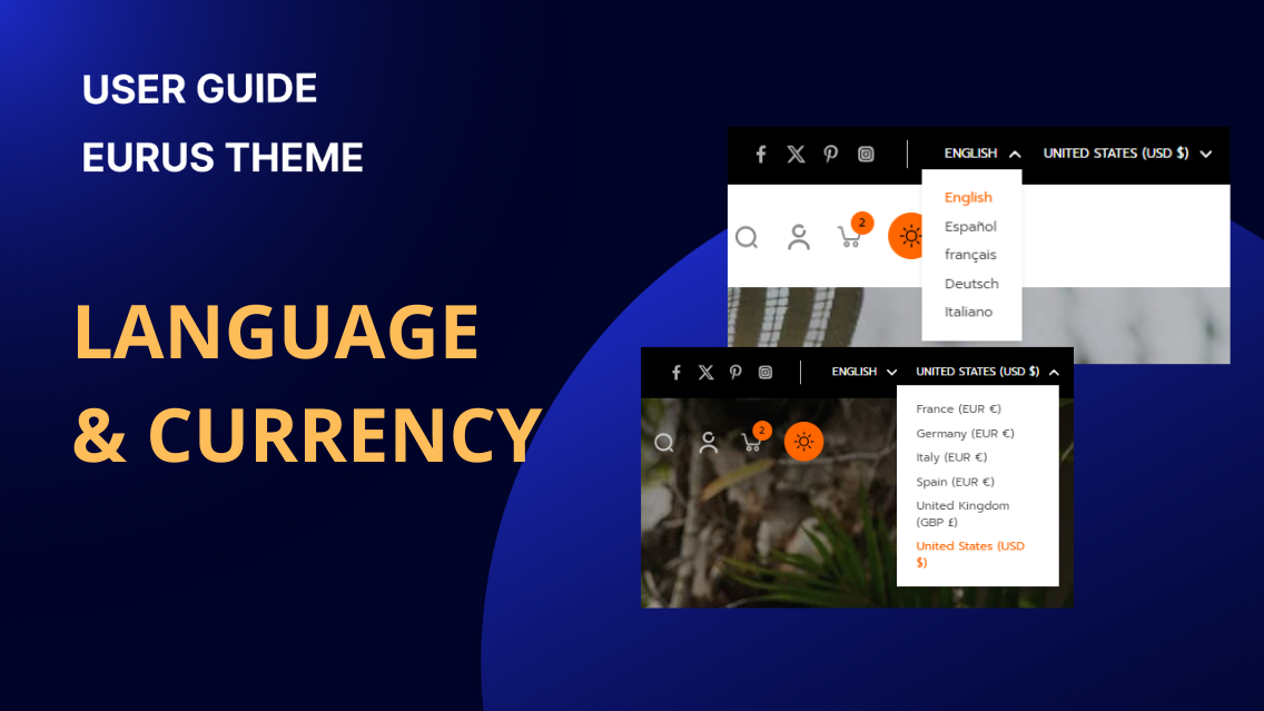
User Guide - Header
The language and currency configuration allows you to display a language and currency selector on your store’s front end. How to set up Steps: Open the Theme Editor and in the HEADER GROUP, select the Header section. In the LAYOUT settings, locate Language and currency configuration, there are 2 options “Show language selector” and “Show currency selector” Note: In order for language and currency selectors to display on the frontend, you first need to sell with multiple currencies to multiple regions around the world. To add currencies to your stores, please follow the guide here. To add languages to your stores, please go to Settings > Languages > Add language and choose the language you want to add.

User Guide - Header
Social icons typically appear in the storefront, commonly in the header and footer section, but. The exact location may vary based on the theme's design and customization. It enhances website visibility and provides easy access for users to connect with your social media accounts. How to Set Up Social Media Icons? Open Theme Editor. Find the Social Media section in Theme Settings. Enter social links for each configured account. Enable in Header or Announcement Bar: Once social accounts are added, you can choose to display them in the header or announcement bar by enabling the respective sections.
