Product page
Product page

Product page
1. Overview 1.1. What is Gift wrapping? Gift wrapping is a service that involves packaging items as gifts. Admins can create a gift wrapping service product and offer it for sale alongside regular products. It adds a personal touch for occasions like birthdays, anniversaries, or holidays, while also generating extra revenue from customers willing to pay for the convenience. 1.2. How does Gift wrapping work? When customers add a regular product to their cart on the storefront, the gift wrap service product is also added to the cart simultaneously, meaning they can buy the product and the service at the same time, or the merchant can offer free gift wrapping on some occasions. 2. How to set up Gift wrapping? STEP 1: First, you need to create a product in Shopify Admin to act as Gift wrapping product, like this: STEP 2: Choose the gift wrapping product in the Theme settings In Theme Editor, go to Theme Settings > Product additional options > Gift wrapping product, choose the Gift wrapping product created in the Shopify Admin. 👉 If you want to hide the gift wrapping product from search page, suggest search, product grid, product recommendations, cart upsell -> toggle “Hide product from catalogue”. Note: If you want to hide the gift wrapping product from customer discovery while keeping it available for purchase, Shopify now supports the Unlisted product status. To set up Unlisted product status, go to Shopify admin > Products > Choose the gift wrapping product (created in STEP 1) > Change Status to Unlisted. STEP 3: Add Gift wrap block to the product page Go to the product page you want to add gift wrapping option, under Product information section, add Gift wrap block. Once added, a checkbox will appear, allowing customers to opt for gift wrapping. STEP 4: Click “Save” when done.

Product page
This feature allows customers to subscribe to notifications when a product becomes available again after being out of stock. It's handy for customers who are interested in purchasing a product that's currently unavailable. In the Eurus theme, you can choose how the back-to-stock alert behaves. It can either show by default regardless of the stock status of the product, or only appear when the product is unavailable, based on your set up (Use "Only show when product is unavailable" setting). Admins can customize the text and message displayed when customers subscribe to the back-to-stock alert. This allows for personalized communication with customers who are interested in the product. After customers subscribe, the store owner receives an email notification about the subscription. However, it's essential for the admin to manually send an email to customers when the product is back in stock, as the theme doesn't handle this automatically.

Product page
1. What is Trust badges block? Trust badges are symbols or images displayed on your store to enhance credibility and trustworthiness. They often include security seals, payment method logos, or quality certifications. These badges reassure customers about the safety and reliability of their transactions. The Trust badges block allows you to add badge images to your product pages. 2. How to set up Trust badges? STEP 1: Add the block In the Product page, under the Product information section, add a Trust badge block. STEP 2: Click on the Trust badge block to open its settings panel: At Badge, upload the image. Paste a Link to redirect customers to another page when clicking on the trust badges. STEP 3: Click “Save” when done. 3. Support Information Need help? Contact our support team at Omni Themes Support.

Product page
To display social sharing icons, follow these steps: Go to theme settings. Then navigate to the "Social Media" section, you can see 3 Sharing Options. Share on Facebook Tweet on Twitter Pin on Pinterest Once enabled, these options will appear on the product page for customers to share across different social media platforms.

Product page
To create collapsible tabs for additional content in the description section, follow these simple steps: Add the block “Collapsible tab” From here, you can customize Open this tab by default: tick the box to make the tab expand automatically when the page loads. Set up the icon: 4 options Choose your favorite Icon from the drop-down list. Choose "None" if you don't want any icons. Find your preferred one in the Icon list, copy and paste its exact name to the “Use another icon” field. (Note: Make sure to choose Icon > "Use another icon" to activate this function.) Upload a Custom icon image. Add a Custom icon (SVG code). (For assistance with custom SVG code, please contact our support.) Use secondary background: Tick the box to show the background for the content inside the collapsible tab. Heading: enter the title of the collapsible tab to describe the content it will contain. Tab content: Add the content you want to display when the tab is expanded. Result: Tips: You can also utilize metafields to dynamically populate content based on the product, providing more personalized information.

Product page
Estimated shipping date of the product (Estimated Delivery Time)
To display the estimated shipping date of the product, under Product information section > add the Estimated delivery time block. Note that once the product is sold out, this block will be automatically hidden. To set up this block, go to the Theme settings and locate the Shipping and delivery section. Detailed instructions and settings for this feature can be found in the guide to Theme settings here. By doing so, you will set up the Estimated shipping date on the cart page, mini cart, and product page. However, if you want to customize the setting of this block on the product page, you can click straight on the Estimated delivery time block and make changes.

Product page
The benefit of showing ratings is that it enhances trust and credibility for your products. To display ratings, please note that the theme itself cannot provide a built-in review feature. You'll need to use an app for this functionality. Once you've integrated the app, you can use app blocks to show ratings, stars, and the number of reviews for each product. Check this guide for more information. Additionally, if you encounter compatibility issues with other review apps during use, please contact our support for assistance. We are happy to assist you!

Product page
To display the inventory status of products or variants: Step 1: In Theme Editor, go to Theme Settings > Product > Inventory status, and set it up as guided in this document Step 2: Under the Product Information section, add the Inventory Status block. From here, the inventory status will show as in stock, out of stock, or low stock based on the product's availability. ✍️ However, if you want to display a message for products that are out of stock but have inventory on the way: Step 3: Enable the "Notify on Incoming Inventory" setting in the Inventory Status block. ⚠️ Note: To make this feature work, you must create the incoming inventory of the product first, check out this guide from Shopify to learn more. When enabled, the message will change depending on the product’s inventory status: Default message Shown when? How to customize the message? Back in stock soon: {date} Shown when an incoming transfer has a specific restock date Go to the Inventory Status block and edit the text fields under "Incoming Transfer Notice" To change the text color, go to Theme settings > Product > Inventory status > change the In stock message color setting. On backorder, shipping soon Shown when the product is out of stock but still available for purchase. Go to the Inventory Status block and edit the text fields under "Backordered Status Notice" To change the text color, go to Theme settings > Product > Inventory status > change the Low stock message color setting. (⚠️ Note: If that product is set to be “Continue selling when out of stock”, then the text color will be the same with In stock message). Step 4: (Optional) Turn on “Hide When Pre-Order is Enabled” → If checked, the incoming inventory status won’t show when Pre-Order is active. (Since Pre-Order and On Backorder share the same display logic, this may cause confusion. You can enable this option to hide On Backorder and show only Pre-Order instead.) Step 5: Click “Save”.

Product page
This feature is applicable only for gift card products. To display the gift card recipient form, follow these steps: Navigate to the "Buy Buttons" block in the theme settings. Tick the option to show the gift card recipient form. This will allow customers to directly send the purchased gift card to the email address entered in the form, along with a personalized message. Result: In the email of recipient:

Product page
1. How to set up and customize the “Buy buttons” block? The Buy buttons block is used to display the “Add to cart” button and the “Buy it now” button at the same time. The "Add to Cart" button will be shown by default when the product is available. The "Buy it now" button is a direct route to checkout, bypassing the mini cart or cart page entirely. If you want to add and customize Buy buttons block, here’s how: STEP 1: Add the block In the Quick view section, add Buy buttons block. STEP 2: Customize the overall look of the button Click on the Buy buttons block to open its settings panel and then you can: Choose the Button style: Primary or Secondary Enable “Show dynamic checkout buttons” toggle to display the "Buy it now" button and any other dynamic checkout buttons provided by payment methods like PayPal or Apple Pay. Enable “Show add to cart” toggle to display the button. Enable “Show price on Add to cart button” toggle to show product price on the button. Toggle “Show quantity selector” to let customers choose product quantity before adding to cart. Customize colors for both primary and secondary buttons. STEP 3: Customize the Pre-order button When a product is available for pre-order, the "Pre-order" button replaces the "Buy it now" button. You can customize: Button label: Enter the text you want to show on the button. The default is “Pre-order” Message: Enter additional information about the item shown under “Pre-order” button. Toggle Show dynamic checkout buttons for pre-orders Choose Content box type (Square, Round, Adapt to edge setting) Adjust colors for the button background and text. STEP 4: Click “Save” when done. 2. How to show store pickup options? Pickup availability refers to the option for customers to collect their purchases directly from a store location, instead of having them delivered to their address. The benefits of offering pickup availability include: Convenience & Customer satisfaction: Customers have the flexibility to choose a pickup location and time that suits them best, avoiding the need to wait for delivery or worry about missing packages. Cost savings: Offering pickup options can help reduce shipping costs for both the merchant and the customer, particularly for local orders. To set up the store pickup feature, first follow the instructions provided here:Shopify's guide on setting up local pickup. Then, enable the store pickup option in the respective block settings to display it on your website. Additionally, you can tick the box "Hide when pre-order is enabled" which means the option will be hidden when the product is not available and can be pre-ordered. This may result in not offering the pickup option. Guide for Pre-order features can be found below. Result:

Product page
Product basic information (title, price, description, etc.)
1. Product title and Vendor name By default, the product title and vendor name are displayed in the product page. The vendor name appears above the product title. If you want to rearrange this order, follow these steps: Disable the "Show product title" and "Show product vendor" settings in the section settings. Then, add two separate blocks for the product title and vendor name. Additionally, you can adjust the size of the product name as needed (Vendor name cannot be resized. You can link the vendor name to a page showcasing the vendor's corresponding products on the product page. Additionally, you have the option to link to a popup page without leaving the current page, or to an external URL. To provide more details about a product's vendor, you can set it up following the priorities below: Link Vendor to Associated Collection: When you tick the "Link vendor to associated collection" option, either in a specific section or block, depending on where vendor details are displayed or added. The vendor name on the product page will link directly to a collection of products by that vendor. This offers a seamless way for customers to explore more products from the same vendor. Show Page Content in a Popup: If you prefer not to redirect customers away from the current page, you can select a page to display its content in a popup. This is especially useful when using metafields to show vendor collection in the admin. If this option is enabled, the link to the vendor's collection is applied automatically. External Link Option: If you want to provide an external link to more information about the vendor, you can fill in a URL that will direct customers to an external website or resource. The preferred option is to link to the page containing the vendor's products, as the primary goal is to provide a direct link related to the vendor. 2. Product price To display the product price, follow these steps: Add the "Price" block to your product page. This block will automatically display the price of the product. Configure Price Block: You can choose whether to include tax status and shipping policy information in the displayed price. Adjust the text size of the price to ensure it fits well with the overall design If you need more information, please read Shopify documentation for detailed instructions on Location-based tax settings. Note: If you’ve set up unit pricing in Shopify, the Eurus theme fully supports displaying it on your storefront. 3. Product description To add the product description with an option to show it as a collapsible tab, follow these steps: Add the Description block to your product page. Open the block settings panel, enable Show in tab to display the description as a collapsible tab, optimizing space on the product page. Use the Default content height setting to control how much content is shown before the "Read more" button is clicked. If you want to customize the description for each product/product variant, follow this: How to add a custom description to your product using metafields? STEP 1: Create a Product/Variant metafield Before creating a metafield: If you want to provide a custom description for your product 👉 Create a Product metafield. If you want to provide a custom description for each product variant 👉 Create a Variant metafield. Go to Shopify admin > Settings > Metafields and metaobjects > Products/Variants (based on your preference). Click Add definition and create a new metafield. Enter Name and set the metafield Type to Rich text. "Save" the metafield. If you need more detailed guidance, check this out 👉 How to create Product metafields. STEP 2: Input Metafield values Go to Shopify admin > Products. Click on the product you want to add a custom description for. Scroll down to the Metafields section and enter your custom description. For variant-specific descriptions, click a product variant and enter the content in its Metafields section. "Save" the product. STEP 3: Enter the Metafields key in Description block Go to Product page > Product information section > Description block. In the Custom description field, enter the namespace and key of the created metafield. You can enter both product and variant metafield key to display both of them. STEP 4: Click "Save" when done. 4. Product variants and Quantity selector To include product variants and a quantity selector on your product page: Adding the "Variant Picker" block will automatically display all variants of the product. You can configure this block to display variants either as a dropdown menu or as buttons, depending on your preference. Type: Dropdown Type: Button Add Quantity Selector Block to enable customers to specify the quantity of the product they wish to purchase. This block allows customers to adjust the quantity before adding the item to their cart, providing them with more control over their purchase. You can select the style of the block with 4 options: Adapt to edge setting, Rounded, Square, Rounded corners.

Product page
Show multiple images for each product variant
Want to show off multiple images for each product variant? Shopify’s one-image-per-variant rule might cramp your style. The Eurus theme 6.6.0 update lets you easily add as many images as you want. ✅ New in Eurus 8.7: You can now assign images based on multiple product variants (e.g. both Color and Size). Just follow the updated ALT tag and theme settings below! 1. How It Looks on Your Store 2. Setting Up the Product Step 1: Access your product in Shopify In Shopify admin, go to Products. Select an existing product or click Add Product to create a new one. For detailed instructions, check Shopify’s guidelines. Step 2: Upload images & update variants In the Media section, upload all the images you need. In the Variants section, enter the option name and option values for your product. Step 3: Edit ALT text Click the image to edit the ALT text Select Add alt text and type in the ALT text: The ATL Text is the same with Option value you set above, MUST follow this format: For only one variant For multiple variants #option-value #: hashtag character option-value: written in lowercase, replace spaces with - #option-value-1_option-value-2 Use a single # followed by option values for all variants, separated by _ (underscore) Use - (hyphen) for spaces inside each option value Example: Inside the option name "Color", there is an option value called "Mint blue," then for all images representing this Mint blue option, enter #mint-bluefor your alt tag and click "Save" Example: If your variant options are Color = "Mint blue" and Size = "XS", use:#mint-blue_XS ⚠️ Note: If your option value contains special characters (e.g. periods, slashes, plus signs) or spaces, replace them all with - (hyphen) when writing the ALT text. Example: Option value "3.4 oz" → ALT text: #3-4-oz Additionally, avoid using # within your option value itself, as this will cause the image filter to break. All images related to one Option value use the same ALT text ❓ What about my ALT text for SEO purposes? Simply type your desired text in the ALT field before the # symbol, like this: Example: Super attractive and comfortable #mint-blue. 3. Setting Up the Eurus Theme Step 1: Go to the Theme editor and navigate to the Product Page. Step 2: On the right panel, scroll down and enable "Only show media associated with the selected variant". Fill in the Option name in "Option to classify variant media" If you're using multiple variant options (e.g. Size and Color), list one per line, like this: Click SAVE. Important note: The text must exactly match the Option name in Shopify admin Enter all languages available on your site, separated by semicolons (e.g. Color; Colour; Couleur) Note: ✅ Works only for Product information and Featured Product sections. ✅ If ALT tags are set up, the default variant image added in Shopify admin won’t be shown as product featured image. In this case, images which do not have any option name's alt tag will be hidden. ✅ Images display on your storefront in the same order arranged in the Shopify admin media list. 4. How to Show Variant Images on the Page First Load Make a great first impression with your customers! Learn how to immediately show the most relevant images when customers land on your product page. Step 1:In the Theme editor under the Product information section, enable the "Show variant images on page load" option. This makes sure that when a customer first visits the product page, the variant images show up according to the ALT tags you’ve set up. Step 2:Choose how you want to display variant images on the first visit: Status of The result on first page load Enable Only the images related to the first product variant will be shown. Disable The Shopify default variant image will be shown. Need Help?Contact support if you encounter any issues.

Product page
1. What is product information? Product information is the essential content displayed on a product page, providing customers with details about the product's features, specifications, dimensions, materials, and more. It helps shoppers understand what the product is, what it offers, and whether it meets their needs or preferences. Additionally, product information may include images, videos, reviews, and other media to offer a comprehensive view of the item. This information is crucial for customers to make informed decisions and feel confident about their purchases. This post will walk you through the steps to set up the product information section, allowing you to personalize your product page. 2. How to set up the Product information section? a) How to customize product media display? If you want to customize the media display on the product page: STEP 1: Open the settings Navigate to the Product page > Product information section > Media settings group. STEP 2: Customize product media layout Choose the layout displayed on the desktop Desktop layout: Left Desktop layout: Right Choose media layout: Desktop media layout: Thumbnail slider Desktop media layout: Stacked Desktop media layout: 2 columns Choose Mobile media size, Image ratio, Thumbnail position STEP 3: Choose media transition and effect Choose Transition style: Slide or Fade Enable image zoom and choose a Zoom effect you want: Option name How does it zoom? Enlarge (default value) When clicking on the image ➜ a full-screen pop-up of only that image will show, like when viewing a larger version of a product image. Magnifier When hovering over the image ➜ a zoomed-in view appears, like when using a magnifying glass to see details. Image Gallery When clicking on the image ➜ a full-screen pop-up with all product images displayed as a gallery will show. Enable video autoplay (available for Thumbnail slider layout). Once video autoplay setting is enabled, you can activate looping by checking the "Enable video looping" option in the settings. Note: When looping and autoplay are enabled, the video will automatically mute. Customers can manually unmute the video using the video player controls if they wish to hear the audio. STEP 4: Click "Save" when done. b) How to show breadcrumbs on the product page? To show breadcrumbs on the product page, you can: Enable the “Show breadcrumbs” setting to display breadcrumbs. Choose whether to include borders around the breadcrumbs for a defined appearance. Expand the breadcrumbs to the full width of the desktop screen for enhanced visibility with “Make breadcrumbs full width on desktop” setting. c) How to show multiple images for each product variant? Please refer to this guide to set it up. 3. How to set up a block inside the Product information section? The Eurus Theme is regularly updated and offers 30+ different blocks to showcase information on your product page. Click on a block's name to view its guide: Add to cart & Buy buttons Back to stock alert Collapsible tab Collection link Complementary products Customizable options Description Engraving Estimated delivery time Featured icon Frequently Bought Together Gift wrap Horizontal tabs HTML Inventory status Labels and badges Nutrition fact bar Payment methods Price Product rating Product title Quantity selector Separator Sibling products Size chart SKU Social sharing Sticky add to cart Table of information Text Text with icon Trust badge Variant picker Video shopping Vendor name Volume pricing table If a block isn't clickable, its guide isn’t available yet. If you need help setting up those blocks, contact us here: Omni Themes Support.

Product page
To show a sticky add-to-cart bar, follow these simple steps: Step 1: In the “Product information” section, add the "Sticky add to cart" block to your product page. Step 2: Customize the following key settings: Choose how the add-to-cart bar appears on desktop screens by using setting “Desktop display type” (Popup/Full width) Enable the quantity selector for customers to adjust the quantity of items they want to add to their cart. Full width: Popup Enable "Link to original add to cart button": ON: When customers click the sticky add to cart button, they will be taken to the original "Add to Cart" button on the page. OFF: Clicking the sticky button will add the product to the cart immediately (cart popup appears).

Product page
1. What is the Product Recommendations? The Product Recommendations section dynamically displays products that customers may also like, based on their browsing behavior, their orders, and the product information. 🔍 For more information, take a look at the guide about Related products. 2. How to set up the Product Recommendations? If you don’t know where to start with your Product recommendation section, simply follow these steps: Step 1: Install Search & Discovery application: Before starting with the theme, you will need to install the Shopify Search & Discovery application from the Shopify app store. By default, the app will auto-generate the recommended products based on each customer’s viewing or buying history, but you can manually add, remove, and edit this list to match your preferences within the app settings. 🔍 For more details, check out this guide from Shopify. Step 2: Show the Product Recommendations section: In Theme Editor, you need to: Click on the Home page drop-down menu, then select Product page. Under Template, find the Product Recommendations section. By default, this section is hidden, click on the Eye button to unhide it. Step 3: Adjust the numbers of products shown: Click on the Product recommendations section to open its settings panel. Then, scroll down to find and adjust the Maximum products to show (from 2-10). Step 4: Customize the overall look: Enter Heading, but some words inside a [] bracket to add the heading highlight effect. Change the Background color. Step 5: Click “Save” when done. 3. How to enable Recently viewed products tab? To enable a Recently viewed products tab for a better customer experience, follow these: STEP 1: Open the settings Click on the Product recommendations section to open its settings panel. Scroll down to Recently viewed products settings group. STEP 2: Set up the tab Toggle Show recently viewed products tab ON to enable the tab Tick the checkbox “Enable clear history” to allow users to clear their viewing history manually. STEP 3: Customize the tab display Further adjust how the tab looks: Tabs desktop alignment: Choose Left / Center / Right Title size: Adjust using the slider (e.g., 120%) Text style: Select your preferred typography style STEP 4: Click “Save” when done 4. How to make your Product recommendations carousel? Step 1: Click on the Product recommendations section to open its settings panel. Step 2: Scroll down to the Carousel setting group. Step 3: For desktop: Turn on the Enable carousel on desktop. For mobile: Turn on the Enable swipe on mobile. (Optional) Turn on "Enable next/previous arrow on mobile" to show the arrows so customers can click to see the next blocks instead of scrolling through them on mobile. Step 4: Click “Save” when done. 5. How to change the information shown for each product card? Step 1:Click on the Product recommendations section to open its settings panel. Step 2:Scroll to the Product card options group. Step 3:From here, you can customize the following: Show vendor: Toggle this option on/off to display or hide the product vendor name. Show product rating: Turn this option on/off to display star ratings for products. ⚠️ Note: To enable product ratings, ensure you have a product rating app installed and set up in your store. Show highlighted attributes: Turn on/ off to show the icons at the bottom of the product cards. To learn how to set it up, check out this Highlighted icons on product cards guide. Show Quick View button: Turn on/off to enable or disable the Quick View function. Step 4:Click “Save” when done. 6. How to set the number of columns for Product Recommendations? Step 1:Click on the Product recommendations section to open its settings panel. Step 2:Scroll down to the Layout settings group. Step 3:Adjust the following options to set the number of columns: Desktop columns: Use the dropdown or slider to choose the number of product columns displayed on desktop (options typically range from 2 to 5). Mobile columns: Use the dropdown or slider to select the number of product columns displayed on mobile (commonly 1 or 2). Step 4:Click “Save” when done.
Product page
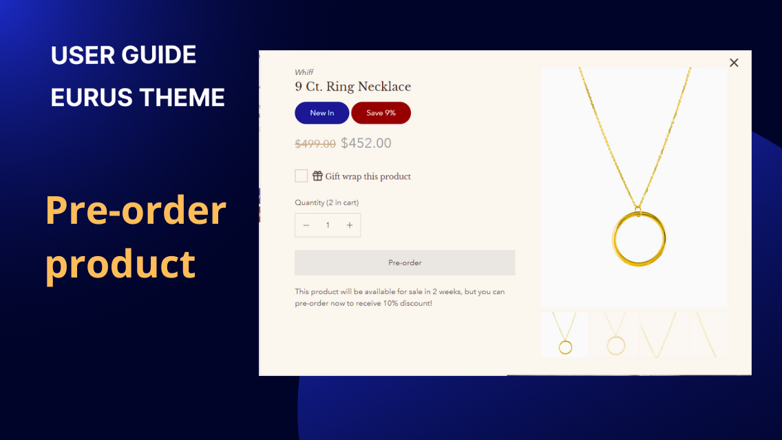
1. What are Pre-order Products? Pre-order Products allow customers to purchase items that are currently out of stock or yet to be released. Instead of seeing a typical "Out of Stock" message or hiding the products from the storefront, customers can place an order in advance, securing the product once it becomes available. This feature is particularly useful for managing inventory, gauging demand, and keeping customers engaged even when a product isn't immediately available. 2. How to show the pre-order status on the product card, cart, and checkout pages Step 1: Enable Pre-order Feature: Navigate to Theme Settings > Products > Pre-order. Enable the Pre-order option by selecting from the following logic: Yes: All products will display a "Pre-order" button on the product card, product page, quick view, featured product, and in the product property. No: No product will display the "Pre-order" button in any location. When product is Out of Stock: Products that are i) out of stock and ii) have the "Track Quantity" and "Continue Selling When Out of Stock" options enabled will display the "Pre-order" button. Step 2: Apply Pre-order to Specific Products or Collections You can choose to apply the pre-order settings to specific Products or Collections: If neither is selected, the pre-order setting applies to all products meeting the above criteria. If both are selected, the pre-order setting applies only to the selected products and collections as long as they meet the above criteria. Step 3: Customize Pre-order Button Label & Cart message Add a Card Button Label configuration to customize the label of the pre-order button on product cards. The default label is "Pre-order". Add a Pre-order Cart Message configuration to display a message in the cart or mini-cart for pre-ordered products. The default message is "Ships in 2 weeks". The message will appear in the product property section in the format: Preorder: [message]. In the product page: In the product card: In the mini cart: Step 5: Add Pre-order Label Block Go to the Overlay group > Product Labels & Badges section and add the block Pre-order. This block will have similar configuration options as the Sale Label block. You can edit the label text, choose an icon to display next to the heading, and adjust the position of the label on the product cards. Only one Pre-order block can be added.
Product page
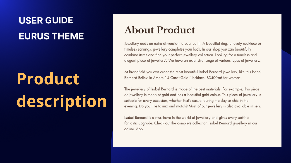
1. What is the product description? A product description provides an overview of a product's features, benefits, and key selling points. It is typically used to replace the standard description block in product information when the description is lengthy or contains rich content. Well-crafted product descriptions can help to attract customers, increase sales, and enhance the overall shopping experience. 2. How to modify the width of the description? By default, the description will be displayed within the page width. To modify the width of the description, follow these steps: Navigate to the "Desktop layout" settings. Look for the "Content width" option. Adjust the custom width for the content block using a percentage relative to the page width. This will result in a more compact display of the description. Optionally, enable the "Make section full width" option to allow the content to span the entire width of the section. 3. How to change the text size of the description? To change the text size of the description, you can follow these steps: Add a custom heading for the section if necessary. You can configure the alignment and size of the heading according to your preference. Adjust the overall text size using the Text size configuration. This will affect the size of the text within the description. Additionally, Line spacing configuration controls the spacing between two lines of text within the description. Additionally, you can customize the padding, style, and other settings to further enhance the appearance of the description. Conclusion: By customizing text size, alignment, and padding, users can create visually appealing descriptions that effectively communicate the unique features and benefits of the product.
Product page
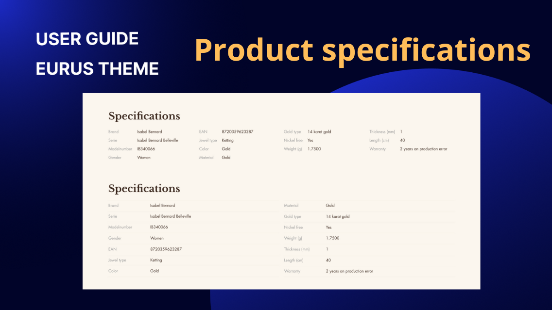
1. What is product specification? Product specifications refer to detailed information about a product's features, components, measurements, or other relevant details. This comprehensive overview is particularly suitable for products with complex structures or compositions, such as materials, dimensions, nutritional information, or any other relevant metrics. These specifications serve as a valuable resource for consumers seeking specific details about a product before making a purchase. 2. How to show product specifications in the table? a) Using Plain Text: Within the section, add a "Specs" block. Configure the following settings in the block: Optionally add a custom icon using SVG code. Contact support for assistance with custom SVG code. Enter the title for each row of specifications. Enter the specific details or values for each row. The row titles and contents will be displayed in the table format. This method is suitable for scenarios where multiple products share the same specifications and values. b) Using Product Metafield Values: First, create a product metafield following Shopify's guideline and assign value(s) to the metafield. Within theme editor, under the section, add a "Product Metafield Values" block. Add a row title for each specification. Add the corresponding metafield value as row content. This method is applicable when different products have different specifications. Please note that each block can show one metafield's value(s). You can use Shopify's bulk update feature in the admin panel to mass update values for this metafield. Additionally, all types of metafields can be used here. 3. How to set up the specifications table? To set up the specifications table, you can configure the following main settings in the section settings: a) Heading & Text Enter the title for the specifications table. Adjust the size of the heading text. Choose the appropriate HTML tag for the heading. Align the heading text to the left, center, or right. Add any additional text or descriptions related to the specifications. b) Optional image Add an image to accompany the specifications table. Customize the image specifically for mobile devices. Choose the style or layout for displaying the image. c) Layout Specify whether you want the specifications table to have one column or two columns. Adjust the height of the image on desktop devices. Enable or disable the section divider to separate this section visually from others. Set padding to control the spacing around the specifications table. Choose colors in Style settings. Overall, a well-structured specifications table enhances the understanding of product attributes and aids in facilitating informed purchasing decisions for customers.
