Collection page
Collection page
Collection page
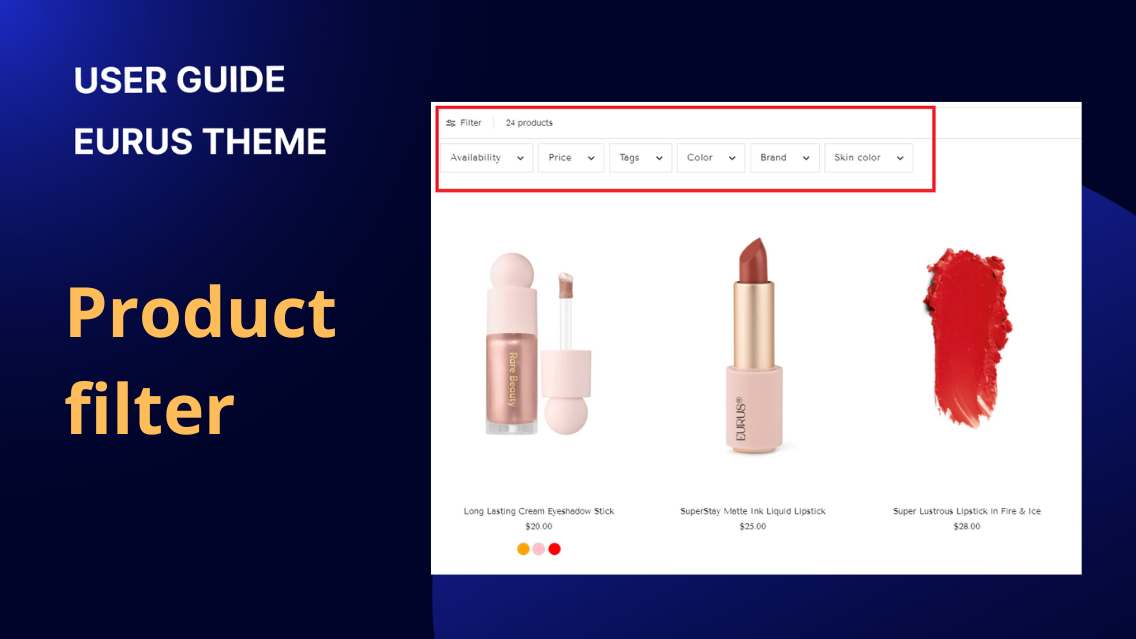
Product filters are features used to refine and narrow down search results or product listings based on specific criteria such as price, color, size, or category. They enhance the shopping experience by allowing customers to quickly find the products that match their preferences or requirements. At the theme level, you cannot directly add filters to your store. Instead, you'll need to utilize apps like Shopify Search & Discovery. These apps offer advanced filtering capabilities and integration with your Shopify store. For detailed instructions on how to set up and customize filters, you can refer to the Shopify guide here. Once configured through such apps, the theme's role is to display these filters on your storefront, typically on collection and search results pages, enabling customers to easily navigate through available options. The product grid section is set to display 15 products per page in a five-column layout on the desktop. It has the product filtering and product sorting options enabled. You can also enable sticky filters bar on desktop. When this setting is enabled, the filters bar will remain fixed to the top of the viewport as your customers scroll on desktop devices.
Collection page
The section has both the Show featured image of collection and Show collection title options checked. In order for all the necessary information to show up you will need to set a Title, a Description and a Collection image for each of your Collections. You can do that from the Collections menu under Products in your Shopify Admin. Section settings Image Show featured image of collection Used to show collection image Image opacity Set the opacity of image Image width Choose option for image width ( Boxed width/ Full width) Collection title Show collection title Used to show collection title Position Adjust the position of collection title Size Adjust collection title size Color Change color collection title Description Show description Used to show description of collection Content alignment Change the alignment of description Layout ( Desktop/Mobile) Image height Select height option:*Use image of the first slide*Fixed height *Full screen Fixed height Adjust image height for each device: *Desktop : 300px - 800px*Mobile : 200px - 500px Padding ( Top/Bottom) Adjust the padding on top of the section (range from 0 to 100 px).

Collection page
1. What is a collection banner? A collection banner is a key visual and informational component on a collection page, primarily used to highlight and present various content such as featured images and breadcrumbs. It serves both aesthetic and functional purposes, enhancing user engagement and guiding users through the collection. 2. How to show a collection banner on a collection page? To show a collection banner on a collection page and configure its settings, follow these steps: Look for the option labeled "Show collection image" and tick the checkbox to display the collection image on the banner. Adjust the height of the collection image on desktop devices. Set the overlay opacity of the image. The higher the value, the clearer the overlay on the image. Adjust the height of the collection image for mobile devices. Set the padding on top & bottom of the banner. This can range from 0 to 100 px. If you need to add a specific title to the collection banner, you will need to follow these settings: Decide whether to display the collection title. Adjust the position of the collection title. Adjust the size of the collection title. This can range from 50% to 200% of the default size. Select the heading tag for this section to enhance the SEO of the page. 3. How to show breadcrumbs in the collection page? Breadcrumbs are a navigational aid used in websites and applications to help users understand their location within the site's hierarchy and to easily navigate back to previous sections. To show breadcrumbs on a collection page and configure their settings, follow these steps: Select "Breadcrumbs" from the list of available blocks. Tick “Show breadcrumb borders” or “Make breadcrumbs full width on desktop” if needed Adjust the alignment of the breadcrumbs on desktop/mobile devices. Choose the color of background/text/text link for light/dark mode for the breadcrumbs. 4. How to show a collection description on a collection page? To show the collection description on a collection page and configure its settings, follow these steps: Add a block and select "Description". Use the "Default Content Height" setting to control how much content is shown before the "Read more" button is clicked. You can select from 4 options: Show full content, Small, Medium, or Large, based on your preference for how much content is visible initially. Adjust the alignment of the content on desktop/mobile devices. Adjust the style settings (like background color, text color, and padding) to match your website's design. Adjust the padding on top/bottom of the block If the collection description is long, use the "Show Read More" button feature. The "Read More" button helps manage long descriptions, keeping the page clean and user-friendly. Specify how many lines are shown by default. Customize the label of the button.
Collection page
1. What is a product filter? Product filters are features used to refine and narrow down search results or product listings based on specific criteria such as price, color, size, or category. They enhance the shopping experience by allowing customers to quickly find the products that match their preferences or requirements. At the theme level, you cannot directly add filters to your store. Instead, you'll need to utilize apps like Shopify Search & Discovery. These apps offer advanced filtering capabilities and integration with your Shopify store. For detailed instructions on how to set up and customize filters, you can refer to the Shopify guide here. Once configured through such apps, the theme's role is to display these filters on your storefront, typically on collection and search results pages, enabling customers to easily navigate through available options. In the collection page: In the search page: 2. How to create filters for collection/search results pages? To create filters for your collection and search results pages, you'll need to rely on apps like Shopify Search & Discovery. Each app may have its own documentation and instructions for adding filters, so it's essential to refer to the specific documentation provided by the app you're using. You can find detailed instructions in the documentation provided by the Shopify app you've installed. For more information, you can refer to the Shopify documentation here: Shopify Search & Discovery Filters Documentation. 3. How to customize the filters in the storefront? To customize the filters in the storefront, the Eurus theme has these settings: Enable the filters and customize the filters. Configure the layout, including options for sticky filters. Choose desktop filter layout: Drawer, Aside, Above Set up pagination for navigating through the filtered results: Offer options for customers to select the layout of products on desktop and mobile separately; Pagination type Customize the information shown on the product cards like vendor, Quick view button.. Adjust padding and styling to ensure the filters blend seamlessly with your storefront's design. By configuring these settings, you can tailor the filters to suit your preferences and optimize the browsing experience for your customers. 4. Dynamic Grid Filters a) What are Dynamic Grid Filters? Dynamic Grid Filters is a distinctive feature in the Eurus theme, designed to enhance the product discovery experience by displaying filter values as an image grid. These Filters allow you to showcase up to two filter values as images, making it easier for customers to visually understand and select product attributes. These filters work independently, just like standard filters, but are presented in a more visually engaging format. Why Use Dynamic Grid Filters? Convenience: Helps customers quickly identify product variations through images. Visual Appeal: Creates a more engaging and aesthetically pleasing shopping experience. Improved UX: Enhances user experience by making product attributes clear and accessible. Boosted Conversion: By simplifying product discovery, you can increase the likelihood of conversions. b) How to set up the Dynamic Grid Filters? This guide will walk you through the process of setting up Dynamic Grid Filters, step by step. Filter app requirement: The Eurus theme does not natively support filter display; you will need a filtering app like Shopify's Search & Discovery to enable and manage filters. Step 1: Create Filters 1.1. Create the Filter Option Depending on how you want to filter products, you can create filters using either product options or metafields. Using Product Options: If you already have swatches or images set up as product options, you can skip this step and proceed to create the filter in the app. For help setting up color swatches, refer to Shopify’s Product Filter Guide or our Product Swatches Guide. Using Metaobject/Metafield: If you prefer to use metafields for filtering, follow these steps: Create a Metaobject: Ensure it includes a field for the filter option name and a field for color/image input in a one-value format. Create Entries: Input relevant data into the metaobject. Create a Metafield: Set the type as "Metaobject reference", choose the metaobject that was created previously. Ensure that the metafield is set to accept only one value. Assign Metafield to Products: Go to each product and assign the metafield to the corresponding entries. 1.2. Create the Filter in the App Once your product options or metafields are set up: Navigate to the Search & Discovery app in Shopify. Follow the Shopify Filter Setup Guide to create filters. Also, refer to the Storefront Filters Customization Guide to fine-tune the filters. Step 2: Front-End Setup 2.1. Enable Dynamic Grid Filters Go to your theme's settings in the Product Page or Collection Page section where you want to display the filters. Enable the Dynamic Grid Filters option. 2.2. Configure Filter Display Enter Filter Names: Input the names of the filters you created (e.g., color, skin type). Each filter should be on a separate line. You can configure up to two filters. Set the number of columns to display each filter. Adjust the image width for each filter option to ensure optimal presentation. c) Eurus' Dynamic Grid Filters vs. Shopify's Visual Filter? A Shopify visual filter enables customers to narrow down product searches using visual elements such as color swatches or images. This feature improves the shopping experience by helping users easily identify products through visual cues. For further information, refer to this article: Visual filters. Similarities: Both Eurus' Dynamic Grid Filters and Shopify's Visual Filter allow the use of images or color swatches alongside names to represent filter values, enhancing the user experience by making it easier for customers to understand and interact with filter options. Differences: Storefront Display: Shopify's Visual Filter: Displays filter values in a standard visual format similar to other filters. While it improves UX by adding visual elements, it is more compact and less prominent on the storefront. Eurus' Dynamic Grid Filters: Provides a more comprehensive and visually striking display. The most often used or most important filters are presented in a larger, more prominent grid format, making them more noticeable and engaging to customers. This layout not only draws more attention but also offers more space to convey additional information or promotional messages related to the filter value. Example: Shopify's Visual Filter: Best suited for stores looking for a simple, integrated filter option that blends seamlessly with other filter types. Eurus' Dynamic Grid Filters: Ideal for stores aiming to make a bold visual impact with their filters. The larger display size and more detailed presentation are perfect for highlighting important filter options, enhancing product discovery, and boosting conversion rates by appealing directly to customers' visual senses.

