Overlay group
Overlay group
Overlay group
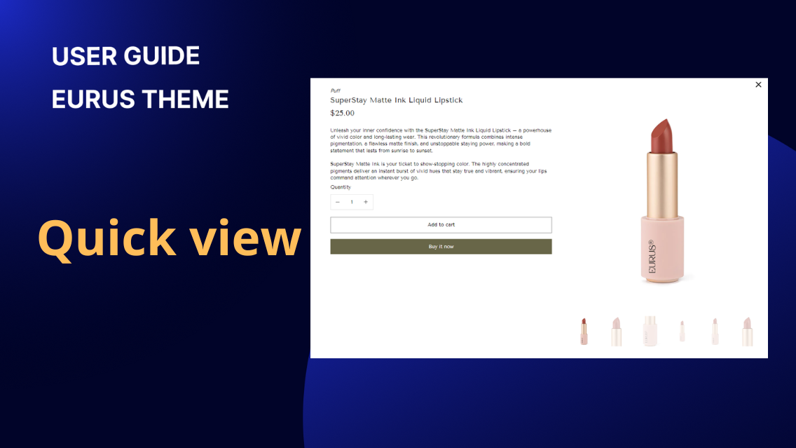
1. What is a Quick view? Quick View is a feature that allows customers to quickly preview product details without leaving the current page. Typically, when users hover over a product image or click on a designated button, a modal window or pop-up appears, displaying essential product information such as name, price, variants, and a brief description. Quick View enables customers to make faster purchasing decisions by providing them with essential product details without navigating to a separate product page. This feature enhances the user experience by reducing the number of clicks required to view product information, ultimately streamlining the browsing and shopping process. ✍️ How to locate the Quick view section in Theme Editor: Open the Theme Editor in your Shopify admin (Online store > Themes > Customize). In the left-side panel, scroll down to find the Overlay group. Click on the Quick view section. From here, you can customize its settings such as Quick View button's color, media size, transition style, and more. 2. How to show a Quick view button on the product cards? Quick view allows users to quickly preview a product without having to navigate away from the current page or go to the full product detail page.To show the Quick View button on the product cards, follow these steps: Open the theme editor and navigate to the overlay group section. Then, enable the Quick View section. Configure the settings in the Product card group. These settings will apply to all product cards and include: Enable the "Show Quick view button" configuration, which opens a popup displaying product details without leaving the current page. Customize the Quick view button label. Configure button styles such as button color. When "Show Quick view button" is enabled, it will display only one button. 3. How to show a Quick add button on the product cards? Quick add (or Quick buy) allows customers to add a product to their shopping cart directly from the product cards. To show the Quick add button on the cards, open the theme editor and navigate to the overlay group section. Then, enable the Quick View section.Configure the settings in the Product card group. These settings will apply to all product cards and include: Enabe the "Show Quick add button" Adjust the Quick add desktop/mobile position: Select whether to display it on top of the product image or at the bottom of the product card on desktop/mobile. Here is the logic of this section: When both "Show Quick add button" and "Show Quick view button" are enabled, two buttons will be displayed. The Quick add text will display as: "Choose options" when the product has options "Add to cart" when there are no options "Sold out" (with the button disabled) when the product is unavailable. When "Choose options" is clicked, content will slide up to allow the selection of options and adding the product to the cart. 4. How to set up Quick view content? To set up Quick View content, follow these steps: a) Setup display: Choose the product to preview in the Quick View. This is just a preview, and the settings will apply to all products. Adjust the title size, heading tag, and decide whether to show the vendor name. Configure how media is displayed within the popup. This is similar to setting up media in the product info section. You can refer to the guide for setting up media here. b) Organize product information in the Quick View popup: Organize the product information similarly to how it's done in the product information section, excluding certain blocks that are only applicable on the product page, such as back in stock, complementary products, and sticky add to cart. 5. How to set up Quick Add Variant Picker When Quick add is enabled, all product variants are shown automatically. You can choose to show variants as either a dropdown menu or buttons in theme settings. Type: Dropdown Type: Button 6. How to show the Payment method on quick view? By following these steps, you can customize the display and organization of information in the Quick View popup for your products. In Theme Editor, scroll down to the Overlay area at the bottom. Click on Quick View section. Tap on Add block, seach and select the block named Payment methods. Click Save when done. From here, you can change the heading, and description, add payment icons, and customize the colors in the Style area. 7. How to customize the “View product details” button? ✍️ What is the purpose of “View product details” button? When clicked, this button takes customers to a page where they can learn more about the product: features, specifications, and customer reviews. This button can be especially useful in sections that have limited space. ✍️ How to add and customize the “View product details” button? In the Featured product section, add a new block called View product details, you will have 3 style choices to choose from: Style choice Example look of the button Primary Secondary Text link You can freely change the button, text, or hovering color for the button as you want.
Overlay group
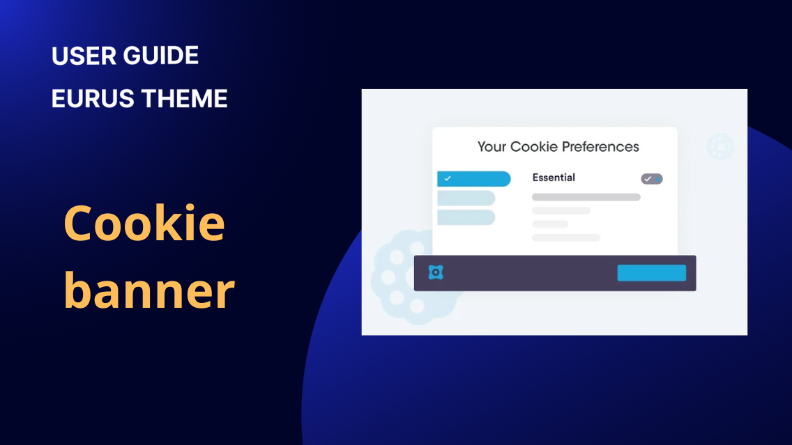
1. What is a cookie banner? A cookie banner is a notification that appears on a website, informing visitors that the site uses cookies and seeking their consent before collecting any data. It serves as a tool for compliance with privacy regulations, particularly in regions where asking for user consent before collecting data is mandatory for online merchants. ✍️ How to locate the Cookie banner section in Theme Editor: Open the Theme Editor in your Shopify admin (Online store > Themes > Customize). In the left-side panel, scroll down to find the Overlay group. Click on the Cookie banner section. From here, you can customize its settings. 2. How to set up the cookie banner with the Eurus theme? Firstly, activating the Cookie Banner: Activate the default Shopify cookie banner by following the steps provided here: Configuring customer privacy settings. After that, you can set up the banner in two ways: a) Approach 1: Using Eurus Theme's Cookie Banner (Recommended): Eurus Theme provides advanced customization options for the cookie banner, allowing you to tailor its style, buttons, and message to match your brand identity. To do this, follow these simple steps: Step 1: In the Overlay group section, locate the Cookie Banner section. Step 2: Enable the cookie banner feature.Step 3: Once enabled, you can customize various aspects: Set up the cookie message: Craft a clear and concise message that informs users about your site's cookie usage. If you want to time the appearance of the popup from when a visitor enters the site, use the “Delay” config (measured in seconds). Configure buttons: Customize the buttons to align with your brand or encourage specific actions. Style adjustments: Tailor the banner's appearance to match your website's overall design. b) Approach 2: Using Shopify's Banner: Alternatively, you can create a cookie banner within the Shopify admin. Once set up, this banner will override the theme’s cookie banner by default. Refer to this document by shopify to set this banner up.
Overlay group
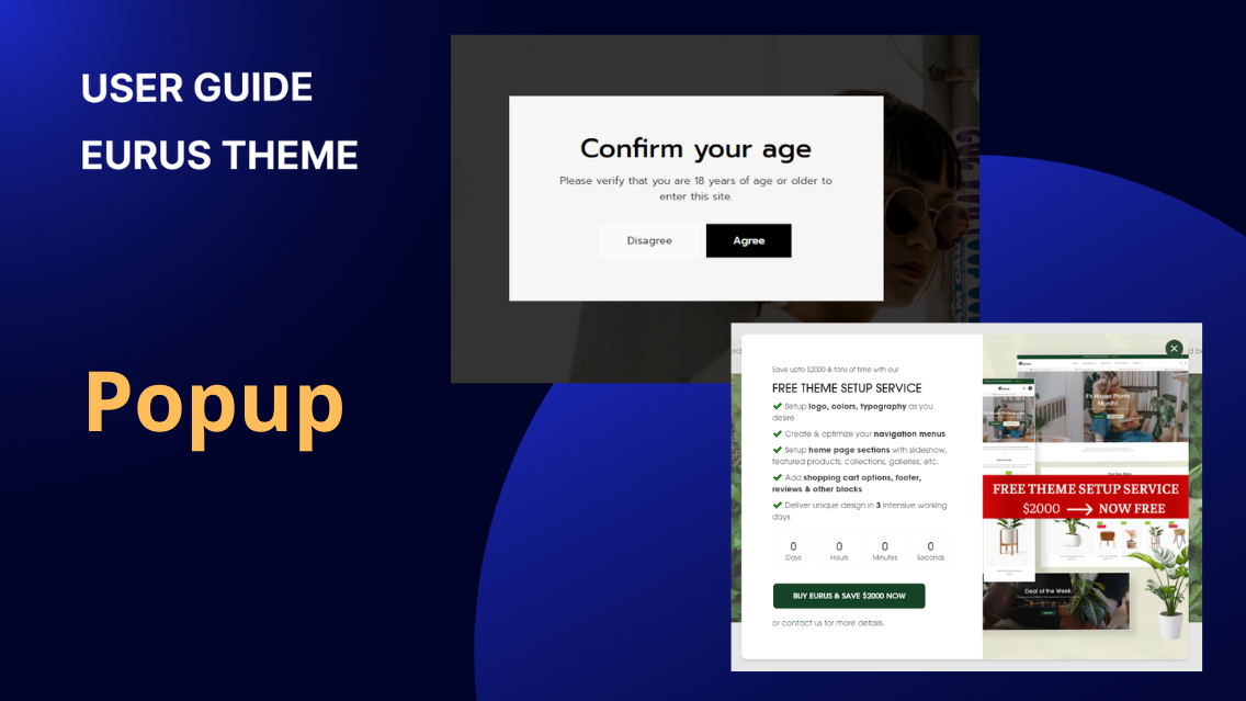
1. What is a popup? The pop-up feature in the Eurus theme provides an effective way to capture user attention and convey important messages or promotions. It offers unlimited pop-ups (in both minimal and full style of popup), allowing for easy customization to match your brand's aesthetic. Additionally, it includes features such as countdown timers and scheduling options, enabling you to create engaging and time-sensitive pop-up campaigns to enhance user engagement and drive conversions. ✍️ How to locate the Popup section in Theme Editor: Open the Theme Editor in your Shopify admin (Online store > Themes > Customize). In the left-side panel, scroll down to find the Overlay group. Click "Add section" and choose Popup. From here, you can customize its settings. 2. Types of popups in Eurus theme and how to set up Popups: In the Eurus theme, you can utilize three main types of popups to enhance your website's functionality and user engagement: a) Promotion Popup: Overview: This type of popup is ideal for showcasing promotions, sales campaigns, or limited-time offers. It can include a countdown timer to create a sense of urgency and encourage immediate action. Additionally, you can incorporate coupon codes to incentivize purchases and boost conversions. General Configuration: You can adjust the position of the popup (for desktop display only), add images, position content to the left or right, align content to the left, center, or right, and choose text and background colors. Display rules: Optimize your popup display with Eurus Theme's versatile display rules, allowing you to tailor the appearance based on guest status, mobile preferences, scheduling, and reappearance frequency for an enhanced user experience. Admin can choose whether the popup appears for non-logged-in visitors by using the “Show for guests only” config, enhancing their experience with tailored content for different customer groups. Eurus theme allows you to optimize the mobile experience by deciding whether the popup displays on mobile devices or not with “Show on mobile” config. It's recommended to show only one full popup at a time on mobile for better user engagement, but you can choose to show minimal popups or display them at different times. Activate the “Schedule” config to set specific start and end dates using the 'Countdown timer' block (read the guide below). This is useful for automating when to show or hide popups without manual intervention. For example, to schedule a popup for a Christmas campaign, set the start and end times. The popup will automatically appear and disappear based on the countdown. If you want to time the appearance of the popup from when a visitor enters the site, use the “Delay” config (measured in seconds). If a customer closes a popup, the admin can use the "Reappear after" config to determine when the popup will show again, measured in days (offering flexibility from 1 to 30 days). Adding Coupon Code: Coupon codes are a powerful marketing tool that encourages users to make a purchase by providing them with a special discount code they can use at the checkout. In the Text block, provide instructions like "Simply enter code coupon_code at checkout" and enter the Coupon code content (e.g., SIMPLY10). This allows customers to copy and use the coupon code easily during checkout. Example: Result: Showing Countdown Timer: Countdown timers are effective for promotions with deadlines to encourage quick action. Include a countdown timer block to create urgency for limited-time offers. Admin can set up the time zone, start and end times for the countdown, and style (color) for this block. Example: Result: b) Newsletter Signup Popup: The newsletter signup popup provides a convenient way for visitors to subscribe to your newsletter or mailing list. It helps you capture leads and build a loyal customer base by allowing users to easily opt in to receive updates and promotional content. Simply add the Email form block to collect newsletter subscriptions. You can conveniently display Social icons here by adding a Social Icons block to the popup, making it easy for customers to contact you. c) Age Verification Popup: For websites that contain age-restricted products or content, the age verification popup is essential for ensuring compliance with legal requirements. This popup prompts users to confirm their age before accessing certain areas of the website, helping you maintain regulatory compliance and responsible marketing practices. Admin can add a Background image, adjust Overlay opacity, and set the popup to reappear after a specific number of days (1-30 days). This feature controls how soon a dismissed popup will reappear. Conclusion: By following these steps and tips, you can effectively set up and customize popups in your Eurus theme to engage users, promote offers, capture emails, and comply with age restrictions. 3. How to show popups in minimal style? Minimal popups in Eurus Theme are a simplified version designed to show multiple popups without occupying much space on the screen, while also ensuring that important content on the page is not hidden. They feature a small sticky message at the bottom, and users can click it to open the full popup with detailed information or actions. This allows for a streamlined and efficient popup experience, ensuring that important messages are conveyed without overwhelming the user interface. Minimal popup: Full popup: To showcase popups in a minimal style, follow these simple steps: Enable on Desktop or Mobile: Tick the "Enable on desktop" or "Enable on mobile" option based on your preference in the configuration settings. Configure Title and Subtitle: Enter the content into the "Title" & “Subtitle” field (Optional). Leaving the title/subtitle field blank will allow the minimal popup to use the text from the heading of the main popup. Set Position and Overlay: Admin can choose the preferred position for multiple minimal popups (bottom left or bottom right) by opening Theme Settings > Design > Popup > Minimal popup position (left/right). Alternatively, check "Show popup overlay" if you want the popups to overlay on top of each other. Example: Suppose you want to display multiple minimal popups simultaneously. You can set up the popups with distinct content, ensuring that the minimal style conveys the essential message. (To make editing easier, only the selecting popup is shown in Theme editor.) Tips: Make sure to configure both minimal popups and main popups to avoid covering other essential elements that are also sticky on the screen, such as the "back to top" button or chat widget from a chat app. If full popups are set up at the same position, they might overlap and cover content. However, when configuring minimal popups at the same location, they will automatically adjust to ensure everything is displayed correctly. 5. How to display popups in pages? Displaying Popups on All Pages: Add the popup to the overlay group will show the popup in any page that has the Overlay group (all page except Checkout page): Displaying Popups on Specific Pages: Add the Popup Section to the template group of that page. Notes: It's important to note that both the template and overlay groups are limited to a maximum of 25 sections, as per the default Shopify settings. When a popup is added to a group template, admin can place it in any position without affecting the display order of sections within the group template.
Overlay group
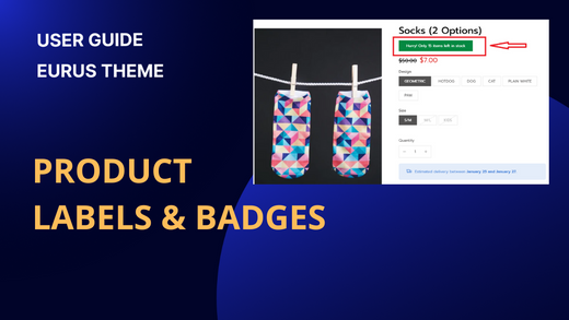
1. What are labels and badges? Product labels and badges in the Eurus Theme are visual indicators added on product cards and product pages, presenting key information and ongoing promotions. These labels aim to assist customers in quickly identifying important details about the products. ✍️ How to locate the Product labels and badges section in Theme Editor: Open the Theme Editor in your Shopify admin (Online store > Themes > Customize). In the left-side panel, scroll down to find the Overlay group. Click on the Product labels and badges section. From here, you can customize its settings. 2. Types of product labels and badges in Eurus theme: There are 6 types of labels available in the Eurus Theme, each serving a specific purpose: Sale Label: Automatically displayed for products currently on sale. Sold Out Label: Automatically displayed for products that are out of stock. Image Label: Allows the upload of custom images to be used as labels. Text Label: A customizable text input for various purposes. Pre-order Label: Indicates products available for pre-order. New product label: Show a label on the product and set an expiration date for it. 3. How to set up labels and badges? a) Setting up all types of labels and badges: To configure labels, navigate to Theme editor > Overlay group > Product labels and badges > Add a label block. Key setup features include: Content: Admin can add content to the label by inputting text into the content field and selecting an icon in the Icon configuration. In addition to text, admin can also use the following codes in the content: {sale} for the discount percentage. {sale_amount} for the discount amount. {qty} for the total quantity in inventory. <br /> to insert a line break. <b>your content</b> for bold text. Sale label automatically displays on all discounted products (The products are set “Compared at price”). For example: You use the code Save {sale} for the sale label. The product “Solid Wood Side Table” is 25$ for price and 30$ for “Compared at price” (discount 17%). Using the {sale} variable in the content will lead to this result on the storefront’s sale label: Example Content: "20% off today only!" Result: OrExample Content: "Hurry! Only 15 items left in stock" Result: Icon Configuration: 3 options: Choose your favorite Icon from the drop-down list. Choose "None" if you don't want any icons. Find your preferred one in the Icon list, copy and paste its exact name to the “Use another icon” field. (Note: Make sure to choose Icon > "Use another icon" to activate this function.) Add a Custom icon (SVG code). (For assistance with custom SVG code, please contact our support.) Display Options: For each product card, you can decide to put the label ON the product image, or OUTSIDE the product image, with several options: ON the product image: Top left Bottom left Top right Bottom right Custom position OUTSIDE the product image: Below image Bottom of card Next to price (for Sale label only). For more details of how to customize the position of product labels, please refer to our video guide. Admin also can preview these adjustments in real-time within the theme editor, ensuring seamless customization and a visual understanding of the label positions on their storefront. Styles: Admin has the flexibility to customize label styles (square/rounded corners/rounded). Additionally, admin can adjust font size scale, label size, label opacity, and color according to their preferences. These customizable features empower administrators to tailor the visual appearance of labels on their storefront.Please refer to our video guide to customize label styles. b) Select products/collections to apply Image and Text labels: When selecting products or collections to apply Image and Text labels, there are two key configuration options: Apply to Products: Choose specific individual products to which you want the Image and Text labels to be applied. Useful when you have particular products that require custom labels. Apply to Collections: Select specific collections to which you want the Image and Text labels to be applied. Ideal for applying consistent labels to an entire collection of products. Note: If both collections and individual products are selected, the labels will appear on items that meet either of the criteria. This follows a logical OR configuration. This provides a flexible and targeted approach, allowing you to precisely control where your Image and Text labels are displayed c) Set up Schedule for Text label & Image label Admin also can schedule to display text labels and image labels on selected products by using the config group “Schedule”. Check the “Enable schedule” box to enable schedule, then you can choose the time zone you want to set the schedule on and set up exact time to start/stop showing the text/image labels. d) Set up Pre-order label To set up the Pre-order label, please follow these steps: Set up the icon: 3 options Choose your favorite Icon from the drop-down list. Choose "None" if you don't want any icons. Find your preferred one in the Icon list, copy and paste its exact name to the “Use another icon” field. (Note: Make sure to choose Icon > "Use another icon" to activate this function.) Add a Custom icon (SVG code). (For assistance with custom SVG code, please contact our support.) Enter the text for the Pre-order label. You can use special codes such as {sale} for discount percentage, {qty} for total quantity, {price} for product price, etc. Use HTML tags like <br /> to break lines or <b>your content</b> for bold text. Select the label type (Square/Rounded corners/Rounded). Set the font size scale for both desktop and mobile versions by using settings “Desktop font size scale” or “Mobile font size scale” Upload images if you prefer to use a visual label instead of text. Adjust the size and opacity settings for both desktop and mobile versions. Choose the label’s position on the product image (Top left/Bottom left/Top right/Bottom right/Custom position) and customize horizontal and vertical position as needed (Used with Custom position only). Configure the background, text, and border colors for both light and dark modes to match your store's theme. By following these steps, you will be able to successfully set up and customize Pre-order labels for your Shopify store. 4. How to show labels and badges on product cards? Enable the display of labels on product cards by activating in the section and enabling each label block. Step 1: Enable it in the section by clicking the Enable product labels and badges checkbox. Step 2: Tick the Show on product card config for each label block (sale label, sold out label, etc.). Tips: Keep in mind that due to the limited space on product cards, it's recommended not to display more than three labels on a single product card to avoid covering the product image. 5. How to show labels and badges on product pages? By adding the block in the Product labels and badges section, the labels only show on product thumbnails. In order to show labels on product page and other product sections (Quick view, Feature product), follow these steps: Step 1: Enable it in the section by clicking the Enable product labels and badges checkbox. Step 2: Enable the Show on product page config for each label block Step 3: Go to the needed section, add a 'Labels and badges' block anywhere you'd like, then click Save. 6. Using metafields for labels & badges. To learn more about setting up the product labels & badges with metafields, check out this guide. For more details of how to set up product labels, please refer to our video guide.

